Importance of style guides in design

One may call it Graphics Standard Manual, Identity Style Guide, Brand and Graphics Manual, Branding Manual, Brand book… People call it differently, but they all usually mean the same thing (although we should be careful about using “brand” in naming, cause brand books/manuals dictate not only visual and graphic representation, but the brand as a whole).
We’re basically talking about a set of standards and rules by which we enforce a certain style to be applied on company’s documents, presentations, visuals like posters and flyers, communication strategies or even photos.
It can be as broad as it needs to be to everything we may need to use, but keep a recognizable company style by using the same typography, colors, logos etc.
Web style guide is also a set of standards and rules, but meant to be applied throughout your website to ensure consistency and cohesive experience. It can be a part of a company style guide dictating how the brand will be presented on a website, but on the other hand it can be an independent document. For instance, if you only do business online and don’t have that much need for anything “offline”, your web style guide can double as your company style guide (you can easily make your business cards based on your web style guide), or be a good place to build upon if you’re thinking of creating one.
So how do we build a web style guide?
Most of the businesses already have some styles defined. It may be a whole set of standards, but it may also be just a logo and a few colors. This is often a good place to start. We’ll go through your existing documentation and take everything we need and can use to keep things within your existing style framework. We’ll never try to change your style (unless of course you ask as to). If you’re coming empty handed, we’ll have to research your brand in order to define what would best suit your needs and start from there.
COLOR is a logical place to start building! If your company hasn’t already defined some colors to be used, we’ll turn to your logo for help, because you’ve probably incorporated your “brand color” into it. Now that we have your “primary color”, we’ll turn to the humanity’s best invention ever. The Wheel. More precise – the color wheel. There are a few standard color harmonies (complementary, analog, triadic…) we can turn to when combining colors. 2-3 colors are usually enough, given that we’ll use a few shades of every, depending on the content so we’ll have enough to work with.
It’s important to know that some colors may need a bit of tweaking for displaying them on screens. If a color looks good on some other medium, it won’t necessarily be true for displays (and the other way around). There’s nothing strange in using two shades of the same color for web and for print. So if we offer you a slightly updated brand color, don’t dismiss it right away. There’s probably a good reason we did it. Not to mention that different displays will display the same color – differently. So brightness and saturation are something we must keep in mind.
Now that we have a nice set of colors it’s time to move on.
TYPOGRAPHY, or 95% of your website according to some, the most important part of your website and must not be taken lightly. Picking the right font face for any medium can be tricky. We have two options – go for fonts we know will do the job right, or “go into the wild” and experiment with fonts and font pairing. This usually depends on the type of business we’re working on. One can’t just use the same font face for a fashion store, veterinary store, and a flower shop. Typography should reflect your business.
When choosing a font, we also have to be careful and have a set of “fallback”, replacement fonts. Those are fonts that browser will use if the primary font is not loaded for some reason. In such scenario we want to keep everything nice and tidy, so choosing a proper fallback font is also important.
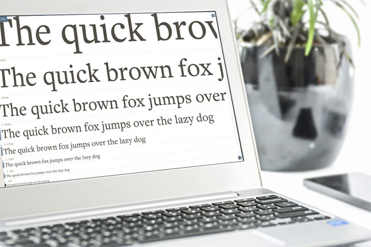
Once we have found you a perfect type face, it’s time to make a typography scale. We’ll define all text styles for headings and body texts and establish a clear hierarchy between them. These styles will be used throughout your website.
This is a crucial moment. Once we’re deep in a project, it’s hard to go back and change the type, because changing only one font size may result in a need to change all other sizes in order to retain a type hierarchy. This may come as a simple variable change in a CSS preprocessor, but this is very hard in a graphics software, because graphics software doesn’t do variables. While changing a type in CSS will keep all paddings and margins in order, for us, other than changing the font size and line height, this means adjusting all margins and paddings around every piece of text “by hand”.
This is why sometimes it may be hard to “make that title a tad smaller” – because that title is a shared style used on other ten pages, and that style is interconnected with other styles through a typography scale.
Now that we have our two basic elements, we can create some more basic elements. We’ll do some primary and secondary BUTTONS, start assembling ICONOGRAPHY and perhaps wrap it all up with some FORMS.
Although there’s lots to tell about the last three (and of course, it doesn’t stop there) we’ll keep it short and not go into details of their how and why. What’s important is that every other element we create consist of color, typography or both, so with these two basic building blocks we cover a lot of grounds and have the primary ingredients to build every other element we may need.
So to recap – we’ve defined colors and type scale, drawn some buttons, put together some forms and now what?
Well, now it’s time to start building using elements defined in style guide. And this is the importance of having (and following) a style guide. By following our style guide we are now sure to be using the right typeface with the right font sizes for all intended purposes. We have consistent buttons with same color, shadow and border radius throughout the store, all our form labels are always at the same location in regards to text boxes, our shadows are always going from left to right, we’re not choosing a color of navigation bar with a color picker based on our feeling or current mood…
We now have and follow STANDARDS.
What’s important to realize is that the style guides are not closed systems. They’re designers playground and they’re regularly updated. While designing, we often find ourselves in need of something not (yet) covered by the style guide. Somewhere along, maybe we decide to give all buttons a nice lightly transparent black shadow but hadn’t defined any shadow style before. This is the time to add that shadow style to our style guide so next time we need a shadow – we use the same. Later if we change our minds about the shadow and make it for instance orange – it’s important to change the color in style guide as well, so we always have a consistency and uniformity.
This was just an overview of the most basic style guide imaginable. Sort of a “starting point” to have something we can work with and build upon. By the end of the project style guide goes through series of changes and may also include things like layouts, design patterns, grids, interactions, animation, setting the tone or voice for copy, determine imagery and overlaying text on an image. We can standardize pretty much anything and go into tiniest details if see needed. All with the aim of having a clear standardization to follow and to ensure consistent and cohesive experience.
Related Inchoo Services


1 comment
Hey Zoran, You are right. Choosing the right color is one of the most crucial step to convert your business into a brand. I have faced the same problem when I wasn’t able to make the right designing decisions for my business. It took a lot of time to decide the colors. Though, I succeeded and think it was worth it.