Navigation – structure, usability and trends

Whether it’s a website, an app navigation, your mobile phone menu or the menu in your car – navigation is one of the fundamental features of every digital product. By providing clear and well-structured navigation, you relieve your users of confusion. This makes it easy for them to find what they’re looking for. If users can’t find their way around your product it will frustrate them.
When thinking about the navigation, you can start with a hierarchical system and make an information architecture. This may become rather complex for a large site, and to break it down, use a visual or textual representation of your site information architecture.
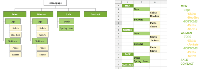
Three types of sitemap
A sitemap can take shape of a graphic diagram, a spreadsheet, or a text document – whichever you find appealing. It is important to have a clear and logical representation of your site’s architecture and hierarchy.
Sitemap vs. navigation
Sitemaps can (and will) become complex, but do you need all those levels and links to every single page in your primary navigation? It may be a natural way of thinking, but the answer, short and simple, is no!
You can break your sitemap to common navigation types like primary (most important pages you want your users to visit, e.g. web store categories), service links (e.g. login, language switcher, etc.), and footer navigation (e.g. about, contact, etc.).
While the sitemap shows one page only once at one location, the navigation(s) offers alternative path(s) to that page (e.g. a link to the contact page can be found in the footer, service and primary navigation).
The KISS principle
KISS stands for “Keep it simple, stupid”, and dates back to 1960s. It states that most things work best if they’re kept simple and any unnecessary complexities should be avoided. The same principle applies to the navigation. You may have also heard about the “Three clicks rule” suggesting that users should find the information they’re looking for in three clicks. Contrary to the popular belief, user’s won’t leave your site if they don’t find what they’re looking for in just three clicks. Fewer click will likely make them happier, but there’s no study or test to support the theory. What matters is to keep the users engaged so they feel they’re on the right path. If you do that successfully by the end of their journey, they won’t have a problem with a few more clicks.
Does this mean you can have 6 levels of primary navigation? Well, yes and no. The number of levels will be determined by the site hierarchy, but be aware that the deeper the navigation, the more likely it is for users to become disoriented. Deciding on how the primary navigation should be grouped and how deep it should go will have a significant impact on how your site works and how the users use it. In most cases, maximum of three levels of navigation are usable. This will keep the general hierarchy and make sure the navigation isn’t too broad and confusing. If you need more levels, you can always go with landing pages which contain additional navigations if necessary. This way you can keep your primary navigation nice and tidy.
Adequate labelling
Users should be able to quickly scan and understand the navigation, so make sure your labels are intuitive. Many sites have poor category names and don’t describe the content within well enough. When the labelling is off, users are unable to find what they’re looking for and get lost and disoriented pretty easy.
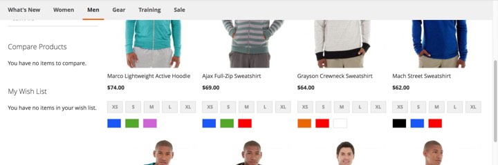
You can also use icons or pictures along with labels. Humans are visual beings. They scan and recognize graphics faster than a text label alone. This is where a mega menu becomes extremely useful.
Navigation accessibility and discoverability
The primary navigation on large screens is usually either a horizontal or a vertical bar. This is a standardized approach which works very well and should not be reinvented. Traditionally, a simple primary navigation will be horizontal, because it feels less intrusive, more balanced and goes with the flow of the page. However, if it becomes too long, it’ll flip vertically. A vertical navigation can help you avoid clutter if you have a lot of levels and want to display the navigation in a more structured manner.
While it became completely normal today to hide the primary navigation behind a three – line icon on small screen devices, such as mobile phones, it’s not uncommon to see sites hiding primary navigation on large screen devices, such as laptops or desktops. This may help you in gaining space but some users will struggle with hidden menus and it will affect their experience in using your site. Hidden navigation is less discoverable, meaning users are less likely to use it. If you have tech-savvy users, or a younger population familiar with the latest UI trends, the hidden navigation may work for you. Keep in mind that a regular Joe will probably not even find it. If you’re even considering this, be sure to test it with your users before making a final decision.
Two popular solutions for large screen devices are sticky (sometimes referred to as “fixed”) nav bars and mega menus. Sticky navigation bars (the ones always visible, regardless of where you are, vertically on the page) may come in handy if you have a lot of scrollable content and an inpatient user. However, the fixed navbar should not take up too much screen so it’s not intrusive and distracting.
Sticky navbar
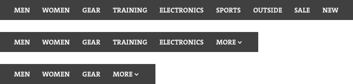
Mega menus are large drop-down menus providing the users with a lot of choices. They enable accommodation of a large number of items which can be structured into a hierarchy through layouts, grouping, and typography. These menus work best for sites with a lot of content (like an eCommerce site), but still – if users are presented with too many options, they may become disoriented (remember the “KISS” rule!).
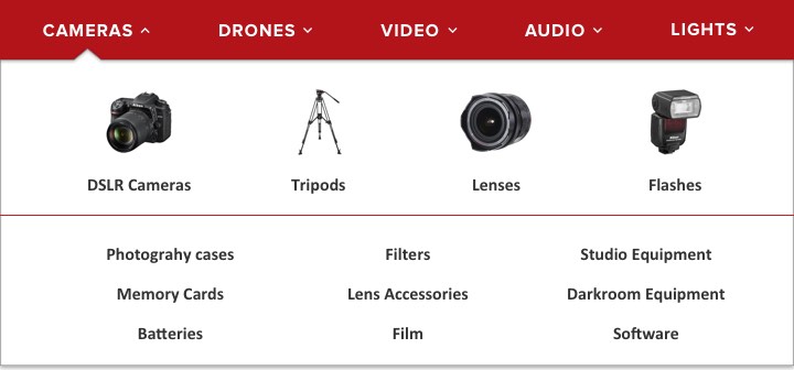
Mega Menu
Going mobile
Don’t ever say you don’t have choices on mobile. pic.twitter.com/Atu3Ogi58j
— Luke Wroblewski (@lukew) April 23, 2015
The trend of hiding the navigation caught up and it’s really hard to find a site or an app not hiding it’s navigation today, but is this really necessary? If you have a lot of categories to display, you’ll probably want to stick with this type of menu. If you have a more limited number of categories, or thinking about restructuring your navigation, here are some alternatives for you:
TAB BAR – you can use tabs as a great way of allowing direct access to different features or categories using visual cues and text. It’s also very clear to see the active page because it’s tab is usually highlighted. Downsides are it’s pretty limited (to 5 or 6 items, although you can always go with “more” button) and it works best with icons.

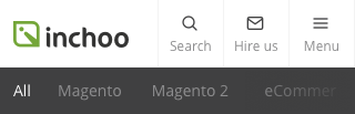
SCROLLABLE NAVIGATION – similar to the previous pattern but without icons. You can find it on Inchoo’s blog if you’re reading this from your mobile phone, or on Google’s search tools. It requires less space, but if you don’t give the users a visual cue that there’s more navigation to scroll through, it will present a problem.
PROGRESSIVELY COLLAPSING MENU – a combination of a scrollable and tab with a “more button” which collapses as the screen becomes smaller. While you do end up hiding the content behind a “more button”, if you prioritize right, most users will be looking for the first 4-5 visible links.
COMBINE IT – just like you’ll break down the navigation on desktop one ways, you can break it on mobile the other way, and have tabs for some primary sections, and a hamburger icon for a secondary navigation, like language, login, service links etc.
Beware of the split button…
Typical off-canvas navigation will have a category title and an indicator (like an arrow pointing downwards) if it includes subcategories. It’s essentially a button within a button because tapping the text will usually lead you to the category landing page, tapping the indicator will expand the category within the menu.
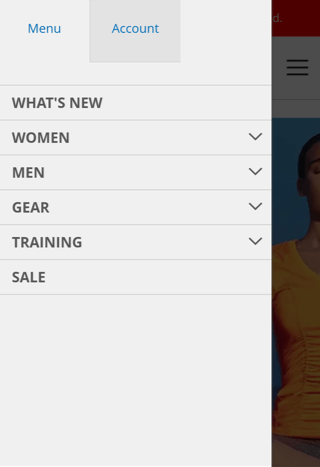
This may seem obviously intuitive, but unfortunately, users aren’t as familiar with this as you may think. Here are some options to consider:
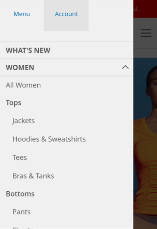
Taping the main category expands the menu, but access to the category landing page is removed
If the category page just replicates the contents of the menu and brings no extra valuable content, you can simply remove the access to it. This way users can simply select the subcategory they’re interested in directly from the main navigation and don’t have to wait for the category landing page to load just to see the same content offered in the previous step.
Taping the main category expands the menu, access to the landing page is enabled by an additional link to it
The advantage is that you can remove the link to the landing page from large resolutions (have the click on the main category label lead to the category landing page) but keep the access to the category landing page on small screen devices. If your category landing page brings extra values (like promotions and similar) be sure to use a proper labeling for it (e.g. View all). This is also the default Magento 2 behaviour.
Two Taps
You can use a two-tap method. The first tap would open the submenu, and the second tap on the same item would lead the users to the landing page. The problem, however, is low discoverability. Users won’t realize they can access the landing page on the second tap because the second tap on the opened accordion menu means – close it.
…and the back button
If you’re thinking of sequential menus (the ones showing only the contents of last top level category you’ve selected), you may want to think twice. While they receive a growth in popularity, they will probably lead an Android phone user to press the phone’s back button instead of the one provided by the menu to go back a level and they’ll accidentally close the menu and navigate to a previous page.
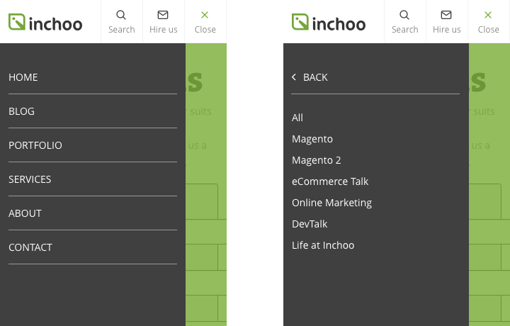
If sequential menus exited on Inchoo.net
In a nutshell
Your navigation should be transparent, simple and intuitive to enable users a seamless experience with no confusion. Use proper labelling for your categories, and try not to hide it all behind an icon if not necessary. Before introducing any changes to the navigation, have a clear reason why the change is necessary, and be sure to test the changes with your users before going into production. Our UX Design Audit can check if your store follows all of these recommendations.
Related Inchoo Services


