The Struggle For Ideal Design

Many already attempted to define ideal design – and many have already confused design with aestheticism. That’s why we’re bringing you an overview of what design stands for and its primary role, problem solving. We also went over the fact that design is supposed to please the customer visually and trigger an emotion in him, so here’s how you combine all of that.
The design and the way problems are solved
Every one of us is a designer in a way. We are all trying to find the quickest and easiest way to solve problems that we encounter, whether it be a trivial thing like opening a yoghurt (as successfully as possible) or something much more demanding, like building life-sustaining structures on Mars. Realizing that something is not working like it should be and as well as it should is, in fact, in human nature. We observe and analyze, and upon identifying the problem, we iterate the product for as long as it takes for us to bypass the said problem. Some will probably find a completely different use for the same product than the other, or perhaps a different method of solving the problem. That is the essence of design: enabling anyone and everyone to use the product or service, any time, any place, without delays and disruptions, without the need to wonder about the inner workings.
Everyone designs who devises courses of action aimed at changing existing situations into preferred ones
– Herbert Simon
Design, contrary to popular belief, is not an art. Design is not a matter of style or taste. When talking about design, we talk about the decision-making process around the functions of a product or a service. What product or service would that be? The one that brings a definite solution to a particular problem. We talk about enhancing the quality of life and shortening the time it takes to carry out a certain task. We talk about breaking down the problem into its smallest segments so as to understand what causes it and how to avoid it. Design that does not work the problem out, therefore, is not design. If we think about design as only something aesthetically pleasing to a certain group of individuals, then we are not, in fact, talking about design. We are talking about taste and “[i]n matters of taste, there can be no disputes“.

“The Uncomfortable” — Katerina Kamprani
Design fulfills the function. It solves the problem. Still, is finding the solution to a problem sufficient enough to create an emotional connection?
The taste & trends and why you should not go gentle into that good night
It is a well-known fact that everyone is entitled to their own opinion, and everyone can state if and what they like about something. Likewise, everyone can follow trends to “stay up to date”, to earn bragging rights and become popular on social networks, among friends and acquaintances. But the question remains: Are trends really for everyone? Do all trends agree with everyone? Are the current, contemporary trends applicable to every kind of business, to every product?
Subjective opinions of stakeholders’ random family members on the color, positioning or shape of an element that they may or may not like do not matter. Someone’s personal taste does not matter. What matters is the kind of visual presentation that will arouse emotions.
Trends come and go. They depend on a multitude of factors. Some trends evolve and adapt, but most are replaced with new ones, which are at that moment presented as the way things should be done, as an example to be followed. Some trends are utilized to such extent that they become a standard, which is not necessarily a bad thing.
Through standardisation of user interface elements we help create the platform that provides a consistent and cohesive experience, which then enables users to find their way around more effectively. This, in turn, saves time and allows the development of a visual language. Android Material Design and Apple Human Interface Guidelines offer exactly that: standardisation for their platforms in order to habituate their users with them. They offer designers a visual solution with which it is easier to shape the information architecture and tailor the user experience. However, is letting something that has become a standard only for certain platforms turn into a widespread trend a good thing? Especially if we consider the fact that the elements of that ‘standard’ are being implemented without careful thought and consideration of their peculiarities and effects?
The perfect example can be found on the web, where standardisation of elements may have quite the opposite result. If we consider online stores designed through the use of templates, we can notice the pattern; they all look the same. Remove the logo and one cannot be sure what web-page one is on. Remove the cover image and all the emotion is gone. Again, the user has no idea what he or she may find there. Trends come in handy with systems that enable quicker and simpler creation and presentation of products and services, but not with the users themselves. Those kinds of systems use the information only to analyze and possibly alter the behaviour of users. They observe only one side of the users and miss the bigger picture. Those kind of systems lose the connection with their users and do not offer the emotional experience of product use. Establishing that kind of bond is very important, and it cannot be done via the interface built on the current trends.
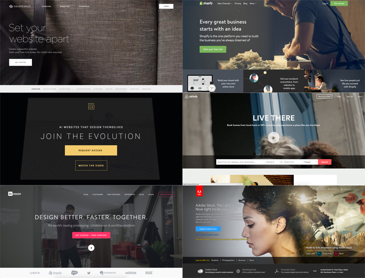 Uniformity of todays interfaces
Templates of that sort may be attractive, but they fail to realize the emotional connection. If the template is created to solve all the potential problems, to be of broad functionality, it is most likely to fail. The presentation might seem satisfactory, but the connections between the product and the customer will not be realized.
Trends are not here so they can be blindly followed and exercised. Trends are, especially nowadays, a result of the lack of time, and the means for the quickest launch of MVPs onto the market possible. Unfortunately, many remain on that level, never growing, never evolving.
“The Competition Does It This Way” Problem
One of the more frequent issues is also one of “borrowing” from the competition. If the competition follows the latest trends when presenting its products and is doing well, some may start believing that the same mechanisms might also be adequate for them. That is, most often than not, a mistake.
Although the decisions made during the process of problem-solving (e.g. on a user-interface of an online store) are the result of an extensive research and thorough methodology (customer journey maps, user stories, personas, analytics/data, brainstorm sessions, user flows, storyboards, use cases and scenarios, usability testing, card sorting, a/b testing, sketches, etc), many still rely solely on the visual aspect that they find appealing.
That brings us back to personal taste, which again brings us back to trends, to imitation. Imitation, uniformity, lack of personality, lack of emotions and finally, an assembly line type of approach.
All that is a part of a problem that could easily be solved by people who are ready to invest time and effort into a process of both problem-solving and creating a user-product relationship.
The emotional connection between data and aesthetics
30% of all human decisions are rational and 70% are emotionally driven.
With that in mind, two Japanese researchers, Masaaki Kurosu and Kaori Kashimura conducted an experiment which confirmed the people’s preference for products that are more visually appealing than those that are simply functional. They modified ATM’s interface that was now more pleasant to use than the one before. All ATM’s were identical in function, number of buttons and the way they worked; the only difference was how their interfaces looked. And people loved it.
When talking about aesthetics, many still think about trends and styles, without examining how those trends would affect the presentation of their products to the targeted group of users.
When designing interfaces, we get to know where our users come from, we get to know their demographic, their interests, when and where they are using the service or product, and what they are using it for. We get to know their internet connection speed, screen resolution and how they use the product. We get to see firsthand what users perceive more and we get to learn how we can improve it.
In order to design an ideal experience we use our findings to help create emotional responses from the ones using the product or service. Through the use of Gestalt principles combined with color theory, shapes, typography, photography, iconography, we are given the tools to create experiences that will keep users happy, engaged and allow them to finish their tasks in no time. When designing products with such care not only will emotional connection be established, but users might also become so engaged as to start promoting the product for you. Apple achieved just that. Their products are aesthetically pleasing and easy to use, which, together with carefully devised marketing strategy, created a strong emotional relationship between the users and their, no longer products, but companions.
The researches have shown that the aesthetic quality is necessary during the user experience design because of the way people think, perceive the world around them and the way they interact with it. Aesthetics is deeply ingrained in human emotions and feelings, and therefore affects the way people receive information.
The common belief is that emotions are animalistic, irrational, while the cognition is cold, logical… human. (Emotional Design, Donald A. Norman). However, emotions are an indispensable part of people’s lives (however animalistic they might be). Everything we think about and everything we do is connected to our emotions and our subconscious. Emotions alter the way we think and often serve as guides to proper behavior. Product design needs to incite emotions because those are more memorable than anything experienced through the senses (sight, hearing, etc.). Most will not remember how something looked like, but how it made them feel.
Designing products that solve problems in an instant and connecting that product with the users on an emotional level lifts the experience users have. Experience that provides engagement and creates relationship stands out in the sea of monotonous products that looks like they were crafted just to be sold.
Because of that it is imperative to connect visually appealing with practical, to unite form and function.
How To Make It All Work?
Visuals and graphics do not make the design, but they do play a significant role in the design process. Design solves the problem, aesthetic quality shapes and connects the cold function with the user. The emotional reaction that stems from that could be further nurtured into a relationship.
Designing interfaces by function which does not follow the form will yield undependable results. Only by investing in quality research and time needed to create a deeper bond between the user and the interface will a business build a recognisable brand and create a relationship. In consequence, the user might spread the word about how he felt while using the product, reaching a greater number of people who might become interested to try it out for themselves.
After all, if something is visually appealing and impractical or dysfunctional, but still makes people smile and makes them happy, is it by definition still functional? Product itself may not meet the purpose it was created for, but it definitely meets another purpose – the emotional one, which is the hardest to come by.
Good design is making something intelligible and memorable. Great design is making something memorable and meaningful. – Dieter Rams
To learn how you can make design work for your store and help you grow the revenue, feel free to get in touch and get a custom detailed usability report!


1 comment
With the designer you can now do the overload request. With the designed techniques, you can do some typography fundamentals. Align with white space, Keep it simple, Color Theory, Align in photography and keep it consistence.