5 UX improvements for Magento checkout page design

Magento 2 checkout page is the crucial page of your Magento 2 store. It is the final stage of the checkout flow and only motivated users interested in purchasing your products will reach this step.
Many still remember the complicated 6-step Magento 1 checkout. Compared to that, checkout in Magento 2 has been significantly improved. Yet, there are some usability problems that we encountered during our analyzes, and there’s always room for improvement.
In this blog post, we’ll suggest design improvements for 5 known usability issues on the checkout page in Magento 2:
- Sign in link not visible
- Hidden order summary box on mobile devices
- Confusing address field
- Changing billing address
- Coupon code field position
So let’s start with the first.
1. Sign in link not visible
By default, Magento 2 checkout allows guest users to make purchases with an option to register on the Success page after they place an order. Registered users who already have an account will look for the sign-in option as soon as they land on this page, but the sign-in link is not visible enough.
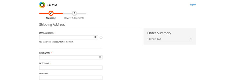
The sign-in link is placed in the top right corner, and users on the checkout are focused on the form, so they fail to notice it.
Despite the fact that Magento will display a password field for registered users after they enter their email address, this is not good usability because users are not familiar with that is going to happen. Users who know they are already registered will actively look for the sign-in option.
For that reason, we suggest highlighting the sign-in link above the email field as a call to action button to prevent oversight.
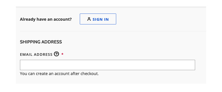
An example of the sign-in link as a CTA button above the Shipping Address form.
2. Hidden order summary on mobile devices
The order summary box is placed in the right column on the desktop version and is hidden under the cart icon on mobile devices. Many users on mobile devices are not aware they can find order summary there. This is especially a problem on the second step when users want to double-check order details and shipping information before they click the “Place order” button.
Who would click on the cart icon to see the shipping information?
A solution for this usability issue can be entirely simple. Adding a label “order summary” next to the cart icon will be clear enough, and users will not have to think where they should click to find that information.
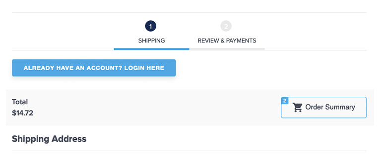
An example of the Order Summary button on mobile and tablet devices
3. Confusing address field
The shipping information form is well structured, with required fields clearly indicated. Still, on many projects, we saw users having problems with the address field. By default, street addresses have three input fields and only one label.
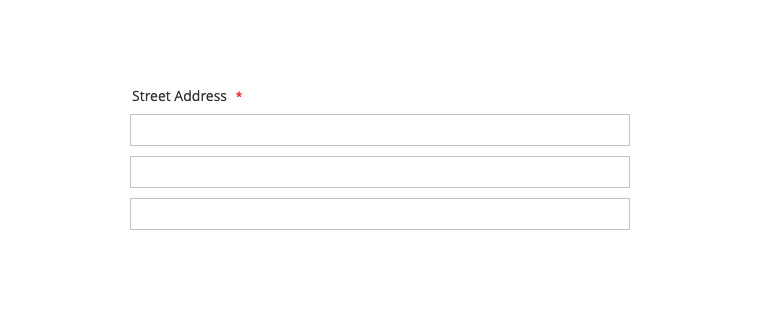
Should I put the street name in the first field and number in the second? Or should I leave the second and third empty?
Many users are confused and not sure what they should enter in the second and third fields. Those fields are optional, but that is not clear since Magento failed to indicate that.
We should clearly indicate that users can leave those fields empty. It is also possible to remove the third line, but be careful if you already have customers who saved the address with three lines because they will get “Street Address cannot contain more than two lines” checkout error on the Place Order step.
The easiest solution would be adding placeholders in Address fields 2 and 3:
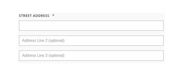
An example of how we solved that usability issue on one of our projects.
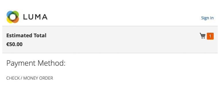
4. Changing billing address
One of the best practices on the checkout page is to use the shipping address as billing address by default, and Magento uses a preselected checkbox to achieve that. Although this seems like the right solution, on a few projects, we have seen that some users who wanted to change the address did not know how to do it and were not able to finish the order.
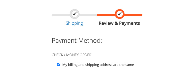
Unchecking the checkbox field to change address is not intuitive for some users
In terms of usability, users should be able to see where they can change their billing address. Unchecking a checkbox is not intuitive for many users we analyzed.
One solution could be showing the address so users can check one more time if all details are correct and the “change billing address” button for users who would like to use different billing addresses.
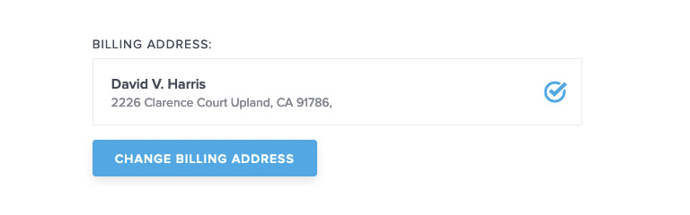
Solution for one of our clients
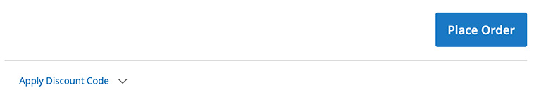
5. Coupon code field position
At the end of the checkout process, just below the Place Order button, there is a link “Apply Discount Code,” which tells users it is possible to get this product cheaper if you knew this code.
For that reason, some of them will go on Google to look for coupon codes and leave the site, and there is a big chance some of them may not come back.
The position of the coupon code field is a tricky question. If you remove it completely from the checkout and leave it on the shopping cart page only, users who skip the cart page (there is a direct link to checkout in the minicart) will be frustrated because they won’t be able to use code if they have it.
If you don’t use coupon codes in your promotions frequently, this might be a solution, but if you need it and leave it at the last step, some users will leave the site, and while searching for codes, will see ads for the competitors and maybe find a better alternative.
So what should we do to allow users with code to use it and keep other users on the site?
If you have a global campaign and all orders will qualify for a promotion, make code visible on the site all the time, including the checkout page.
If only some users have a coupon code, the easiest solution would be adding a helper text or icon near the coupon code field and explain how to get it.
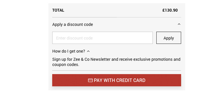
Users who click “How do I get one” link will see they should sign up for a newsletter to receive coupon codes.
If you use an email for a promotion, the URL can include a parameter stored in the user’s session so you can display promo code fields only for those users.
The coupon-code field position’s final decision will depend on the frequency and types of promotions you use.
Conclusion
Every change on the checkout page, even the smallest one, can significantly impact conversion and revenue. For that reason, you should always monitor how users interact with your store and test incremental design changes. If you’re unsure if your store is user friendly, check out our usability & UX audit and see how we can help.
In the meantime, check out the rest of the articles from this series:
- Best practices for Magento Homepage design
- Best practices for Magento Category page design
- Best practices for Magento Product page design
- Best practices for Magento Cart page design
- Best practices for Magento Theme design
Need help with implementing checkout improvements mentioned in this article to your store? Contact us now.


3 comments
Hi Marko, I am a newbie in the web development field. That’s why I am so happy after going through this content. How long have you been writing? Keep it up. Thanks!
Creating your eCommerce app can be challenging, but it has its benefits; as told, people nowadays like to do shopping in comfort. So my question to you is, does efficiency matter in-app for eCommerce application development?
“User experience” is one of the decisive factors which can strongly affect the success of every online store. However, store owners usually have several problems when trying to enhance the experience of users. Therefore, extensions which provide practical solutions are always essential for every store. But before going to any further, let’s have a glance at the definition of the term “User experience” and the importance of it to online stores.