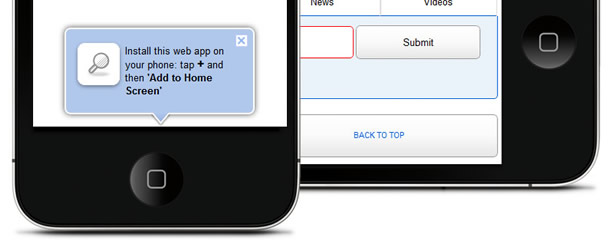
Idea is to create one page which will be ready for mobile devices and serve like mobile app. We will use google ajax search API and jQuery to enhance experience. Also we will have script which will notice visitors how to add shorcut for iOs devices and use search like standalone app.
Let’s start with HTML
<!DOCTYPE html>
<html dir="ltr" lang="en">
<head>
<meta charset="utf-8" />
<!-- if is screen bigeer than 481px load normal css -->
<link rel="stylesheet" href="css/style.css" media="screen and (min-device-width: 481px)" type="text/css" />
<!-- css for mobile devices, based on screen size -->
<!--<link type="text/css" rel="stylesheet" media="only screen and (max-device-width: 480px)" href="css/mobile.css" />-->
<link rel="stylesheet" type="text/css" media="only screen and (max-device-width: 480px)" href="css/mobile.css">
<link rel="stylesheet" href="css/mobile.css" media="handheld" type="text/css" />
<!--[if IE]>
<link rel="stylesheet" href="css/style.css" media="screen" type="text/css" />
<![endif]-->
<!-- tell iPhone not to shrink mobile website -->
<!-- <link rel="stylesheet" href="css/style.css" media="screen" type="text/css" />-->
<meta name="viewport" content="width=320; initial-scale=1.0; maximum-scale=1.0; user-scalable=0;" />
<!-- enable full-screen mode (only when launched from home screen) -->
<meta name="apple-mobile-web-app-capable" content="yes" />
<!-- iOS 2.0+: tell iOS not to apply any glare effects to the icon -->
<link rel="apple-touch-icon-precomposed" href="images/icon_home.png" />
<!-- iOS 3+: full-screen startup splash screen image (must be 320x460) -->
<link rel="apple-touch-startup-image" href="images/startup.png">

<!-- bookmark popup window, use local storage HTML5 feature -->
<script type="text/javascript" src="js/bubble.js"></script>
<script type="text/javascript" src="js/bookmark.js"></script>
<link rel="shortcut icon" type="image/x-icon" href="favicon.ico" />
<title>Search and you shall find…</title>
</head>

<body>
<header>
<h1>My mobile search</h1>
<h3>Search for</h3>
<ul class="icons">
<li class="web" title="Web Search" data-searchType="web">Web</li>
<li class="images" title="Image Search" data-searchType="images">Images</li>
<li class="news" title="News Search" data-searchType="news">News</li>
<li class="videos" title="Video Search" data-searchType="video">Videos</li>
</ul>
<form id="searchForm" method="post">
<fieldset>
<input id="s" type="text" />
<input type="submit" value="Submit" id="submitButton" />
<div id="searchInContainer">
<input type="radio" name="check" value="site" id="searchSite" checked />
<label for="searchSite" id="siteNameLabel"></label>
<input type="radio" name="check" value="web" id="searchWeb" />
<label for="searchWeb">Search The Web</label>
</div>
</fieldset>
</form>
</header>
<section>
<div id="resultsDiv"> </div>
</section>
<footer>
<div class="meta"> <span class="alignleft"><a href="#">Normal web</a></span> <span class="alignright"><a id='top' onclick='$(document).scrollTo(0,500);'>Back to top</a></span> </div>
</footer>
<!-- loading js files, moved to bottom, firs browser load html, css files then at the end js -->

<!-- loading jQuery from google CDN network -->
<script type="text/javascript" src="http://ajax.googleapis.com/ajax/libs/jquery/1.4.3/jquery.min.js"></script>
<!-- loading jQuery from google CDN network end -->

<!-- loading jQuery live serach and settings for search -->
<script type="text/javascript" src="js/search.js"></script>
<!-- loading jQuery live serach and settings for search end-->

<!-- loading jQuery from back to top effect -->
<script type="text/javascript" src="js/scroll.js"></script>
<!-- loading jQuery from back to top effect end-->

<!-- jQuery js settings, etc -->
<script type="text/javascript" src="js/control.js"></script>
<!-- jQuery js settings, etc end -->

<!-- loading js files, end -->

</body>
</html>
We will use CSS media query to detect screen size and adapt, add full-screen loading image with icon then load js for bubble notice and use HTML5 local storage to show only to new visitor bubble. At the end we are load jQuery scripts.
You need to edit search.js to add desired web address which will be included in search.
var config = {
siteURL : 'inchoo.net', // Change this to your site
searchSite : true,
type : 'web',
append : false,
perPage : 8, // A maximum of 8 is allowed by Google
page : 0 // The start page
}
Now this is basic information how to get started with our little web app and customize to your needs. Use your smartphones to test demo page.
Live preview: msearch.veselistudio.com
Download: Custom mobile web search

