This post continues from the FOWD NYC 2011 – Day One post. We carry on with the presentations held on the second day of the Future of Web Design conference held in NYC.
In our first post we covered all of the presentations we attended and we’ll carry on in the same rhythm presenting you with the:
Day Two
Pith, Passion, and Productivity: Pillars of a Successful Design Career
By none other than Cameron Moll.
Pith
“When I start editorializing the things that other people are doing, I lose my pithyness.”
How do you make a name for yourself as a designer?
“Write. Write with pith, authenticity and passion.”
Passion
Cameron’s Colleseo Poster and Authentic Jobs both started out as pursuits of passion.
“Do and write about things you’re passionate about.”
Productivity
“We have a strategic plan. It’s called doing things.” – Herb Kelleher (co-founder of SouthWest airlines)
Look for ways to get the most out of your time.
Design Principles: The Philosophy of UX
By Whitney Hess was another inspiring speech.
When talking about UX, we usually talk about user experience and visual design. But good design does not equal good experience! So, design principles are there to provide consistency, constrains, shared vision and objective evaluation.
Visual Design principles:
- Contrast
- Emphasis
- Variety
- Balance
- Proportion
- Repetition/Rhythm
- Movement
- Texture
- Harmony
- Unity
Experience design principles:
- Stay out of people’s way.
- Create a hierarchy that matches people’s needs.
- Limit distractions.
- Provide strong information scent.
- Provide signposts and cues.
- Provide context.
- Use constraints appropriately.
- Make actions reversible.
- Provide feedback.
- Make a good first impression.
You should read Whitney’s slides in detail.
The Future of CSS
By David Shea, was a treat after another. David started with a satisfying graph of browser market share showing IE decline and Chrome’s rise on the desktop while the mobile landscape was not that definite.
Here are some highlights:
- Most importantly – Optimize CSS for browser perfomance
- nth-selectors
- First, last of type
- Forms CSS manipulation
- Vendor prefixes – Dropping them or not?
- Color modes, background property…
David continues with more CSS magic but it’s too intensive to list them all here.
Why don’t you check them out here.
The Future of Mobile UX
By Steve Fisher a funny Canadian guy. His speech about The Future of Mobile UX, hit right on the spot. It was about, you guessed it, responsive web design.
Steve opened with some great humor featuring iMac spoof: “”For the letter ‘A’, I press it once. For the letter ‘Z,’ you guessed it, I press it 26 times.” The new MacTini
And finished with deep thoughts: “The web is not about specific devices. The web is not fixed width.”
“Mobile design isn’t just about shrinking it down”
Wondering what happened in between? Steve’s slides can be downloaded here.
Responsive Web Design and Embracing the Unknown
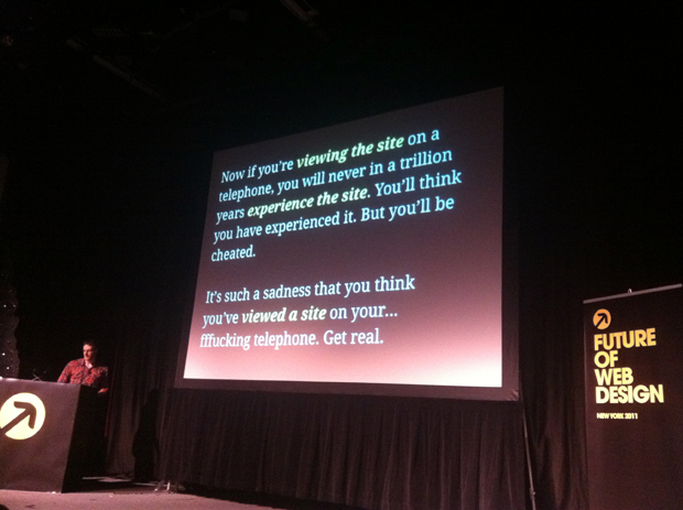
By Aaron Weyenberg. David Lynch: “It’s such a sadness that you think you’ve seen a film on your fu**ing telephone.” http://j.mp/t8oZX1
A few years ago web designer’s biggest worry (except IE6), was whether to design for 800 or 1024 pixels wide screens. Today, there are dozens of screen sizes, browsers and platforms. And there are probably more to come. We need to embrace responsive web design philosophy.
“There is no Mobile Web. There is only The Web, which we view in different ways. There is also no Desktop Web. Or Tablet Web. Thank you.” – Stephen Hay via twitter
“If responsive web design was a political philosophy it would be socialist. If it was a religion, it would be agnostic.”
Aaron slides can be downloaded here.
Summary
There are few buzzwords that were repeated throughout the conference: content, mobile, UX, responsive. These are not just buzzwords, we actually need to take care about that now and not in some distant future to be forgotten. Optimizing your “One Web” presence is not such a big deal if you take care of it the right way on time.
However none of the attendees/speakers mentioned e-commerce in context where things are inherently more challenging especially when it comes to Magento. This is something that we’ll try to catch up with by creating a Responsive HTML5 Magento theme in the near future.
A few people already asked us: “So, did you learn something new on the conference?”
No, nothing especially. But that was not the prime intention we have books and tutorials for that. BTW we’ll have all of those presentations packed in a hybrid presentation/slides video for download also so we can catch up with what we’ve missed or couldn’t attend to.
Thanks Cat and Ryan, that’s really indispensable 🙂
The real value we got from this conference is the current and future perspective of the “One web”, and on top of that to feel the energy and enthusiasm of the community that is pushing the web towards new boundaries.
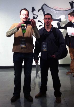 Finally, we’ve met some interesting people on the conference, among the others: Jens, Ilina, Zoran, Rob and Ben from SparkBox, Ditte and Emil from SnowFire, Gregory from ThomasNet…
On behalf on the entire Inchoo Team, Hrvoje Jurišic and Željko Prša the lucky ones who attended the conference say a big “Thank you” to all of you involved with the organization and also to our new acquaintances for sharing their enthusiasm and opinions.
Hope to see you someday soon on another conference soon 🙂
Cheers.
