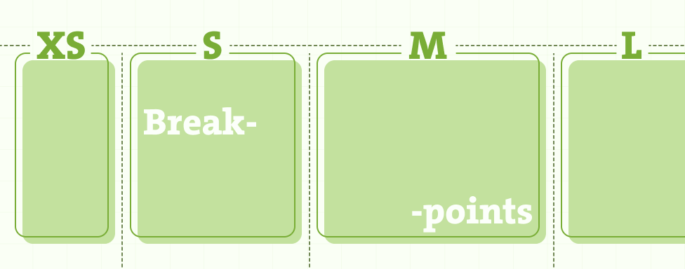
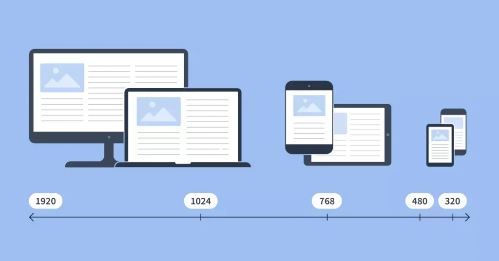
The Magento 2 Page Builder is an essential tool for crafting engaging and responsive page designs. By default, it operates with two primary viewports—desktop and mobile—and supports four breakpoints. However, not all breakpoints are exposed in the admin interface when adding or editing content, which limits flexibility and responsiveness for modern devices.
In this blog, I’ll address these limitations by guiding you through the process of adding a new viewport tailored for smartphones and adjusting existing breakpoints to align with tablet devices. Additionally, I’ll ensure that your design is fully adaptable by updating CSS configurations. Let’s dive in.
Adding and Configuring Custom Viewports
In order to add and configure custom viewports, follow these four steps:
Step 1: Prepare Your Module
If you do not already have a custom module for your Page Builder customizations, you will need to create one. This module will serve as the foundation for all necessary changes. Once the module is set up, the first task is to extend the configuration for the image content type.
Step 2: Add the view.xml Configuration File
The first step in extending breakpoints is to define updated viewport configurations in the view.xml file, which should be placed in the etc directory of your module. In this configuration, we will adjust the existing breakpoints to better suit our needs by refining the “mobile” viewport (for devices up to 767px), the “tablet” viewport (for devices between 768px and 1279px), and the “desktop” viewport (for devices 1280px and above).
Additionally, you will need an icon representing the tablet viewport. You can find a suitable icon here.
Example configuration (etc/view.xml):
<?xml version="1.0" ?>
<view xmlns:xsi="http://www.w3.org/2001/XMLSchema-instance" xsi:noNamespaceSchemaLocation="urn:magento:framework:Config/etc/view.xsd">
    <vars module="Magento_PageBuilder">
        <var name="breakpoints">
            <var name="desktop">
                <var name="label">Desktop</var>
                <var name="stage">true</var>
                <var name="default">true</var>
                <var name="class">desktop-switcher</var>
                <var name="icon">Magento_PageBuilder::css/images/switcher/switcher-desktop.svg</var>
                <var name="conditions">
                    <var name="min-width">1280px</var>
                </var>
            </var>
            <var name="tablet">
                <var name="label">Tablet</var>
                <var name="stage">true</var>
                <var name="default">false</var>
                <var name="class">tablet-switcher</var>
                <var name="icon">VendorName_ModuleName::css/images/switcher/switcher-tablet.svg</var>
                <var name="media">only screen and (max-width: 1279px)</var>
                <var name="conditions">
                    <var name="max-width">1279px</var>
                    <var name="min-width">768px</var>
                </var>
            </var>
            <var name="mobile">
                <var name="label">Mobile</var>
                <var name="stage">true</var>
                <var name="default">false</var>
                <var name="class">mobile-switcher</var>
                <var name="icon">Magento_PageBuilder::css/images/switcher/switcher-mobile.svg</var>
                <var name="media">only screen and (max-width: 767px)</var>
                <var name="conditions">
                    <var name="max-width">767px</var>
                </var>
            </var>
        </var>
    </vars>
</view>
Step 3: Update CSS for New Viewports
To ensure your new viewport and breakpoint configurations work as expected, update your CSS files:
Create a viewport.less file
Define the CSS classes for your viewports in this file.
Example file location:
view/adminhtml/web/css/source/viewport-switcher/viewports.less
Example:
.tablet-viewport {
  &.pagebuilder-stage-wrapper {
    &.stage-content-snapshot,
    &.stage-full-screen {
      .pagebuilder-stage {
        .pagebuilder-canvas {
          left: 50%;
          transform: translateX(-50%);
          max-width: 76.8rem;
        }
      }
    }
  }
}

.mobile-viewport {
  &.pagebuilder-stage-wrapper {
    &.stage-content-snapshot,
    &.stage-full-screen {
      .pagebuilder-stage {
        .pagebuilder-canvas {
          left: 50%;
          transform: translateX(-50%);
          max-width: 36rem;
        }
      }
    }
  }
}
Include the file in _module.less
Add an import statement in _module.less to ensure the compiler processes viewport.less and applies the styles to the admin interface.
Example file location:
view/adminhtml/web/css/source/_module.less
Example:
@import ‘viewport-switcher/viewports.less’;
Utilizing Breakpoints: Adding Configuration Forms
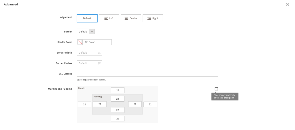
Now that we’ve defined and adjusted our breakpoints, the next step is to leverage these breakpoints effectively by adding configuration forms for them. This will allow for more precise control over how content behaves on different devices.
In this example, we’ll extend the Image content type to include additional configuration options for margins and paddings specific to mobile and tablet viewports. This setup ensures that you can assign unique values for each breakpoint while maintaining fallback logic: if no values are added for mobile or tablet, the desktop configuration will apply across all viewports.
Step 1: Update XML Configuration for the Image Content Type
First, we’ll update the XML configuration for the Image content type to support custom settings for the new breakpoints.
Example XML Configuration (view/adminhtml/pagebuilder/content_type/image.xml):
<?xml version="1.0"?>
<config xmlns:xsi="http://www.w3.org/2001/XMLSchema-instance" xsi:noNamespaceSchemaLocation="urn:magento:module:Magento_PageBuilder:etc/content_type.xsd">
    <!-- Full Config: Magento/PageBuilder/view/adminhtml/pagebuilder/content_type/image.xml -->
    <type name="image">
        <breakpoints>
            <breakpoint name="tablet">
                <form>pagebuilder_image_tablet_form</form>
            </breakpoint>
            <breakpoint name="mobile">
                <form>pagebuilder_image_mobile_form</form>
            </breakpoint>
        </breakpoints>
    </type>
</config>
Step 2: Add Form Configuration for Each Breakpoint
Next, we’ll create specific forms for the mobile and tablet breakpoints. These forms define the input fields for margins and paddings, allowing you to tailor these settings for each viewport.
- Tablet Form Configuration: Create a file named view/adminhtml/ui_component/pagebuilder_image_tablet_form.xml with the following content:
<?xml version="1.0" encoding="UTF-8"?>
<form xmlns:xsi="http://www.w3.org/2001/XMLSchema-instance" xsi:noNamespaceSchemaLocation="urn:magento:module:Magento_Ui:etc/ui_configuration.xsd" extends="pagebuilder_image_form">
    <argument name="data" xsi:type="array">
        <item name="js_config" xsi:type="array">
            <item name="provider" xsi:type="string">pagebuilder_image_tablet_form.pagebuilder_image_tablet_form_data_source</item>
        </item>
        <item name="label" xsi:type="string" translate="true">Image</item>
    </argument>
    <settings>
        <deps>
            <dep>pagebuilder_image_tablet_form.pagebuilder_image_tablet_form_data_source</dep>
        </deps>
        <namespace>pagebuilder_image_tablet_form</namespace>
    </settings>
    <dataSource name="pagebuilder_image_tablet_form_data_source">
        <argument name="data" xsi:type="array">
            <item name="js_config" xsi:type="array">
                <item name="component" xsi:type="string">Magento_PageBuilder/js/form/provider</item>
            </item>
        </argument>
        <dataProvider name="pagebuilder_image_tablet_form_data_source" class="Magento\PageBuilder\Model\ContentType\DataProvider">
            <settings>
                <requestFieldName/>
                <primaryFieldName/>
            </settings>
        </dataProvider>
    </dataSource>
    <fieldset name="advanced">
        <field name="margins_and_padding">
            <argument name="data" xsi:type="array">
                <item name="config" xsi:type="array">
                    <item name="default" xsi:type="null" />
                    <item name="breakpoints" xsi:type="array">
                        <item name="tablet" xsi:type="boolean">true</item>
                    </item>
                </item>
            </argument>
            <settings>
                <label translate="true">Margins and Padding</label>
                <placeholder translate="true">Default</placeholder>
                <validation>
                    <rule name="validate-number" xsi:type="boolean">true</rule>
                    <rule name="less-than-equals-to" xsi:type="number">999</rule>
                    <rule name="greater-than-equals-to" xsi:type="number">-999</rule>
                </validation>
                <additionalClasses>
                    <class name="admin__custom-field-control__with-tooltip">true</class>
                    <class name="admin__custom-field-control__tablet__with-tooltip">true</class>
                    <class name="admin__custom-field-control__with-tooltip__flex">true</class>
                </additionalClasses>
                <tooltip>
                    <description translate="true">
                        <![CDATA[
                        <p>Style changes will only affect this breakpoint</p>
                        ]]>
                    </description>
                </tooltip>
            </settings>
        </field>
    </fieldset>
</form>- Mobile Form Configuration: Similarly, create view/adminhtml/ui_component/pagebuilder_image_mobile_form.xml:
<?xml version="1.0" encoding="UTF-8"?>
<form xmlns:xsi="http://www.w3.org/2001/XMLSchema-instance" xsi:noNamespaceSchemaLocation="urn:magento:module:Magento_Ui:etc/ui_configuration.xsd" extends="pagebuilder_image_form">
    <argument name="data" xsi:type="array">
        <item name="js_config" xsi:type="array">
            <item name="provider" xsi:type="string">pagebuilder_image_mobile_form.pagebuilder_image_mobile_form_data_source</item>
        </item>
        <item name="label" xsi:type="string" translate="true">Image</item>
    </argument>
    <settings>
        <deps>
            <dep>pagebuilder_image_mobile_form.pagebuilder_image_mobile_form_data_source</dep>
        </deps>
        <namespace>pagebuilder_image_mobile_form</namespace>
    </settings>
    <dataSource name="pagebuilder_image_mobile_form_data_source">
        <argument name="data" xsi:type="array">
            <item name="js_config" xsi:type="array">
                <item name="component" xsi:type="string">Magento_PageBuilder/js/form/provider</item>
            </item>
        </argument>
        <dataProvider name="pagebuilder_image_mobile_form_data_source" class="Magento\PageBuilder\Model\ContentType\DataProvider">
            <settings>
                <requestFieldName/>
                <primaryFieldName/>
            </settings>
        </dataProvider>
    </dataSource>
    <fieldset name="advanced">
        <field name="margins_and_padding">
            <argument name="data" xsi:type="array">
                <item name="config" xsi:type="array">
                    <item name="default" xsi:type="null" />
                    <item name="breakpoints" xsi:type="array">
                        <item name="mobile" xsi:type="boolean">true</item>
                    </item>
                </item>
            </argument>
            <settings>
                <label translate="true">Margins and Padding</label>
                <placeholder translate="true">Default</placeholder>
                <validation>
                    <rule name="validate-number" xsi:type="boolean">true</rule>
                    <rule name="less-than-equals-to" xsi:type="number">999</rule>
                    <rule name="greater-than-equals-to" xsi:type="number">-999</rule>
                </validation>
                <additionalClasses>
                    <class name="admin__custom-field-control__with-tooltip">true</class>
                    <class name="admin__custom-field-control__mobile__with-tooltip">true</class>
                    <class name="admin__custom-field-control__with-tooltip__flex">true</class>
                </additionalClasses>
                <tooltip>
                    <description translate="true">
                        <![CDATA[
                        <p>Style changes will only affect this breakpoint</p>
                        ]]>
                    </description>
                </tooltip>
            </settings>
        </field>
    </fieldset>
</form>
Step 3: Include Layout Files for Each Configuration Form
Finally, ensure that the corresponding layout files are added to bind these configurations to the admin interface. Examples include:
- Mobile Layout File: view/adminhtml/layout/pagebuilder_image_mobile_form.xml
- Tablet Layout File: view/adminhtml/layout/pagebuilder_image_tablet_form.xml
This setup allows you to fully utilize the customized breakpoints and ensures consistent, responsive content across all viewports.
Step 4: Improve Tooltip Positioning in the Admin Panel
To enhance the admin panel experience, we’ll add custom CSS to better position the tooltips for mobile and tablet viewports. This ensures that the tooltips are properly aligned and visible when editing content in Page Builder.
Here’s an example CSS configuration (which you can adjust as needed):
.admin__custom-field-control__with-tooltip__flex {
    .admin__field-control._with-tooltip {
        display: flex;
        flex-direction: column;
        gap: 1rem;
    }
}

.admin__custom-field-control__with-tooltip {
    .admin__field-control {
        position: relative;
    }

    .admin__field-tooltip {
        position: absolute;
        right: 0;
        height: 100%;
    }

    .admin__field-tooltip-action {
        cursor: pointer;
    }

    .admin__field-tooltip-content {
        bottom: 110%;
    }
}
Conclusion
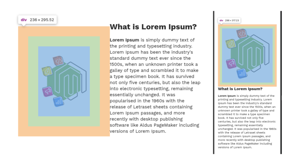
By refining and adjusting the existing breakpoints in Magento 2 Page Builder, we can better tailor the design to meet the needs of modern devices. This enables designers to fine-tune content layout and spacing for each device resolution, ensuring a more responsive and personalized user experience.
While this example focuses on the Image content type, the same approach can be applied to any content type in Page Builder. By adjusting the configuration forms for different content types, you can achieve consistent responsiveness across all elements on your page.
Although this requires some extra configuration work, the result is a more flexible, scalable design that adapts seamlessly to any screen size. Ultimately, this optimization enhances the quality of your pages and contributes to a better experience for your customers.


