In eCommerce business there’s always room for design improvements, but when you decide it’s time for change, what strategy to choose?
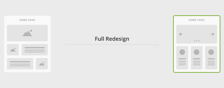
Most businesses would choose traditional full redesign strategy of switching over to completely new design.
Full Redesign

Full redesign strategy usually looks like this: Your website is starting to look dated and you believe that new modern design will attract new customers, so you hire an agency with many fancy designs in their portfolio. After a few months of planning, sketching, wireframing, designing and development, new design is launched and after that everyone goes back to business until the next big redesign.
This is how most businesses do it, but there are some common pitfalls in this strategy.
If you change your design drastically you don’t know how users are going to react.
Your loyal users hate changes, and it’s completely logical, they are loyal because they like things just the way they are. They invested a lot of time mastering your design and if you change it drastically they are in the same position as new users.
Probably the best examples are Facebook and Twitter redesigns. After each redesign millions of users are frustrated and they tend to create groups and petitions against new design. They are following the “if it ain’t broke, don’t fix it” principle.
Another negative impact of this strategy is a risk of losing domain authority and SEO rankings. Only a few mistakes can lead to a complete SEO disaster and drop-offs in traffic and revenue.
Expense is also one of disadvantages. Full redesign demands a large investment because the site is rebuilt from scratch. The previous design is usually thrown away and you have to invest again.
Even though we know redesign is risky and users don’t like changes, there’s always room for design improvements, so how do we strike that balance between users desire to stick with familiar user interface and our ambition for design improvements?
Incremental Design Changes

What is incremental change? Dictionary says: “Incremental describes regular, measurable movements that are usually small.”
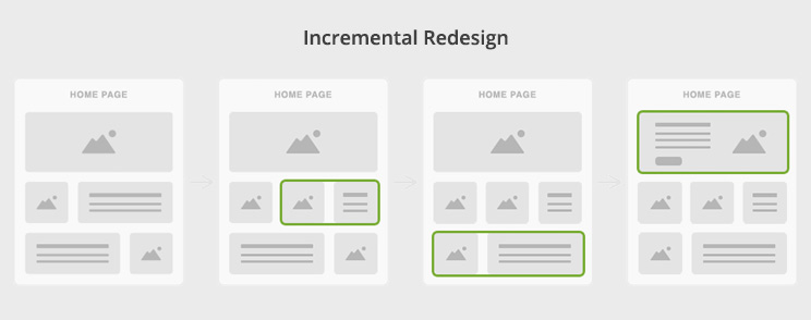
As we can see the keywords are regular, measurable and small. In contrast to the full redesign, incremental redesign is a streamlined process that involves continuous improvements based on data driven decisions. Changes are smaller and new ideas are presented gradually.
It doesn’t involve a total overhaul of a web store, rather just a single page or page section.
This strategy minimizes risk by changing only elements that improve results. And how do we know which elements should we change to improve results? Very easily, by doing A/B tests.
What is A/B testing (split testing)?

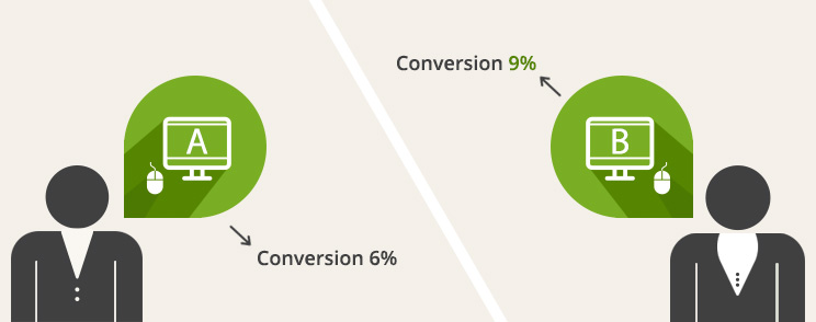
A/B testing (or split testing) allows us to test design choices on real users which makes final decisions easy to make because we can ensure that every change produces positive results.
How does incremental redesign works?
1. Decide what to test
Use Analytics to identify a specific page or feature that are not driving sufficient conversions.
2. Pick an element and design a B version
Results of analysis will indicate areas in need of improvement and the next step is to design a B version of that area.
3. Test B version against the original and measure results
There are several online tools that allow you to run A/B tests, for example Visual Website Optimizer or Optimizely. Integrate split testing software in your webstore and see which version produces better conversion rate.
4. Analyze data, choose winner and implement it
Compare results of each version and choose a winner. For example, if red button drives 10% more clicks than blue button, it will be easy to make decision to change that element.
5. Repeat all steps for different element
Full redesign or Incremental design changes?
To sum up, incremental redesign strategy is more efficient because it maximizes ROI, minimizes risk and improves your web store continually.
Of course It’s perfectly fine to refresh the entire design from the ground up if there’s good reason to do so.
At Inchoo we detect that with technical, SEO and eCommerce UX audits. If there are too many issues to fix, it is more efficient to create everything from scratch and then continue improving web store with incremental design changes.


