At least once a month I shop online. The web shops I visit the most are related to fashion and beauty (Missguided, ASOS, Beauty Bay, Feelunique etc.) and there are many factors that affect my purchase decisions.
When it comes to choosing a shop, the main criterion is that it has a European warehouse (and, of course, the assortment of products that satisfy my needs). Even though there is a detailed explanation of Croatia’s customs procedures in postal traffic, and there is a “de minimis value” below which no duty or tax is charged, and clearance procedures are minimal – I experienced unexpected costs. Therefore, I avoid shopping outside the EU.
After quite a number of web shops visited and online purchases made, there are some features that made my purchase decisions easier, and shopping experience merrier.
A generous entrée
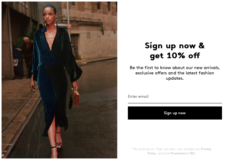
When I visit a web shop, what I love to see first is the window “Register and get a discount on your first order!” or “Free shipping on your first order!” – that immediately cheers me up and lures me to continue. While I’m registering, it thrills me when I see the “Date of Birth” box – I know I’m getting something for my birthday.
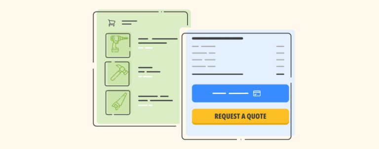
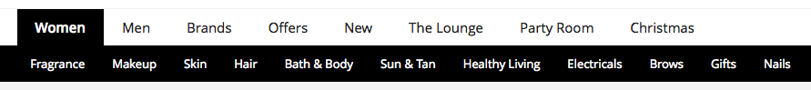
“No sweat” navigation
I glance at the upper corners to scan if and where the “Menu”, “Search”, “My Account” and “Shopping Cart” buttons are. This is the first step where I discern the shop’s usability, subjectively – of course. Below is an example of navigation that allows me to easily find what I’m looking for; I can choose a category that I’m interested in, shop by occasion, by brand etc.
Scopious filters
When shops have several thousands of products in each category (and you have limited time for shopping), different filters are essential. The ones by brand, purpose, size, colour, collection for e.g. clothing, or by concern, product type, ingredient preference, customers review grades for e.g. cosmetics make my rummage a lot easier. The more filters – the better.
Profound ABC’s
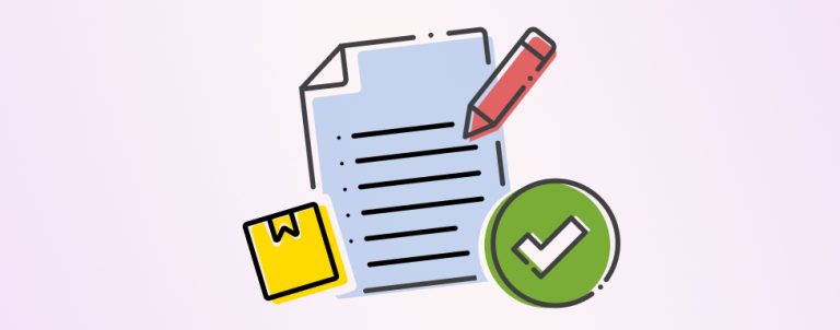
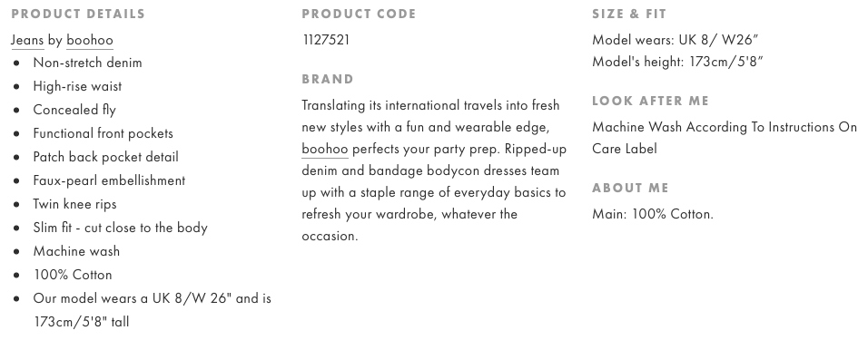
I like to read a really detailed description of the product I’m interested in: brand, size (with an easy understanding size guide), ingredients, directions, additional tips etc. The photos displayed should be of superior quality and zoomable from all corners. It’s great if there’s a video of a model wearing a product or a “how to use” video (great way of estimating fabric quality, fit or colour).
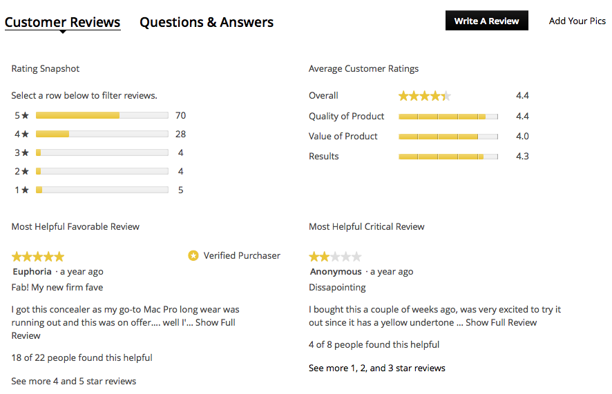
Besides the above mentioned features, customer reviews (those who e.g. have similar skin type to mine, when I’m buying a moisturizer) are something I read regularly and sometimes even end up abandoning my shopping cart.
Additional allurements
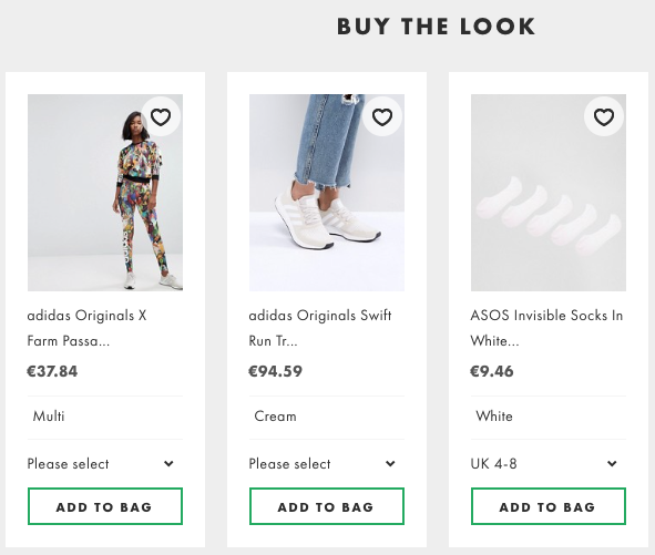
A classic call to action elements, banners: “30% off work wear”, “Buy the look”, “You might also like”, “Girls on Instagram wear it like this” etc. work on me too. Sometimes a girl needs some inspiration…

The web shops I’m registered to often send me newsletters, information about upcoming sales and coupon codes – they’re another call to action I rarely turn down (I sometimes do some clicking even when I’m working :O)
Child’s play check out
Several times I was in a situation where check-out made me leave and not make a purchase because there were too many steps, it was very slow, a valid coupon code got refused, some items I put in a bag were suddenly out of stock or the shipping costs were unexpectedly high. I want to know the price I’m paying and terms on my first step of the check out. The variety of ways of payment is also very important (PayPal, debit and credit cards).
To most web shop owners the profit is the main goal. To achieve this goal, they need to satisfy the customers and adapt to their wishes. They should focus on carefully listening and constantly adapting to their customers’ needs.
Web shops are created in order to make life easier for everyone. We don’t say it for no reason: “Life’s too short to buy offline”.
See how we can help you by getting in touch.