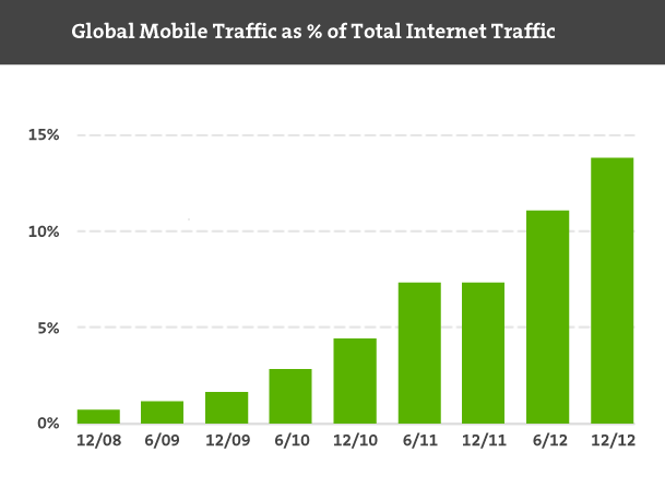
Smartphones are becoming the dominant way how users access the internet today. You don’t want to be left out of it. Are you ready for the future?
If you haven’t been living under the rock in the last couple of years, you probably noticed that mobile is kind of a big thing now. Ever since Apple launched iPhone in 2007, number of people surfing the web on their mobile device is climbing sky high.

Globally it rose from around 1% back in 2009 to 13% in December 2012. We also checked some of our stats, and the numbers are even higher. From 11% mobile visitors for site in India, to whooping 42% for UK site.
M-Commerce growing rapidly
Last year, 11% of all sales in USA came from mobile device. Americans spent $24.66 billion, and this numbers are 81% higher than they were in 2011. That’s some growth!

This year alone, mobile sales rose 31% in the first quarter, mostly on the tablets, so called “couch commerce” is rapidly becoming the most popular form of online shopping .
Predictions are that mobile will have 15% of e-commerce sales this year. And by the end of 2016 that number should rise to 27%, or $87 billion.
If you build it, they will come
So, what is the main reason for this “web surfing on smartphones” boom? Smartphones themselves, sure… The total of smartphones entering the World per day in 2012. was about 3.6M devices. Luke Wroblewski compared that number to 371k of newborn children worldwide every day. Striking numbers, right?
But there are some other reasons too. Mobile devices before iPhone could also browse the web, but it was a painful experience. Smartphones changed that. But web browsing remained unpleasant experience on websites that are not optimized for small screens and low bandwidth.
With the rise of mobile friendly websites, share of traffic and revenue on mobile devices rose too. It is symptomatic that most of the websites saw 100-400% mobile growth after launching mobile friendly version. Even “non-mobile” numbers were higher.
For example, these are O’Neill clothing numbers after launching their responsive website (source):
- 65.7% conversion rate increase on iPhone/iPod
- 101.2% revenue growth on iPhone/iPod
- 407.3% conversion rate increase on Android devices
- 591.4% revenue growth on Android devices
- 20.3% conversion rate increase on non-mobile devices
- 41.1% revenue growth on non-mobile devices
So, what’s the best mobile strategy?
Depends. There’s no silver bullet. Depends on your target audience, your goals, type of website or web app. Lot of stuff. You have to keep in mind that today, we have a plethora of devices and resolutions. Generally, there are three ways to go:
- Native app
- Mobile website
- Responsive website
Native Apps
…run physically on the specific mobile device and they are coded just for that device. These applications usually can be downloaded from “app stores” like Google play or iOS App Store. This is the best choice when you need to access device’s hardware and settings.
Downside is that you would have to develop app for every platform. iOS, Android, Blackberry, Windows Phone, tablets… And user would have to want to download it.
Basically, if you own regular online store, or website, this is not the road you want to take.
Mobile website
…has different code base and content for desktop and mobile. With that in mind, it could offer completely different user experience for these two groups. But mobile website usually targets only one resolution, so you end up covering only small portion of visitor’s possible resolution.
Responsive web design
…is device and resolution agnostic. It serves the same code and the same content to all users, regardless of their platform. It uses fluid layouts, media queries and flexible images to adapt to every resolution. Smartphone, tablet, laptop, desktop, TV… you name it. RWD is future ready, for all those devices and resolutions yet to come.
As said before, RWD is not a silver bullet, but it is probably the best solution for most of the projects. The bottom line is that customer doesn’t care if your website is responsive, mobile or any other kind. He only cares to finish the goal that got him to your website in the first place. Reading an article, buying a product, searching for a location… whatever he’s after. And you should give him the best possible user experience, regardless of his platform and resolution.
With mobile traffic expanding this quick, and with new devices coming out almost on a daily basis, “mobile” is not to be ignored. In days ahead, everything on the web will be “responsive” by default, and we will not be talking about your “mobile strategy”, we’ll talk about your “web strategy”.
So, would you care tell us about your web strategy?


