You’re at stage of building an online store where you need to define the structure of your navigation. In this article, I’ll give you some advice that will help you figure out how to structure it and what deserves a place in the main navigation and what does not.
1. Main navigation is not a sitemap
If I had a penny for every time I saw an imitation of sitemap in form of mega-menu horizontal main navigation I’d be an extremely rich person.
The thing is, while you’re planning your store’s navigation, it will be easiest for you to think of it in terms of nicely organized folders and subfolders which most often look like your category and subcategory tree.
You’ll end up with something like this:
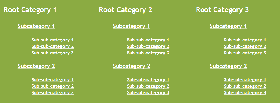
I like to call that sitemap inspired navigation structure or category tree based navigation.
I’m guilty of thinking that way and building such navigation myself as well in the past. It’s the most natural way of thinking about it, however, not the optimal way of structuring your navigation.
What’s wrong with category tree based navigation approach?
From both SEO and usability perspective, it gives equal real estate or link juice to all of your categories no matter which ones are more important or more often used. This becomes problematic with stores that have a lot of categories and products as every URL of that store is sending some of the link juice to unimportant categories instead of concentrating your online store’s link juice on to the most important ones.
While we’re on this topic, a recent article from destilled made me think a lot about navigational structure from SEO point of view so make sure you read it as well.
2. Most important pages must be in main navigation!
This one sounds like a no-brainer but it actually isn’t. Ask yourself this:
- Is your top landing page in terms of traffic accessible from main navigation in one click?
- Are your top 5 landing pages there?
- If significant portion of your visitors is looking for the same product, would you put it into main navigation?
Those are all very important questions. I bet most of you would never put a product into main navigation because you think of it as category tree based navigation and it doesn’t fit into the mental concept of main navigation you’ve built.
But, if that product page is really important, more important than most of the sub-categories, sometimes even more important than most of the root categories, then you really need to put it there.
If it’s really important it needs to be in main navigation. It doesn’t matter if it’s a category, product or a static page.
Let’s say you’re selling mobile phones. At any given moment, you’ll probably have 3-5 models that are really bestsellers and attract most of the sales while hundreds of other models don’t even fit 10% of your sales. Put your top sellers into main navigation! You’ll have internal links from all over the website directly to them, boosting your search engine ranking positions for those terms. You’ll also enhance usability as most of your website visitors will find what they are probably looking for within the main navigation no matter where on the website they land.
3. Think twice about what’s an attribute and what’s a category
This is one of the most common points of failure of planning a good navigational structure for online stores. Most eCommerce websites out there have some form of layered / faceted / filter navigation. In case of Magento, we’re talking about layered navigation based on product attributes and / or categories as filters.
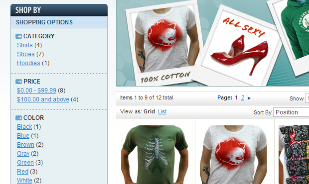
You’ll often be faced with a decision – should I make something an attribute or a category. The most common case where I see the wrong decision being made involves product brand.
People instinctively place product brand as attribute. In most cases I’ve seen, they actually should have set it as a category. I’ll give you a simple rule to follow that will help you figure out if it’s an attribute or a category:
If it needs to be a landing page, it’s a category, otherwise, it’s an attribute.
It’s really that simple. If you want to rank for it and have people land on it, make it a category, not an attribute.
Let’s see it on example:
- Brand – you’re selling car parts. Do you really need to rank for “Ford” in combination with other keywords or alone? Yes. Brand is a category!
- Color – you’re selling car parts. Do you really need to rank for “red” in combination with other keywords or alone? No. Color is an attribute!
4. If it gets too big – simplify!
Don’t let yourself end up with gigantic main navigation that no one can actually navigate.
If visitor has to stare at the navigation for more than ~10 seconds to find what he’s looking for, it’s too big.
How to cut it down? How to simplify it? Follow the 3 steps before this to figure out what really needs to be in there. After that, move the rest into the separate page.
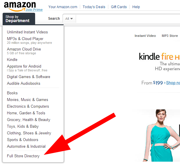
This is the way even Amazon does it. With really lots of categories and subcategories, you can read the main navigation in ~10 seconds. If you need anything else, see the full page.
If you’re thinking how to improve the experience of your customers, make sure to get our Magento Usability Report!
