Inchoo was very lucky to be at the “Future of Web Design” #FOWD conference this year in New York City and here’s what we experienced among some of the very best and talented in both web design and web development.
Future Of Web Design: New York from Scott Coello on Vimeo.
This was our first FOWD conference and being in NYC for the first time as well we were still settling in with the impressions of the Big Apple when we arrived at the “New World Stages” where the conference was held.
Day 1
OMG it’s full of people
If we counted right, there were over 400 people at the conference attending two tracks. Designers, web developers, business owners where all there for the conference waiting for the introductory speech on the Track 01 to begin.
Ryan Carson
From Carsonified opened the conference with a short introduction about what to expect from the presentations.
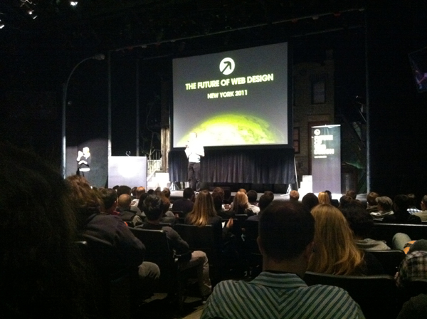
Kevin Systrom
From Instagram shared his story first about the success of the company that made a simple photo sharing app with photo filters perks. A simple idea that is at the core of their enormous popularity among iPhone users and what’s interesting is that their web site is just one HTML page used to display their 250 million photos and everything else is within their mobile application. They built a successful business without having a regular company web page.
Instagram Statistics:
- 250 million photos in the bank
- 12.6 million users
- 1.5 users per second gets registered
- Hosting costs: “2 really nice cars”
Kevin’s presentation was inspiring and we’ve learned a few tricks for fast page loading that he revealed. Hint, check what’s Google doing on Gmail’s login page to see where they took the inspiration from.
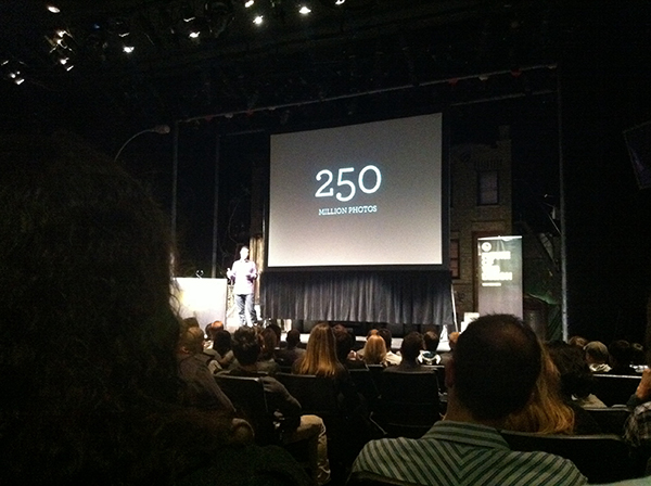
After Kevin, Carsonified officially launched their Treehouse site dedicated to Web Design, Web development and iOS learning.
Brandon Mathis
Gave a great speech titled “Sass & Compass: The Future of Stylesheets Now” explaining how to turn CSS coding into more than just bearable experience by using Sass: syntactically awesome style sheets. Easier to read, easier to update. It is a scripting language that is interpreted into CSS, and allows us to use variables, math, nesting, mixins and more… Brandon hit the spot by calling it “a layer of empathy between the designer and the stylesheets.”
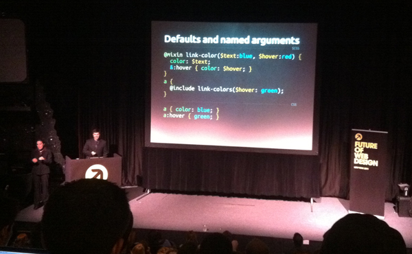
You can see his presentation on speakerdeck.com
The Myths of Mobile Context
By Josh Clark was next busting those myths with vengeance. Very interesting speech, demystifying some of the usual beliefs about mobile in general.
One usual belief is that mobile user is always in the rush. Not true. Mobile is on the couch, in the bed… According to Josh, 40% of people admit they are using their phones in the bathroom. 60% are liars.
Mobile is not less, mobile is more. There’s camera, GPS, gyroscope and voice.
“Your mobile site should probably have less stuff than your desktop site right now, not because it’s mobile but because your desktop site is probably full of crap.”
There it is again: Mobile first. Start with mobile first, to narrow your content to what’s really important.
To summarize it:
- mobile != rushed
- mobile != less
- complex != complicated
- tap quality > tap quantity
- focus for ALL platforms
- no such thing as mobile web. There’s only one web.
- don’t think app: think service.
- metadata is the new art direction.
- Content like water
You should download Josh’s presentation here.
Super-Powered CSS3 Animations
By Nick Pettit was next presenting what kind of animations can be achieved with CSS3 alone and was particularly aimed at Web developers and Designers new to the CSS3 animations presenting how they can be easily achieved and best used.
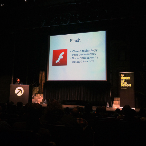
One great point was that even though there are desktop tools for creating animations with CSS3 they are creating a “Flash-like” experience while what we actually need is to use CSS3 animations in the context of the Web app not just as standalone animation.
Unfortunately his presentation is not available online at the moment but he did refer us to this helpful tool for creating CSS3 animation online: Ceaser.
HTML5: Smart Markup for Smarter Websites
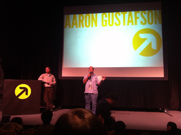
After Lunch and uniSessions Aaron Gustafson was up on the stage. His presentation was orientated to clear up the mess with all of the different how-tos and tutorials around the web and just focus on what HTML5 really is and how to use it most effectively in your daily work.
In summary:
- How to switch to HTML 5
- Redefinition of elements – strong, em, b, i, hr
- New York Times HTML organization case study
- Accessibility and semantics – Using “role” attribute
- Expansion – Front end form validation for example
One other interesting note was about the “time” tag that was omitted from official documentation in favor of the “data” tag but was continued to be used by developers making it again a candidate for the official release. Quote: “Time was back the other day: on Wednesday”.
You should definitely go through the entire presentation here:
After a break that followed Aaron’s presentation we were finally presented with the “Grablet” that was mysteriously lingering around the New World Stages. It turned out to be a unique iPad “one-hand holder”. The Web Font Awards Ceremony followed where they announced the winners wich you can find here: http://www.webfontawards.com/.
The Power of Side Projects and Eccentric Aunts
By Tina Roth Eisenberg was next.
Tina’s speech about how side projects are important for growth and inner satisfaction was inspiring and full of ready-to-go catchy phrases we need to share with you:
- “I don’t distinguish between my personal life and my work life. I do at work what I love to do.”
- “We rely too much on statistics…We as the human race have lost our ability to trust our intuition.”
- “If an opportunity scares you, you need to take it.”
- “Don’t complain, make it better.”
- “Make time for side projects, and treat them like real client projects.”
- “Stay away from people who are fond of disliking things. Be around people who like things.”
- “Haters gonna hate”
That was it for the day and we headed back to the surface from New World Stages to hit the NYC streets only to come back the next day for the day two.
Note:
We took some pictures our selves but sitting far from stage and having only smartphones in the dark we suggest you take a look at the these set of photos as a better reference. The photographer was shooting the “Snowfire” team at the event and we were also lucky to meet the team as well.
Read next:
