An idea for writing this blog post inspired me for implementing this feature on two Magento 1 projects, on first project it was one of many changes that were part of A/B testing, on the second one it was part of creating a new visual identity for clients store.
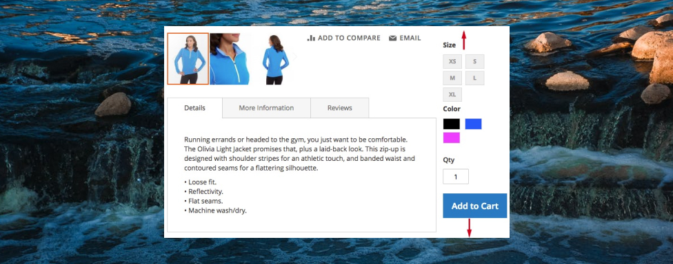
So, what basically is sticky sidebar and why should it be used to improve your conversion rate? Well, just like sticky header, the purpose of sticky sidebar is to have the sidebar element displayed in the viewport at all times (or an at least, when some conditions are met). This is ideal place to move the product options (configurable dropdowns, image swatches etc), add to cart button or any other element that is important for your product. With this being said, your customer is free to browse all of the content on your product and once the decision has been made to purchase the product, the add to cart button is just waiting to be clicked on!
Lets start making the changes in the code to enable this feature. For purpose of this blog post, I have created a custom theme, Inchoo/StickySidebar.
LESS code
Create _extend.less file inside of app/design/frontend/Inchoo/StickySidebar/web/css/source/ and copy/paste the following code:
.media-width(@extremum, @break) when (@extremum = 'min') and (@break = @screen__m) {
  .box-tocart .action.tocart {
    width: 100%;
    margin-right: 0;
  }

  .sidebar {
    &.fixed {
      position: fixed;
    }
  }
}
Make sure to run Grunt commands to symlink and compile this code (on desktop only, it will position the sidebar as fixed element and make add to cart button full width).
XML code
create catalog_product_view.xml inside of app/design/frontend/Inchoo/StickySidebar/Magento_Catalog/layout/ and copy/paste the following snippet:
<page layout="2columns-right" xmlns_xsi="http://www.w3.org/2001/XMLSchema-instance" xsi_noNamespaceSchemaLocation="urn:magento:framework:View/Layout/etc/page_configuration.xsd">
    <referenceBlock remove="true" name="catalog.compare.sidebar" />
    <referenceBlock remove="true" name="wishlist_sidebar" />

    <move element="product.info" destination="sidebar.additional" />

    <referenceContainer name="sidebar.additional">
        <block class="MagentoFrameworkViewElementTemplate"
               name="sticky.sidebar.wrapper"
               template="Magento_Catalog::sticky-sidebar-js.phtml"
               after="-" />
    </referenceContainer>
</page>
This snippet is responsible for the following:
- change page layout from one column to two columns with sidebar on the right hand side
- remove two blocks (compare and wishlist block) that are included when this page layout is being used
- change position of block that contains the product options and add to cart button to sidebar
- add template file that will be used to invoke the AMD component for handling the sticky sidebar logic and calculation
PHTML code
Create sticky-sidebar-js.phtml inside of app/design/frontend/Inchoo/StickySidebar/Magento_Catalog/templates/ and copy/paste the following snippet:
<script type="text/javascript" data-mage-init='{"stickySidebar":{}}'></script>RequireJS code
Create requirejs-config.js inside of app/design/frontend/Inchoo/StickySidebar/ and copy/paste the following snippet:
var config = {
    map: {
        "*": {
            stickySidebar: "js/sticky-sidebar",
        }
    }
};
jQuery code
Create sticky-sidebar.js inside of app/design/frontend/Inchoo/StickySidebar/web/js/sticky-sidebar.js and paste the following snippet:
define(["jquery", "matchMedia", "domReady!"], function ($, mediaCheck) {
    "use strict";

    var sidebar = {};
    var a2c = $(".product-add-form");
    var a2c_mobile_target = $(".product-info-main > .price-box");
    // nodes required to calculate sidebar params: width, left, padding-left
    var page_main = $(".page-main");
    var page_main_w;
    var main = $(".main");
    var main_w;
    // nodes required to calculate sidebar params: top
    var header = $(".page-header");
    var nav = $(".nav-sections");
    var breadcrumbs = $(".breadcrumbs");
    // luma specific css values
    var a2c_mb = parseInt($("#product-addtocart-button").css("margin-bottom"));
    var main_pb = parseInt(main.css("padding-bottom"));
    var tabs_mb = parseInt($(".product.info.detailed").css("margin-bottom"));

    sidebar.el = $(".sidebar");
    sidebar.padding_ratio = parseFloat(sidebar.el.css("padding-left")) / page_main.width();
    sidebar.updateHorizontalParams = function () {
        if (sidebar.el.hasClass("fixed")) {
            page_main_w = parseFloat(page_main.width());
            main_w = parseFloat(main.width());

            sidebar.width = page_main_w - main_w;
            sidebar.left = ($(window).width() - page_main_w) / 2 + main_w;
            sidebar.p_left = parseInt(page_main_w * sidebar.padding_ratio);

            sidebar.el.css({
                "width": sidebar.width + "px",
                "left": sidebar.left + "px",
                "padding-left": sidebar.p_left + "px"
            });
        }
    };
    sidebar.updateVerticalParams = function () {
        sidebar.height = sidebar.el.height();

        var scrolled_from_top = $(window).scrollTop();
        var header_h = header.outerHeight(true) || 0;
        var nav_h = nav.outerHeight(true) || 0;
        var breadcrumbs_h = breadcrumbs.outerHeight(true) || 0;
        var content_h = main.outerHeight(true) || 0;
        var sidebar_limit_top = header_h + nav_h + breadcrumbs_h;
        var sidebar_limit_bottom = sidebar_limit_top + content_h;
        var sidebar_limit_bottom_criteria = scrolled_from_top + sidebar.height + main_pb + a2c_mb - tabs_mb;

        if (sidebar_limit_bottom < sidebar_limit_bottom_criteria) {
            // sidebar should start drifting out of viewport on the top
            sidebar.top = sidebar_limit_bottom - sidebar_limit_bottom_criteria;

            sidebar.el.css({"top": sidebar.top + "px"});
        } else if (scrolled_from_top > sidebar_limit_top) {
            // header and breadcrumbs are now above viewport
            if (!sidebar.el.hasClass("fixed")) {
                sidebar.el.addClass("fixed");
                sidebar.updateHorizontalParams();
            }
            sidebar.top = 0;

            sidebar.el.css({"top": sidebar.top + "px"});
        } else {
            sidebar.el.removeClass("fixed").removeAttr("style");
        }
    };

    var onResize = function () {
        $(window).on("resize", function () {
            sidebar.updateHorizontalParams();
        });
    }, onScroll = function () {
        $(window).on("scroll", function () {
            sidebar.updateVerticalParams();
        });
    }, onInit = function () {
        mediaCheck({
            media: "(min-width: 768px)",
            entry: function () {
                sidebar.el
                    .addClass("fixed")
                    .prepend(a2c.detach());

                sidebar.updateHorizontalParams();
                sidebar.updateVerticalParams();

                onResize();
                onScroll();
            },
            exit: function () {
                a2c.detach().insertAfter(a2c_mobile_target);

                sidebar.el
                    .removeClass("fixed")
                    .removeAttr("style");
            }
        });
    };

    onInit();
});
Let me provide you a walkthrough of the code:
- method onInit() is used to initialize the logic
- by utilizing the matchMedia library, product options change positions between mobile and desktop layout (this detaching of element is neccessary because on mobile, sidebar would be the last element before footer and would not make sence to have it so far down the page). This media query is also responsible to add (on desktop) or remove (on mobile) CSS class name “fixed”
- when on desktop only, JS will calculate values of four CSS properties (updateHorizontalParams() -> width, left, padding-left properties, updateVerticalParams() -> top property). and load event listeners (on page resize and page scroll to do the same calculations
- the display of sidebar can be divided in three different states:
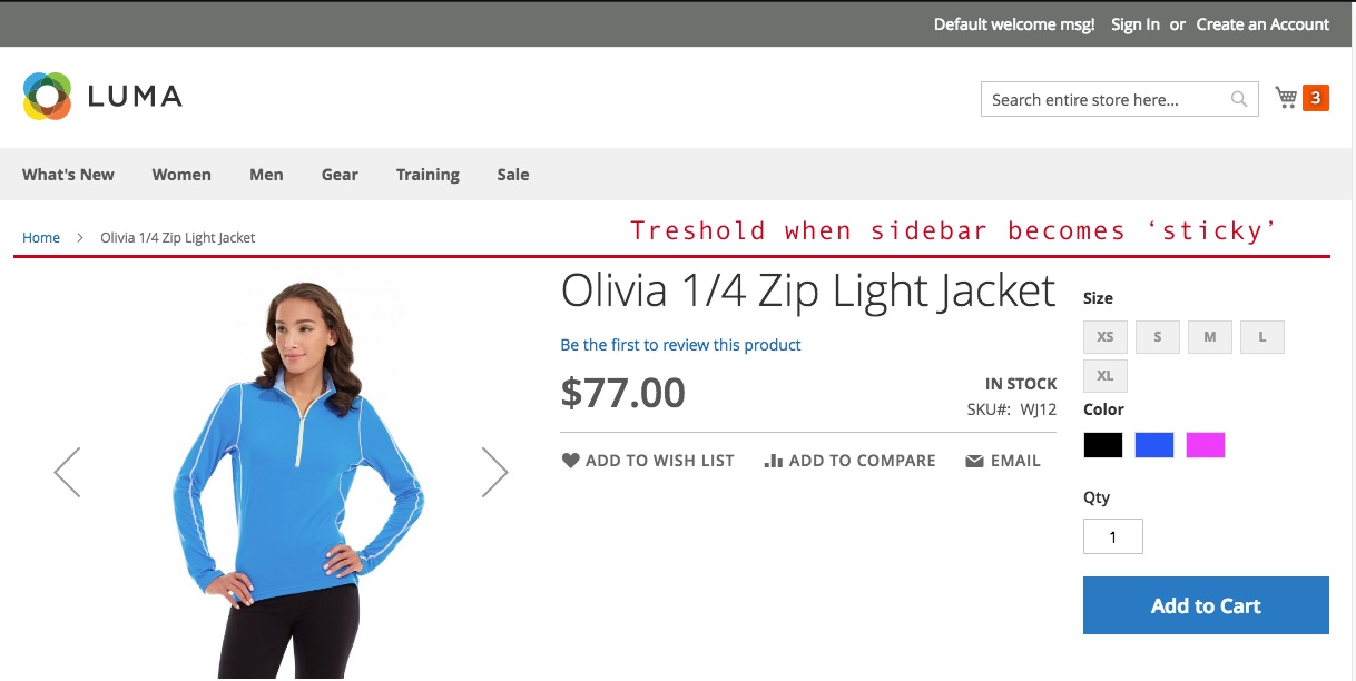
- state #1 – as long as breadcrumbs are in visible in the viewport, sidebar is positioned relatively
- state #2 – as soon as breadcrumbs are scrolled outside of viewport, sidebar is positioned as fixed element and will remain in viewport
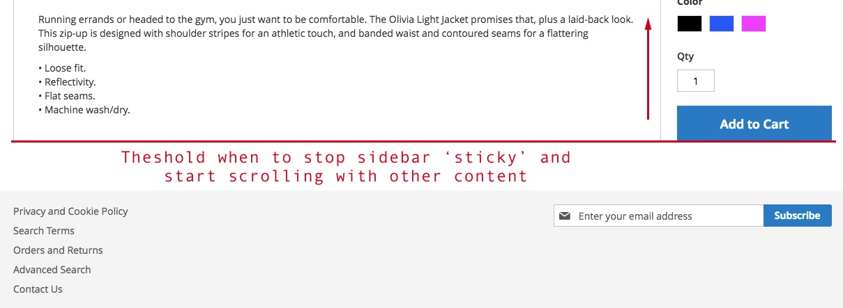
- state #3 – once the bottom side of the sidebar is aligned with the bottom side of the content, the sidebar starts to slide outside of viewport, just like the rest of the page
This code has been optimized to work with Luma theme out of the box, so you may have to add/clean up some of the code stated here. 🙂