
The Magento 2 Page Builder provides users with the ability to visually create and customize pages in their online store without requiring programming knowledge. While this tool may seem like a great solution for creating responsive and tailored pages, it does have some technical drawbacks, particularly in how it handles images on the frontend.
In today’s post, I’ll address these drawbacks and take you through the process of improving them. Continue reading to learn how to overcome these obstacles!
Drawbacks of the Current Solution
One notable issue lies in the Image component of the Page Builder. This component allows users to add separate images for mobile and desktop resolutions, which, in theory, is excellent for adapting content to various devices. However, its current implementation presents several limitations.
- Lack of Lazy Loading Support – Currently, images are loaded immediately when the page is rendered, regardless of whether they are visible to the user. Lazy loading ensures that images are only loaded when they come into view, significantly improving page performance.
- Inefficient Use of HTML Elements – Instead of utilizing the <picture> element, the current approach relies on two <img> elements—one for mobile and another for desktop resolutions. Although CSS hides the unnecessary element, both images are still downloaded, increasing load times and resource costs.
- Missing width and height Attributes – Without defined dimensions for images, the browser cannot reserve space on the page in advance, leading to layout shifts that harm the user experience and SEO.
- No Prefetch Option – Prefetching allows resources to be preloaded before they are needed, ensuring smoother user interactions. The current implementation of the Page Builder does not support prefetching for images.
Optimizing the Page Builder Image Component
To address these limitations, we will enhance the Image component by adding support for width, height, lazy loading, and prefetch, and replace the two <img> elements with a more efficient <picture> element.
Step 1: Preparing the Module
If you do not already have a custom module for your Page Builder customizations, you will need to create one. This module will serve as the foundation for all necessary changes. Once the module is set up, the first task is to extend the configuration for the image content type.
Step 2: Extending the Configuration
To include the new attributes, start by updating the XML configuration. This involves adding attributes such as width, height, loading, and fetchPriority to the image content type. These attributes improve image management by enabling features like reserving space on the page (width and height) and optimizing resource loading (loading=”lazy” and fetchPriority=”high”).
Example XML Configuration (view/adminhtml/pagebuilder/content_type/image.xml):
<?xml version="1.0"?>
<config xmlns:xsi="http://www.w3.org/2001/XMLSchema-instance"
xsi:noNamespaceSchemaLocation="urn:magento:module:Magento_PageBuilder:etc/content_type.xsd">
<!-- Full Config: Magento/PageBuilder/view/adminhtml/pagebuilder/content_type/image.xml -->
<type name="image">
<appearances>
<appearance name="full-width">
<elements>
<element name="desktop_image">
<attribute name="desktop_image_width" source="width"/>
<attribute name="desktop_image_height" source="height"/>
<attribute name="image_loading" source="loading"/>
<attribute name="image_fetch_priority" source="fetchPriority"/>
</element>
<element name="mobile_image">
<attribute name="mobile_image_width" source="width"/>
<attribute name="mobile_image_height" source="height"/>
<attribute name="image_loading" source="loading"/>
<attribute name="image_fetch_priority" source="fetchPriority"/>
</element>
</elements>
</appearance>
</appearances>
</type>
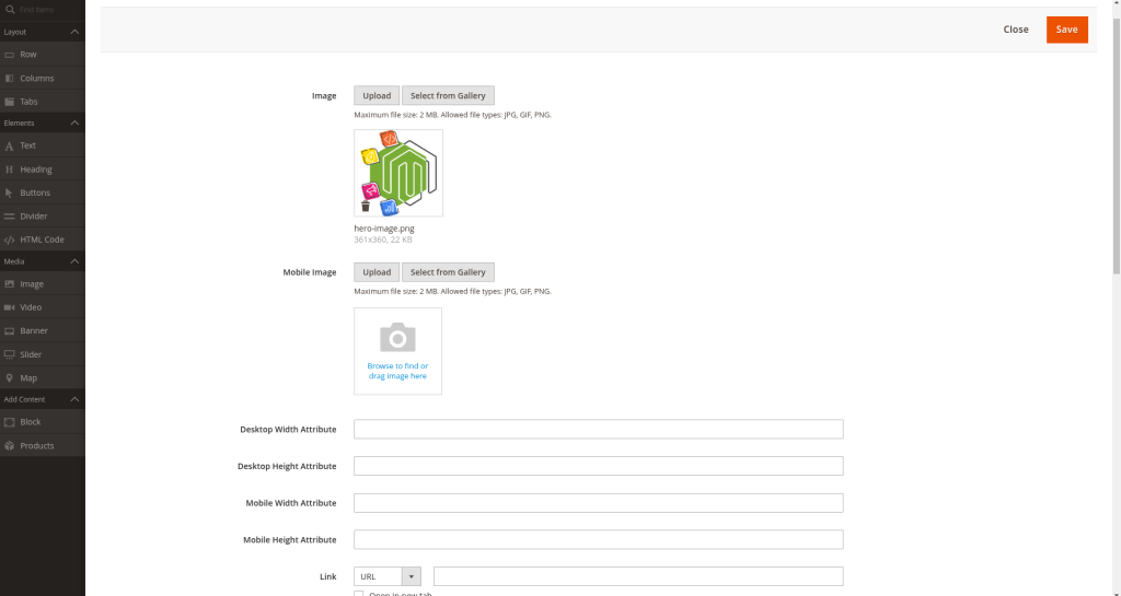
</config>Step 3: Adding Fields to the Admin Form
After extending the configuration, the next step is to allow administrators to input values for these attributes in the UI. To do this, add the necessary fields to the admin form for the image content type. This ensures that users can configure the new attributes directly in the admin interface.
Example Form Configuration (view/adminhtml/ui_component/pagebuilder_image_form.xml):
<?xml version="1.0" encoding="UTF-8"?>
<form xmlns:xsi="http://www.w3.org/2001/XMLSchema-instance" xsi:noNamespaceSchemaLocation="urn:magento:module:Magento_Ui:etc/ui_configuration.xsd">
    <!-- Full Form: Magento/PageBuilder/view/adminhtml/ui_component/pagebuilder_image_form.xml -->
    <fieldset name="general">
        <field name="desktop_image_width" sortOrder="11" formElement="input">
            <settings>
                <label translate="true">Desktop Width Attribute</label>
                <validation>
                    <rule name="validate-string" xsi:type="boolean">true</rule>
                </validation>
            </settings>
        </field>
        <field name="desktop_image_height" sortOrder="12" formElement="input">
            <settings>
                <label translate="true">Desktop Height Attribute</label>
                <validation>
                    <rule name="validate-string" xsi:type="boolean">true</rule>
                </validation>
            </settings>
        </field>
        <field name="mobile_image_width" sortOrder="13" formElement="input">
            <settings>
                <label translate="true">Mobile Width Attribute</label>
                <validation>
                    <rule name="validate-string" xsi:type="boolean">true</rule>
                </validation>
            </settings>
        </field>
        <field name="mobile_image_height" sortOrder="14" formElement="input">
            <settings>
                <label translate="true">Mobile Height Attribute</label>
                <validation>
                    <rule name="validate-string" xsi:type="boolean">true</rule>
                </validation>
            </settings>
        </field>
        <field name="image_loading" sortOrder="40" formElement="checkbox">
            <argument name="data" xsi:type="array">
                <item name="config" xsi:type="array">
                    <item name="default" xsi:type="string">lazy</item>
                </item>
            </argument>
            <settings>
                <dataType>boolean</dataType>
                <label translate="true">Lazy Load Image</label>
                <dataScope>image_loading</dataScope>
            </settings>
            <formElements>
                <checkbox>
                    <settings>
                        <valueMap>
                            <map name="false" xsi:type="string">eager</map>
                            <map name="true" xsi:type="string">lazy</map>
                        </valueMap>
                        <prefer>toggle</prefer>
                    </settings>
                </checkbox>
            </formElements>
        </field>
        <field name="image_fetch_priority" sortOrder="50" formElement="checkbox">
            <argument name="data" xsi:type="array">
                <item name="config" xsi:type="array">
                    <item name="default" xsi:type="string">auto</item>
                </item>
            </argument>
            <settings>
                <dataType>boolean</dataType>
                <label translate="true">Image Fetch Priority</label>
                <notice translate="true">Enable this option if you want the browser to prioritize fetching this image ahead of others. Please note that using this feature alongside lazy loading is not recommended.</notice>
                <dataScope>image_fetch_priority</dataScope>
            </settings>
            <formElements>
                <checkbox>
                    <settings>
                        <valueMap>
                            <map name="false" xsi:type="string">auto</map>
                            <map name="true" xsi:type="string">high</map>
                        </valueMap>
                        <prefer>toggle</prefer>
                    </settings>
                </checkbox>
            </formElements>
        </field>
    </fieldset>
</form>
Finalizing the Changes
Since these attributes are directly stored with the elements to which they are added, no additional changes are required. Once saved, these attributes will be available both in the admin interface and on the frontend. This streamlines the process and ensures that the added functionality integrates seamlessly.
Replacing Two <img> Elements with a <picture> Element
To improve the efficiency of image rendering, we will replace the two separate <img> elements with a single <picture> element. This approach allows for defining multiple image sources, ensuring that only one optimized image is loaded based on the user’s device.
Step 1: Extending the Configuration
Similar to the previous steps, extend the XML configuration to support additional attributes required for the <picture> element. This includes attributes for defining srcset values for different screen sizes. These updates prepare the backend for managing responsive images.
Example XML Configuration (view/adminhtml/pagebuilder/content_type/image.xml):
<?xml version="1.0"?>
<config xmlns:xsi="http://www.w3.org/2001/XMLSchema-instance"
        xsi:noNamespaceSchemaLocation="urn:magento:module:Magento_PageBuilder:etc/content_type.xsd">
    <!-- Full Config: Magento/PageBuilder/view/adminhtml/pagebuilder/content_type/image.xml -->
    <type name="image">
        <appearances>
            <appearance name="full-width"
                        master_template="VendorName_ModuleName/content-type/image/full-width/master">
                <elements>
                    <element name="desktop_image">
                        <attribute name="desktop_image_width" source="width"/>
                        <attribute name="desktop_image_height" source="height"/>
                        <attribute name="image_loading" source="loading"/>
                        <attribute name="image_fetch_priority" source="fetchPriority"/>
                    </element>
                    <element name="mobile_image">
                        <attribute name="image_loading" source="loading"/>
                        <attribute name="image_fetch_priority" source="fetchPriority"/>
                    </element>

                    <element name="desktop_image_mobile_srcset">
                        <attribute name="image" source="srcset" converter="Magento_PageBuilder/js/converter/attribute/src" preview_converter="Magento_PageBuilder/js/converter/attribute/preview/src"/>
                        <attribute name="desktop_image_width" source="width"/>
                        <attribute name="desktop_image_height" source="height"/>
                    </element>
                    <element name="mobile_image_mobile_srcset">
                        <attribute name="mobile_image" source="srcset" converter="Magento_PageBuilder/js/converter/attribute/src" preview_converter="Magento_PageBuilder/js/converter/attribute/preview/src"/>
                        <attribute name="mobile_image_width" source="width"/>
                        <attribute name="mobile_image_height" source="height"/>
                    </element>
                </elements>
            </appearance>
        </appearances>
    </type>
</config>
Note: Make sure to update the path to match your module’s vendor and name. Replace “VendorName_ModuleName” with the appropriate vendor and module name for your setup.
Step 2: Overriding the Master Template
To implement the <picture> element on the frontend, override the default master template for the image component. This involves creating a master.html file that replaces the existing implementation with a <picture> structure, including srcset attributes for mobile and desktop sources.
Example master template (view/adminhtml/web/template/content-type/image/full-width/master.html):
<figure attr="data.main.attributes"
     ko-style="Object.assign({}, data.main.style(), !data.desktop_image.attributes().src ? {} : {borderStyle: 'none'})"
     css="data.main.css">
    <a if="data.link.attributes().href"
       attr="data.link.attributes"
       ko-style="data.link.style"
       css="data.link.css">
        <picture>
            <source if="data.mobile_image_mobile_srcset.attributes().srcset"
                    attr="data.desktop_image_mobile_srcset.attributes"
                    media="(min-width: 768px)"/>
            <source if="data.mobile_image_mobile_srcset.attributes().srcset"
                    attr="data.mobile_image_mobile_srcset.attributes"
                    media="(max-width: 767px)"/>
            <img if="data.desktop_image.attributes().src"
                 attr="data.desktop_image.attributes"
                 css="data.desktop_image.css"
                 ko-style="data.desktop_image.style"/>
        </picture>
    </a>
    <ifnot args="data.link.attributes().href">
        <picture>
            <source if="data.mobile_image_mobile_srcset.attributes().srcset"
                    attr="data.desktop_image_mobile_srcset.attributes"
                    media="(min-width: 768px)"/>
            <source if="data.mobile_image_mobile_srcset.attributes().srcset"
                    attr="data.mobile_image_mobile_srcset.attributes"
                    media="(max-width: 767px)"/>
            <img if="data.desktop_image.attributes().src"
                 attr="data.desktop_image.attributes"
                 css="data.desktop_image.css"
                 ko-style="data.desktop_image.style"/>
        </picture>
    </ifnot>
    <figcaption if="data.caption.html()"
                attr="data.caption.attributes"
                css="data.caption.css"
                html="data.caption.html"
                ko-style="data.caption.style">
    </figcaption>
</figure>
Finalizing the Changes
With these updates, the component now dynamically selects and loads the most appropriate image for the user’s device, enhancing both performance and user experience. By leveraging the default image functionality alongside the newly added srcset attributes, the integration remains consistent and efficient.
Conclusion
Magento 2 Page Builder provides a robust framework for managing content, but targeted enhancements like these can unlock additional performance benefits. By introducing lazy loading, prefetch options, and modernizing the image structure with the <picture> element, you can significantly improve page load speeds and user experience. These updates are straightforward to implement, requiring minimal changes to the existing system. Apply these optimizations to ensure your Magento 2 store is ready to deliver high-performance, responsive images across all devices.


