While working on a Magento 2 project for our client, I was supposed to create more/less button, which is not part of neither Blank or Luma themes. The button should be on product page, but only inside of Details tab on desktop (accordion on mobile), which displays product description field in Admin.
Before we get started, I have created a custom theme (Inchoo/MoreLess that is extending Blank theme), make sure to update the correct path for your theme as we go along. The code was written on latest (2.1.6) installation with sample data.
First of all, we need to create several files:
touch app/design/frontend/Inchoo/MoreLess/Magento_Catalog/layout/catalog_product_view.xml
touch app/design/frontend/Inchoo/MoreLess/requirejs-config.js
touch app/design/frontend/Inchoo/MoreLess/web/js/toggle-product-description.js
touch app/design/frontend/Inchoo/MoreLess/Magento_Catalog/templates/more-less.phtml
touch app/design/frontend/Inchoo/MoreLess/web/css/source/_theme.less
Let’s go over these files and explain for each one what code will be placed inside of them:
requirejs-config.js
Use this file to register your own JavaScript component:
var config = {
map: {
"*": {
// alias: path-to-corresponding-js-file
toggleProductDescription: 'js/toggle-product-description'
}
}
};- toggleProductDescription is arbitrary component alias that points to arbitrary location of a Javascript file (Magento will automatically append .js extension to the filename).
catalog_product_view.xml
This is main layout file for product page, I believe there is no need to explain its purpose. Inside of the content container, new block is created with specified template file that is going to used:
<?xml version="1.0"?>
<page xmlns_xsi="http://www.w3.org/2001/XMLSchema-instance" xsi_noNamespaceSchemaLocation="urn:magento:framework:View/Layout/etc/page_configuration.xsd"> <body>
<referenceContainer name="content">
<block class="MagentoFrameworkViewElementTemplate" name="more-less-js" template="Magento_Catalog::more-less.phtml" />
</referenceContainer>
</body>
</page>
more-less.phtml
This file contains basic configuration of the more/less functionality. Given the fact that Magento utilizes the same template file for each tab, it is advisable to separate the JavaScript initialization part into a different file.
<script type="text/x-magento-init">
{
".product.data.items .product.attribute.description .value":{
"toggleProductDescription":{
"contentMaxHeight": 200
}
}
}
</script>
Let me explain briefly what are the elements and what is their purpose:
- .product.data.items .product.attribute.description .value – string (but in fact, CSS selector) that is used as a container for further JavaScript processing
- toggleProductDescription – alias of the JavaScript file registered in RequireJS config file
- contentMaxHeight – declaration of a variable that is going to be used inside of main JavaScript file
- 200 – arbitrary value of a variable
toggle-product-description.js
Place all of your JavaScript logic in this file. Skeleton of such a JavaScript component should be like this:
define([
"jquery", // declare your libraries, if you are using them
], function ($) { // delare library aliases
'use strict';

return function (config, node) {
// paste snippet #1 here
// paste snippet #2 here
}
});
Here comes the most important part – the passing of parameters from .phtml file and sending back some output:
- config – global variable that contains all of your custom variables. In this case, you are supposed to use config.contentMaxHeight to get the value of the variable
- node – selector that can be used for initialising jQuery objects
Inside of the anonymous function, I have created a simple JSON object that holds all of the parameters for the more/less functionality: a link that triggers the change and a target element that the change gets applied to.
// snippet #1

var moreLess = {
button: {
el: $("<a>", {
id: "toggle-description",
href: "#"
}),
expanded_text: "Show less",
collapsed_text: "Show more"
},
target: {
el: $(node),
height: $(node).height(),
maxHeight: config.contentMaxHeight,
collapsedClassName: "collapsed",
}
};
The snippet utilizes the function parameters which makes it possible to resolve the more/less state of the target element.
// snippet #2

if (moreLess.target.height > moreLess.target.maxHeight) {
// update button text value
moreLess.button.el.text(moreLess.button.collapsed_text);

moreLess.target.el
// add css class to apply some styling
.addClass(moreLess.target.collapsedClassName)
// append link to product description
.parent().append(moreLess.button.el);
}

moreLess.button.el.on("click", function (e) {
e.preventDefault();

if (moreLess.target.el.hasClass(moreLess.target.collapsedClassName)) {
moreLess.target.el.removeClass(moreLess.target.collapsedClassName);
moreLess.button.el.text(moreLess.button.expanded_text);
} else {
moreLess.target.el.addClass(moreLess.target.collapsedClassName);
moreLess.button.el.text(moreLess.button.collapsed_text);
}
});
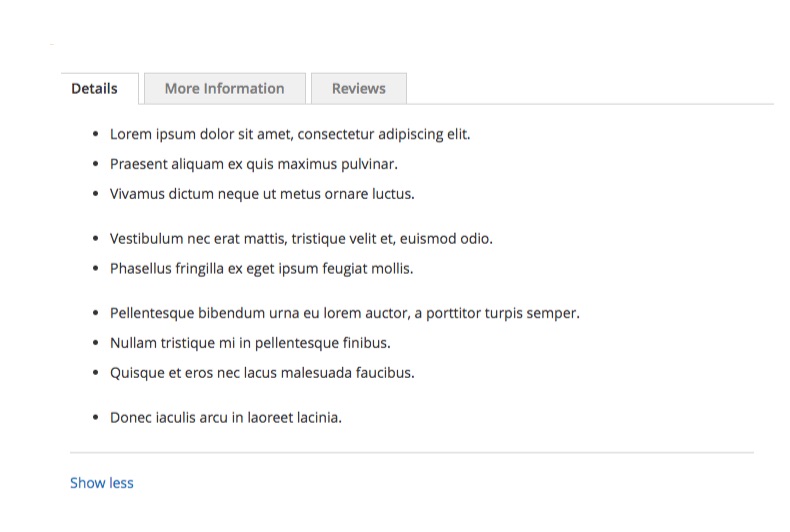
When the component gets loaded, it is making a check to see if the height of the content is greater than the threshold defined and if so, append the more/less button and assign an event listener to it.
_theme.less
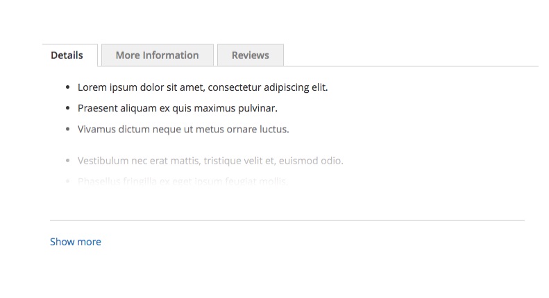
This is optional file for you to create, I have created some minimal styling (transparent-to-solid background) as a nice effect towards the the more/less button.
.product.attribute.description .value{
max-height: none;
position: relative;
max-height: none;
border-bottom: 1px solid #d1d1d1;

&.collapsed {
max-height: 200px;
overflow: hidden;

&:after {
content: "";
position: absolute;
width: 100%;
height: 160px;
z-index: 1;
display: block;
bottom: 0;

background: -moz-linear-gradient(top, rgba(255,255,255,0) 0%, rgba(255,255,255,1) 70%, rgba(255,255,255,1) 100%); /* FF3.6-15 */
background: -webkit-linear-gradient(top, rgba(255,255,255,0) 0%,rgba(255,255,255,1) 70%,rgba(255,255,255,1) 100%); /* Chrome10-25,Safari5.1-6 */
background: linear-gradient(to bottom, rgba(255,255,255,0) 0%,rgba(255,255,255,1) 70%,rgba(255,255,255,1) 100%); /* W3C, IE10+, FF16+, Chrome26+, Opera12+, Safari7+ */
filter: progid:DXImageTransform.Microsoft.gradient( startColorstr='#00ffffff', endColorstr='#ffffff',GradientType=0 ); /* IE6-9 */
}
}
}

#toggle-description {
margin-top: 20px;
display: inline-block;
}
Here is how it looks like on the frontend:
Leave a comment below if you have a question or if this blog post helped you out in your project.
Until next time, keep calm and code on! =)
