The CSS3 Flexible Box Layout, or as a shorter and more widely recognised term – Flexbox, is a CSS box model optimised for designing user interface layout.
It is the addition to the four basic layout modes, previously defined in CSS: block layout, inline layout, table layout, and positioned layout. But, in contrast to these earlier ones, this is the first CSS module designed for laying out complex pages.
Flexbox brings a lot of new stuff to the table and solves some of the existing problems in rather simple manner, especially in regards to:
- Building a responsive/fluid layouts (while containing elements, such as images, maintain their position and size relative to each other)
- Vertical and horizontal centering/aligning of elements
- Changing direction and reordering elements on the screen in a different order from how they are specified by the DOM (i.e., without altering the HTML)
In the rest of this article, I’m going to cover some of the flexbox’s defining aspects and also go through a couple of quick examples and practical ideas.
Flexbox basics
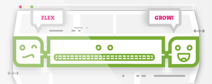
Two fundamental concepts essential for understanding flexbox are flex container & flex items.
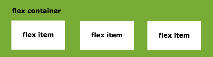
To enable flexbox, first we need to specify the value on a display property for the container element.
.container {
    display: flex;
}
By doing so, we are changing container element to use flexbox layout, rather then default block layout. This also means that all container’s immediate child elements are automatically laid out by using flex layout model – they are now set to flex items.
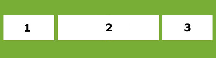
Flexbox has a direction-agnostic layout algorithm and that is in contrast to the block layout – which has vertical direction, or inline layout – which lays out it’s elements horizontally.
Considering this, we can use flex-direction property to easily modify direction of elements:
.container {
    display: flex;
    flex-direction: row;
}
As we can see on the previous image, it’s value is set to row (which is a default value), but we can also change it to column:
.container {
    display: flex;
    flex-direction: column;
}
By looking at most useful flexbox properties, we can also point out to justify-content; a property, which aligns flex items inside of the container on the main axis (horizontally):
.container {
    display: flex;
    justify-content: flex-start;
}
On the contrast, for aligning flex items on the cross axis (vertically), we can use align-items property:
.container {
    display: flex;
    align-items: flex-end;
}
As you may have noticed, we are modifying the layout by changing only one property, particularly the one which belongs to flex container.
Further modifications with flexbox can also be achieved by using properties for flex items.
For example, one of them is with flex-grow property, which defines what amount of the available space (inside the flex container) should the flex item occupy. All flex items have a default value of 0 and when we put value of 1 to each one of them, they will occupy the same amount of space in the container. If we put value of 2 to our 2nd item (leaving the other items with value of 1), it would take twice as much space as the others (if there is available space)
.container {
    display: flex;
}

.item1,
.item3 {
    flex-grow: 1;
}

.item2 {
    flex-grow: 2;
}
To put all together, based on the previous examples, we can conclude that flexbox properties are divided in the two main groups:
- Properties for the parent (flex container):
displayflex-directionflex-wrapflex-flowjustify-contentalign-itemsalign-content
- Properties for the children (flex items):
orderflex-growflex-shrinkflex-basisflexalign-self
It’s also useful to add that, since we are switching to using new flexbox layout, some properties that were created with the regular block layout in mind, won’t be applying here anymore (in this new context of flex layout). This means that:
floatandcleardo not create floating or clearance of flex item, and do not take it out-of-flowvertical-alignhas no effect on a flex item- the
::first-lineand::first-letterpseudo-elements do not apply to flex containers, and flex containers do not contribute a first formatted line or first letter to their ancestors
Browser support
When getting started with new features in CSS, one of the first questions which comes to our mind is the one that concerns browser support. How do we stand here?
At the moment of writing this article, we can say that flexbox has reached a level in which all major browsers, in their latest versions, are supporting this functionality. Of course, as always, here we have a league of it’s own – the legacy browsers – or particularly, Internet Explorer. Although there are some known issues in the latest versions (which can be passed with certain workarounds), it’s pretty safe to say that if you’re lucky with having to maintain IE 10+, you’re good to go.
For supporting as much browsers as possible, like with most new CSS additions, flexbox requires us to add certain vendor prefixes. Fortunately, with modern frontend tools such as Autoprefixer – which automatically adds vendor prefixes to CSS rules that requires them (by using up-to-date values from caniuse.com), this is not a problem at all and you can easily forget about any cross-browser syntax differences.
So, how can we apply this set of tools on our websites? Let’s take a quick look at couple of short examples.
Reordering elements
The first is one of the most straight-forward examples of flexbox in action. Here we’re using the order property, which gives us the possibility to efficiently rearrange the whole layout, without the need for changing the HTML markup.
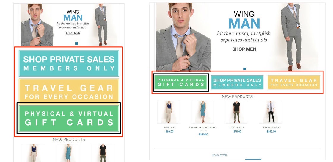
On the following image (screenshots are taken from Magento’s demo site), we are looking at small ‘promos’ list consisting of 3 items. On the smaller screens the list items are stacked in column, on top of each other, and on the larger screens, they are layed out in a row.
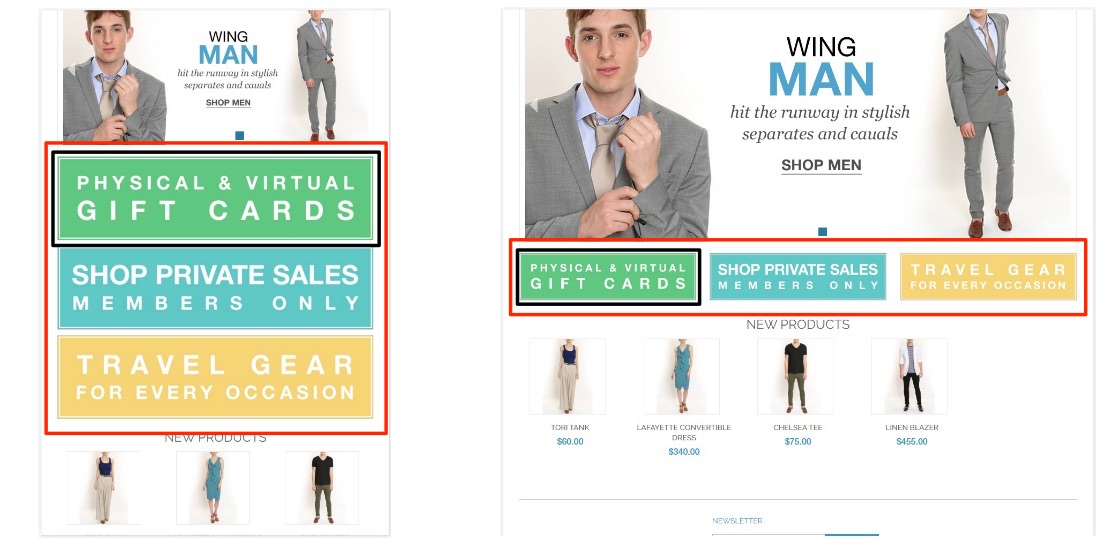
In some situations (e.g., when developing responsive websites) we might want to change the order of their appearance and we can easily do this just by setting the order property on the container’s child elements (flex-items).
Let’s say that we want to keep the default order of items on desktop, but on mobile screens we want to put the 1st item on bottom of the container. A default value for order property of all flex items is 0, so we’ll just need to give a value of 1 to the 1st item and, since it will now have a highest value, it will go down to the bottom.
ul.promos {
    display: flex;
}

ul.promos > li:first-child {
    order: 1;
}

@media (min-width: 768px) {
    ul.promos > li:first-child {
        order: 0;
    }
}
Sticky footer
The common problems when building a layout is a situation in which the page’s content is shorter than the height of the browser so we end up with the footer that sits up in the middle of the page (instead of at the bottom, where we want it to be).
Since this is a very old issue in front end development, there are lot of different existing solutions for this problem. Flexbox solves it in a simplest possible way.
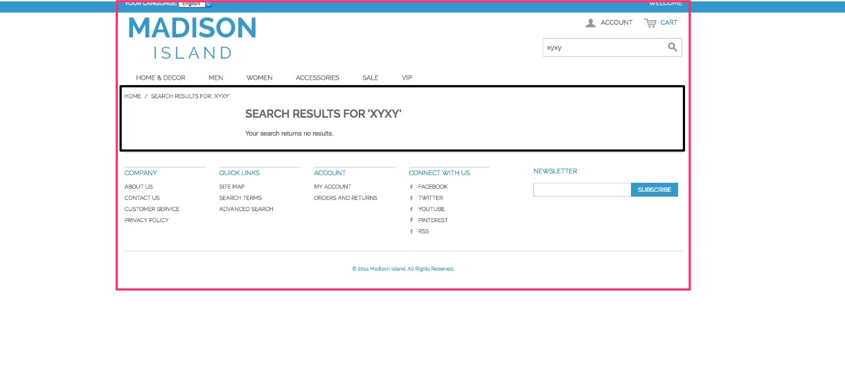
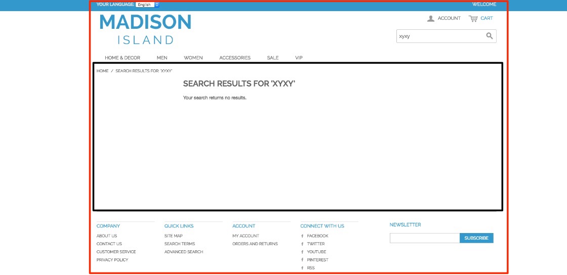
We have made a search on Magento demo site with intention to get a ‘no-result’ search page in return. In the screenshot below, you can see that the main content area (main-container) has very small amount of content, and therefore the footer is pulled up.
To set things up, we need to take two steps.
First, as always when initializing flexbox, we’ll set up flex container (in this case on our page container) with flex-direction set to column and also declare min-height of 100vh, which will set our page container’s height to be the same as the height of the window.
For the second, and last step, we’ll put to our main-container value of flex property to 1. This will tell browser to expand our content area as needed (not depending on our lack of content).
.page {
    display: flex;
    flex-direction: column;
    min-height: 100vh;
}

.main-container {
    flex: 1;
}
So, when we apply our code, we’ll see that footer gets sticked to the bottom of the page regardless of the amount of content on the page.
Equal height columns
Third example gives us an insight in a way that flexbox handles the column/box height.
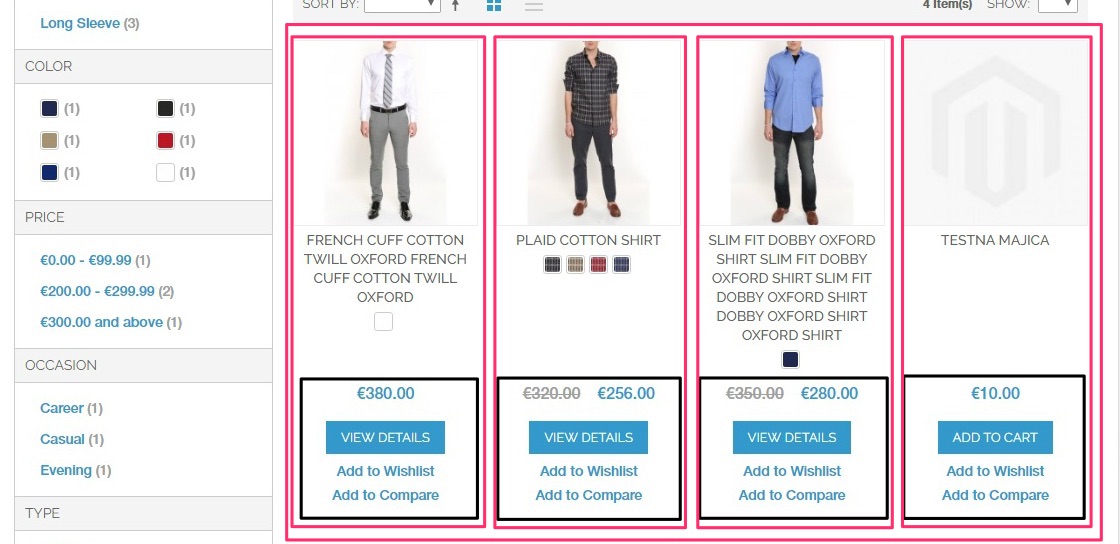
We’re going to take a look at Magento product listing page, where each listed product has different content, with different height.
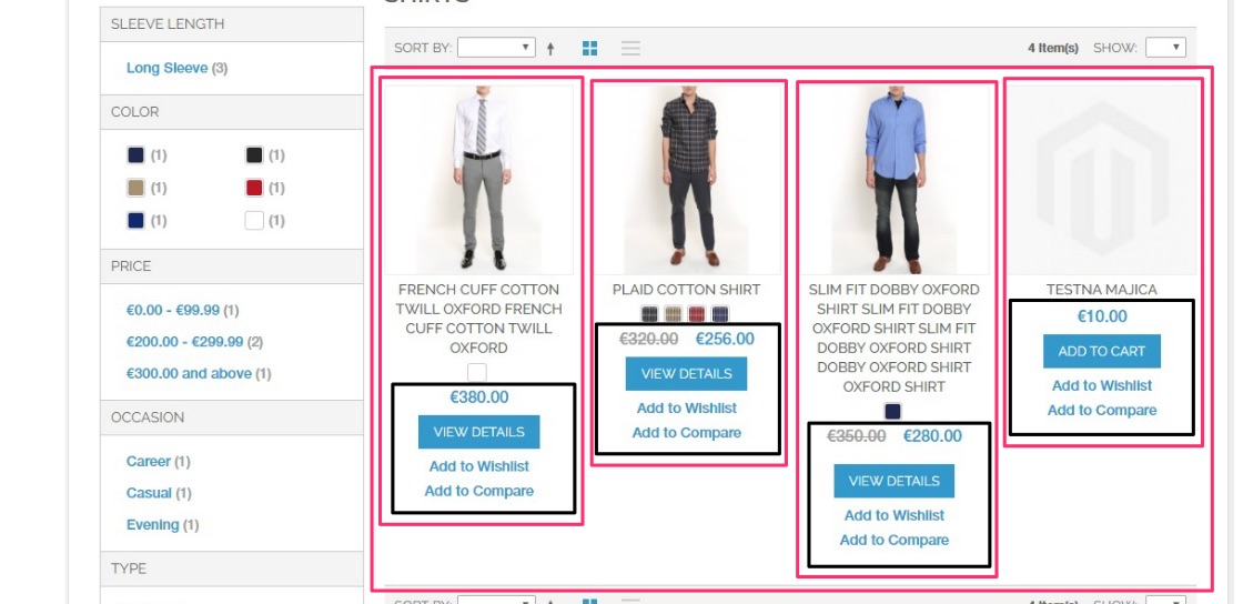
Here we want to make each product box in one row the same height (each box will have the height of the highest box) and also get price box stacked to the bottom of the box.
To achieve this with the help of flexbox, this is what we need to do:
ul.products-grid {
    display: flex;
    flex-wrap: wrap;
}

ul.products-grid > li.item {
    display: flex;
    flex-direction: column;
}

.price-box {
    margin-top: auto;
}
With flexbox, equal height columns come out-of-the-box. To make it work, all it takes is to put display: flex on the container and all of its children (flex-items) will automatically stretch to the height of the parent element. We’ve also added flex-wrap: wrap onto the container to enable the list items to wrap into the multiple rows.
To fully stretch the content inside of the box (flex-item), we’ll also have to turn them into a flex container (with display: flex) and lay its content into the column (flex-direction: column).
For the last part, since we wanted the price box to be at the bottom of the box, we’ve added margin-top: auto to this element;
In the end, it gave a more organized look to our product list.
Conclusion
This was just a basic overview and there is a lot more to cover. But, I hope it will be a good jump-start into the more advanced use of flexbox’s set of tools. Like with learning each new skill, it takes some time and practice to become a master, but eventually, you’ll get comfortable with it. There is a broad range of possibilities and I’m sure that you’ll also find some other flexbox use cases applicable for your website.