The only point of contact your customer has with your online store, is the designed interface. Ever wondered exactly what they think of it? Long gone are the days when the design was purely a visual discipline. It shifted into a responsibility, where designers are also to be valued for their understanding of the product being built. Design doesn’t just paint the building, it builds the stairs to an overall better usability and collaboration of everyone included. It is necessary to update our processes with thorough understanding of end users, colleagues and stakeholders to make responsible and risk-reduced design decisions. Change through user testing is what keeps the design process relevant and competitive.
In a single sentence, we work to make incremental user interface and user experience changes based on usability test results and actual user feedback. This process ensures we’ve improved your online store’s usability, not just with our knowledge of best UX practices, but also with real data from your own customers. This process also keeps us proactive, as we’re able to find bottlenecks we would have never thought of or noticed otherwise. Here’s a short overview of the process – and for more information, you can always drop us a line!
Get to know your online store
For best insights, a combination of qualitative and quantitative data works ideal. With quantitative data from Google Analytics and Hotjar, we start to understand the site and possible bottlenecks. If possible, we conduct a preliminary unmoderated live study on the current site, which gives us valuable qualitative data to get us working on well founded ideas for the redesign. The live study includes audio and video feedback from customers instructed to complete tasks on usual store flows. An ideal alternative would be to visit our clients for a workshop to get most of the customer information but we usually have a remote kickoff meeting and ask most of the questions then.
Additionally, to get a jumpstart on our research phase, we initiate a recruiting screener (we use Hotjar) on the live site to get started on gathering our group of relevant test users.
Analyse from the ground up
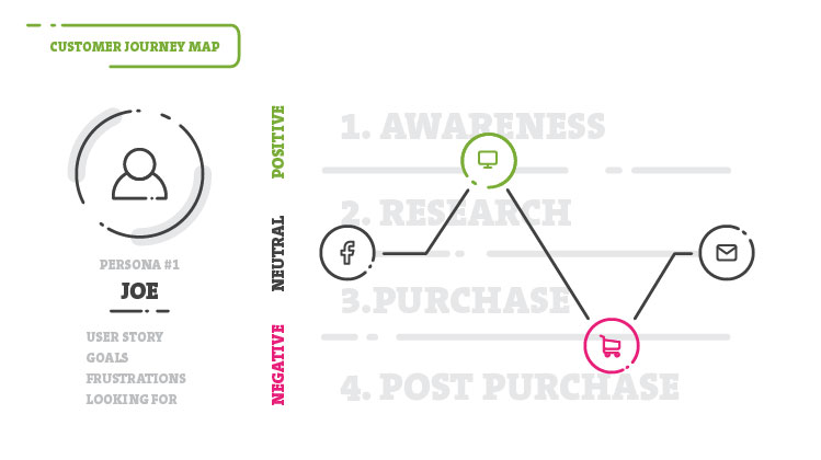
User journeys help us define customer activity, goals, needs, expectations, touchpoints, quality of experience, business goals as well as organisational activities (ideas and solutions). All defined benchmarks and project goals will be tracked to present results of the new design. User journeys also help define user tasks that would be included in usability tests later on. Personas guide in conducting these tests on specific customer profiles (we could pick and choose from recruits as audience segments). Towards the end of this phase, a sitemap is defined. The sitemap assists the team visualise the structure of the navigation and relationship between pages and taxonomy. It also serves as a starting point for wireframes, functional specifications and content maps.
Boldly go where no one has gone before
During the exploration phase, we try to create solution concepts. The team gets together to provide their specific services for another workshop. We brainstorm & sketch pages (whiteboard), which are turned into medium fidelity wireframes (Sketch) and clickable prototypes (InVision). These encompass all of the ideas and changes the team uncovered so far. The next step is to validate or dispute them through tests on actual online store customers we’ve been recruiting up until this point.
Test the prototypes, learn and repeat
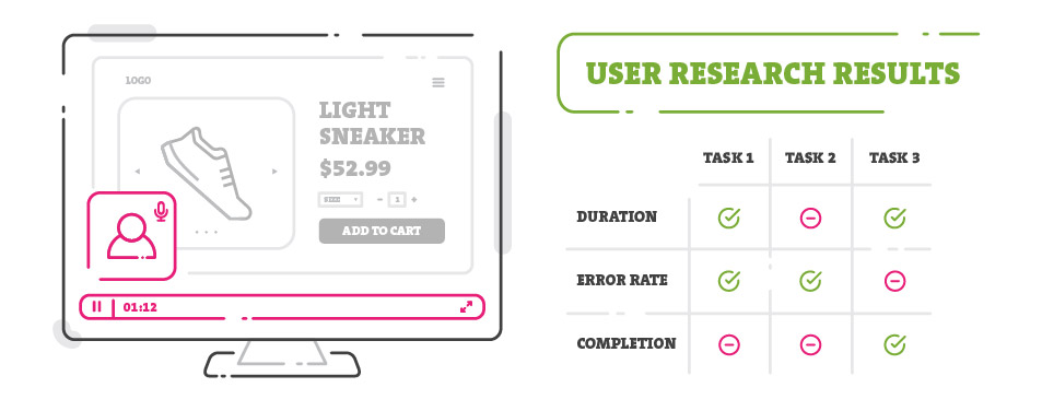
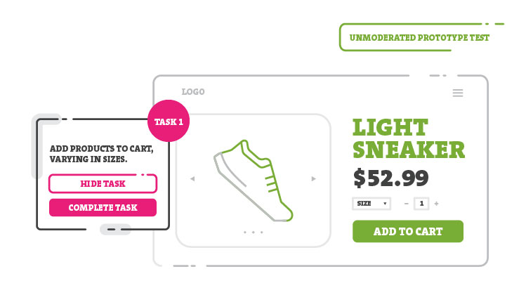
We test our minimum viable product to analyze and refine it in as many cycles as needed. Tools like Validately are used to perform unmoderated live studies on our InVision prototype, assigning tasks to recruited test users. Recordings of these tests are then analysed giving attention to test duration, task error rate, task completion and answers to custom follow up questions. So, what do these live studies contain? We receive audible data as well as video of the prototype in use, with our most important findings being the result of user interaction with given prototype through assigned tasks (e.g. buy a specific product, add it to cart and checkout). Tasks can range in complexity depending on what we’re trying to learn. In collaboration with the client, we arrange an incentive to be provided for all test participants. Having direct feedback on early prototypes from relevant users, ensures significantly reduced risk of friction for our future designs.
Suit up your designs
With early tests done, we’re confident to proceed to the design phase and open up a dialog to communicate moodboard look and feel as well as create the user interface design. The moodboard helps us communicate the purely visual aspect of the project with stakeholders involved. Following the moodboard, the homepage gets the look of the site going while, at the same time, we start developing the style guide for all pages to be designed upon. For the entire user interface, we focus on creating user flows instead of presenting mere pages. Flows are again presented through InVision prototypes and include all of the findings from the previous testing phase both the client and the team agree on implementing. Find out all of the steps we take while designing your store in our Magento Wed Design Service.
Test again, don’t assume
The completed designs are based not only on industry best practices but also on actual customer feedback. Nevertheless, we test again to see how the designs perform from a usability and user experience point of view, avoiding any assumptions that might not prove to be true. The mechanisms we tested on wireframes might work, but our design influences their effectiveness as well. We repeat this cycle until optimal solutions are found.
Post launch care
After launch, we keep monitoring the live site with the goal of optimising the organic conversion rate. We continue the usability tests and include A/B tests to provide basis for further incremental design changes. Tracking previously set benchmarks and goals gives us results to affirm the work so far. After all, your online store is a living and ever changing organism that can be improved at any point.
All key teams at Inchoo (designers, consultants and developers) are included in the decision making process. At all times we are working closely with our client. This approach is in service of optimal store usability as everyone in the team contribute from their perspective while changes and improvements are based on the real customer feedback. If there is a concern whether an investment in such a thorough process is justified, you should consider the risks of not investing in testing at all and basing your decisions on information that doesn’t include your customer feedback.
We would love to take you and your customers on this journey and show you the value of our approach firsthand. Read more about how we can improve your store’s usability and increase your revenue!
