New Inchoo.net Design

Hi Everyone. Since I started working at Inchoo – in fact since my interview, Tomislav (our CEO) has been talking about the revamping of Inchoo.net. In Brazil we have a popular saying: “In a blacksmith’s house, the skewer is made of wood”, which can be applied to almost all types of businesses. You know the drill, unless something is really hurting, we keep our non-billable projects on the back-burner and keep the focus on our clients and opportunities for new projects. Thankfully, we found a gap in between projects and I was the designer responsible.
Project Definition
We can say we are already recognized as Magento developers, so the main objective was to let the world know that we do design on the same level of excellence. We all agreed that we needed a fresh design, something to achieve that “Wow” effect. For started we brainstormed whether we were talking about re-designing the website keeping its structure or we will take totally different direction.
Tomislav and Toni pointed out some important competitors to provide a bigger picture. We discussed competitors strategies, checked our Google Analytics data and decided that I was free to suggest something completely different. Two of them already had an idea, so the differences in our thoughts could improve everybody’s predictions about the project.
Wire-framing
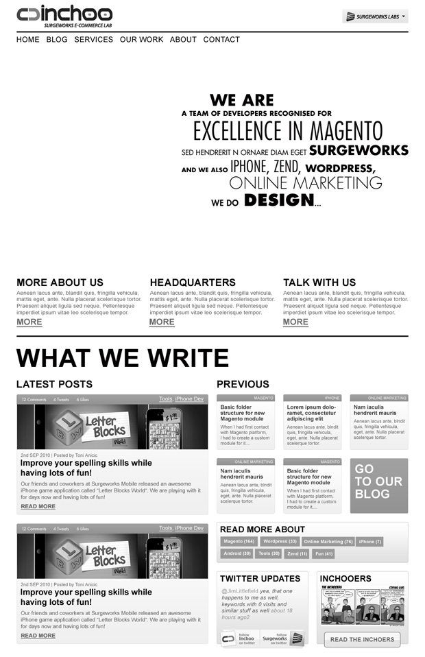
The wire-framing phase was always a very collaborative step at Inchoo. Ideas and suggestions generated by the team gave me a valuable opportunity to challenge myself and enhance the outcomes. After researching and being eager to show something out-of-this-word, I reached the following approach:

As you can see, the homepage had suffered some major structural changes and the blog wasn’t the star anymore. It was an interesting exercise but it brought a lot of questions.
The research and thought involved has added to the project and opened another window for discussion. After throwing some ideas back and forth we all agreed that along with stating that “We have top-notch designers and we can provide awesomeness in design as well as in Magento Development”, we needed to be considerate to our fellow reader, to the Community of Magento developers and business owners that compose our regular audience. We should not assume an institutional image or give priority to a design spectacle over the valuable content we provide and our visitor’s interaction.
It did not take a lot to get everybody on the same page. We then decided to identify the blog as the core of our web presence. Therefore, we put the homepage planning aside for a moment and jumped straight into the blog wire-framing.
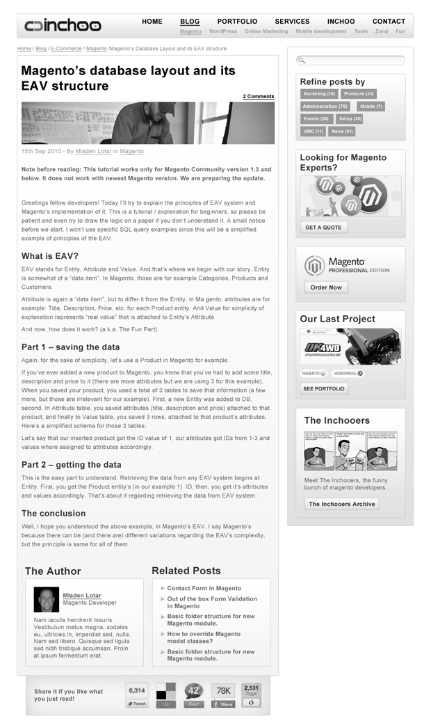
See our single post wireframe below.

We concentrated our efforts in the improvement of our blog features and structure. Everything now should fall in place as we proceed. With everybody in agreement, we decided to start the blog design.
The Design Challenge
We didn’t want to be compared to our competitors. The idea was simple: as we spend most of our lives working and having a lot of fun doing it, we wanted to have a website that reflects this. We were looking for an original approach, a concept aligned to our culture and personality.
The light atmosphere and funky mood that is present all over the site, posts, tweets and so on, drew my attention.
As some of you know, Hrvoje – one of our developers is the illustrator of The Inchooers, the bunch of funny characters, inspired by the Inchoo developers themselves. He is bringing the jokes, the funny episodes and even Chuck Norris into our web presence for a long time. Everything with good humor, a dash of irony and sarcasm at times. It was definitely a good idea to emphasise it on our new visual. Hrvoje was very enthusiastic about it.

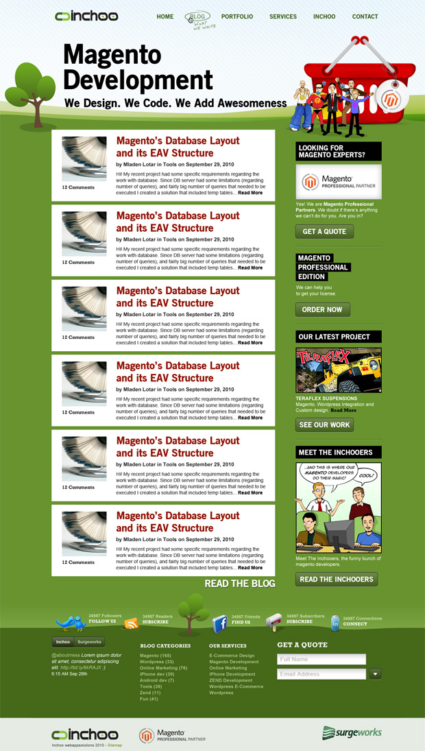
Everybody was quite happy with this approach and it has generated a series of inputs and feedback. The major concern was whether it has gone too playful or too “childish”. However, we were all confident that we were on the right track, it would be just a matter of improving this language and finding the right tone.
It was time to look into details and present a more polished design proposal that would solve those issues.

This time we created the Wow-effect we were looking for.
Front-end WordPress Development
As well as design, I was also responsible for the front-end development on this project.
The design created some challenges that made it necessary to use of some new css3 capabilities, for which we are providing fallbacks for ie7 using modernizr.com. We opted for using web-fonts for the headers instead of relying on web-safe fonts or images.
It’s been a great opportunity to experiment these new resources and has made the front-end development more enjoyable. In fact, we are still testing, adding some bits and pieces and improving the theme as we go. We decided to go live and finish with the little details in middle-air fly.
Vanja Devcic was the front-end developer responsible for the CMS implementation. We have been working in close contact in this phase and the nature of this project gave us the opportunity to try different solutions for different challenges and processes. Although we’ve been working from different sides of the world ( I, from Sydney, Australia and Vanja from Osijek, Croatia), I always had a feeling like we were in the same office.
Besides WordPress development, he has provided an impressive amount of support which contributed to the high-quality output you can see now.
Teamwork
I definitely should mention Renato Carvalho, Rafael Torales and Ney Ricardo form our Design Lab for their positive re-marks during the whole process.


14 comments
New design is great congratulations guys!
Nice site design guys..inchoo, all of u are my idol. I had learned a lot from your magento tutorials. thank you!
Nice post. It seems a really hard project! Well done!
Thank you for all your comments and feedback! And congrats to the team! 🙂
Awesome job Lyss!
Good job, Lyssa! It’s nice to see how things run to get to this great looking site 🙂
Looking forward to see your next posts.
Looks great. Good work by Lyssandro.
I think you should for your site with a “Top”button?right? 🙂
hello my friend,inchoo!
In my latext dreams, I see that website –
inchoo.net!
Our new year and our new design?Congratulations!
Cheers!
Nice work guys! It looks really sharp!
Thank you Lyssandro. Wonderful article and great description of what we’ve done… 🙂
You guys rock! New design is fabulous. Congratulations!
Hi, guys. Great redesign. Congratulations!
There are some small issues to fix: in Google Chrome input styles are a bit low. Also pay attention to “Quick Search” – it is broken in Chrome.
Good luck!
Awesome work Lyssandro and everyone who was involved, the design really has that “WOW!” effect we were searching for. Feedback on Twitter was amazing, people are really loving the new website!
Cheers!