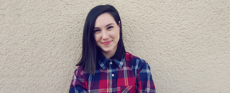
Behind the scenes of Inchoo Design team: a talk with Katarina Dijakovic

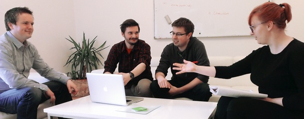
Have you noticed the fresh look on our blog posts? Recently our Inchoo design team has been putting a lot of effort into our featured images, but also working on a great portfolio through various projects along with evolving Inchoo’s identity. Our usability audit is now just one of their services because with the newest addition to the team, Katarina Dijakovic, they’re more versatile than ever.
That’s why we decided to talk to Katarina and learn a bit about what inspires her, what keeps her going and how she found herself in eCommerce.
Here you have an interview with her – about technicalities, design hacks and about what she thinks of design in eCommerce now when there’s a certain mileage in her Inchoo shoes.
Hi Katarina! For starters, tell us something about yourself. You can share something about the early beginnings – when did you start with design – and about the most recent adventure – working at Inchoo?
Katarina: Hi all! My name is Katarina. I began designing back when I started college and my Inchoo adventure started in October of last year. I’ve been drawing for a long time now, way before I started to think about working in graphic design. I knew that was what I eventually wanted to do – ever since I was enjoying commercials and opening and closing credits of the movies more than the movies themselves.
I always found it interesting how different formats can communicate information through details and almost inconspicuous things, how certain elements can make a whole and “round it up” in a certain context and atmosphere. Whether we’re talking about user interfaces, print materials, animations or illustrations, they can connect a person with the world around them. That’s why it’s important to mention the advantage of every member of the Inchoo design team having a different skill set, work approach and understanding of the design process. That’s also one of the reasons why we initiated Design Talks, a gathering of local designers – to stimulate the exchange of knowledge, skills and experience in the Osijek area.
Now that you’re mentioning differences… I can’t help but wonder – are there any differences now, between this job, when you compare it to the projects you worked on so far?
Katarina: I mean, sure there are differences. I worked in a marketing agency, print production, won several contests, studied graphic design… I really had so many opportunities to be in various environments, dynamics and among so many different people. Every person I worked with had their own take on design and approach to work. You can learn so much about different design methods, the way it affects people’s behaviour and its foundations once you get to see things from perspectives which are not alike. I’m still learning, but so far, in my experience, that core meaning of the word design and its foundations are always true. Primary principles such as symmetry, contrast, rhythm and proportion can always be used, no matter the figuration. The human eye and brain will always react in a certain frame of those principles, that’s very simple, but there’s always a question of using it right while keeping in mind the technical requirements and user behaviour you as a designer are trying to encourage.
When it comes to user interface, or to be more specific, eCommerce, it is so interesting because there are so many types of tools we use to show us which parts of the interface are a success, or to put it bluntly, are they doing the job we intended for them – stimulated someone to click, swipe or scroll. They also tell us what can be changed and improved and we gladly allow that functionality to naturally define the design.
Still, it’s important not to follow the same patterns of design blindly. It is crucial not to make design decisions presuming that the users are used to a certain look; for example, that a certain icon represents specific content or that the search bar necessarily needs to be aligned a certain way. Sometimes research and numbers show failure of a design, but they can also be perceived as pointers which show that the users need more time to get used to something what is, in the long run, better in terms of optimal usability. At our team we’re always thinking about something being created more intuitively and not just accepting default solutions because, not so long ago, they weren’t default themselves. They became such because users learned what they represent, they learned to use interfaces which are now accepted as default because it made their experience better. As a consequence of that, our clients business is a success and so is our own. We must remember that there’s always room for teaching users about innovative elements, if they contribute to better usability and functionality. The biggest goal is to make these digital interfaces as natural as possible, or to explain it differently, to create as little emotional distance as we can between the user and the act of online shopping. In doing that, we as designers are educated on the technical implications and demands of our work, especially working on a platform such as Magento.
So, what can inspire all of that? How does your day look like?
Katarina: Normally I always know what my focus for the day is in advance, so I immediately start on that when I get in. But it’s good to prepare yourself or think about the visual solutions outside of work, too. You tend to bring your design home with you, it’s kind of a way of thinking and living.
One of the issues we might have is reaching that certain limit within one day where you feel like you’re not taking as big visual steps as you did when you started. That’s rarely the phase where you feel like you’ve created something visually complete. Often we need to come back to a design after a while and finish it up with fresh eyes. That’s also why I break down all tasks into smaller ones. If there’s something I can do right away or finish in a short amount of time, I simply do it. We’re big believers in design sprints and making things happen without hesitating. It saves us a lot of time later with things in the future.
Personally, I love doing hand sketches. That’s just my own preference, something like my own personal brainstorm session. I’m used to coming across visual solutions which are the results of natural hand movements. From defining shadows in illustrations, planning storyboards for animations or defining wireframes for interfaces – it’s a great way to think about your design and start building it from there.
Can you tell us about what inspires all of that?
Katarina: Mostly things which are personally interesting to me – visually or conceptually. They inspire me to create and work in design in general. Still, I never force my own style and preferences onto my work. It just wouldn’t be appropriate for so many projects and would be very unprofessional because your own style is just one of many filters that you create through. As a designer, I have to think about the client, the end user and their needs. In that scenario, there’s not a lot of room for things which I like or I find beautiful because we’re often not the end user or target group to that project. What is of significance to me, might not be to them. Every project has its own aesthetic demands and you should always try to understand your users objectively and create from that point on. And when I say that, I’m not talking about replicating things which are trendy, no, not at all. Because every project is unique you get to have space, if you approach it in the right way, to create something original and push your own limits as a designer.
I must admit that even though I had certain projects I liked more than others, I still think I learned the most from those which were most risky or my biggest failures. You can’t make big steps towards progress if you don’t learn from your own mistakes, they can be a great motivator and a way of looking at the glass half full. 🙂
In the end, can you tell us why eCommerce, why Inchoo?
Katarina: I’ve been asked that before and I always say why not? At Inchoo we get to be involved with shaping and influencing an important aspect of online behaviour while delivering great user experiences and that as a result has a real effect on the world around us.
We often forget that no matter the seriousness of our work, expectations, technical inquiries, short deadlines and budgets, what makes these positive numbers and high rates of success is the human interaction we aim to create. Behind every number, chart, statistic or a well done audit is none other than a human being. Here at Inchoo, every team works on achieving these goals equally and I think that’s what makes this unique environment a place where everyone would want to learn and thrive.
So, there you have it, guys. Insiders look into artwork our design team has been creating. Let us know what you think! If you like what you see, you are more than welcome to drop us a line – we’d like to help you improve the usability of your store!