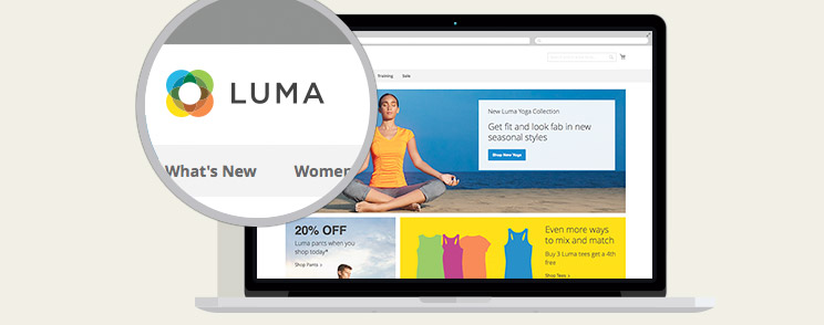
Magento 2 brings new default theme under the name “Luma”. Luma is a very clean, easy on the eyes and elegant theme that has adopted better usability practices than it’s predecessor, Magento 1 default “Madison Island” theme.
In this blog post I’ve prepared an overview of the main differences between these two themes and the crucial UX issues that were found in Beta version of Luma theme. As Magento 2 is still in the development phase, this article will be updated when some major changes occur.
Homepage
One of the main differences between Madison Island and Luma themes, aside of updated look and feel is the Homepage where substantial changes have been made and that especially goes for carousel that has been replaced with tiles.
Why is stepping away from carousel a step forward to better usability?
Many studies of Homepage carousels have proved that they are completely ineffective and anything beyond the initial view has a huge decrease in visitor interaction.
Carousels are one (of many) methods of displaying information on a homepage whose goal is to catch the user’s eye and showcase information that merchant wants to emphasize. Because carousels at first give a visual boost to the homepage, are fairly easy to implement and can show a lot of information without sacrificing screen real estate, most merchants use them as a means to communicate new information to users. Unfortunately, most carousels fail to follow basic accessibility and usability guidelines which effectively renders them useless.
One of the issues with a carousel is automatic advancement of slides which reduces accessibility. Low literacy users or international users who may read more slowly if the store is not in their native language and users with motor skill problems may have difficulties using the carousel. Also, users’ cognitive load increases with each slide as there is no indication of what content is on next or previous slide, forcing them to remember each slide’s position.
Luma solves those issues with tiles. Tiles are a great solution as you can display more banners at the same time without forcing users to remember on which slide they saw the content that appealed to them. Even better, users don’t have to deal with carousel nor its controls, making their experience and search for information easier.
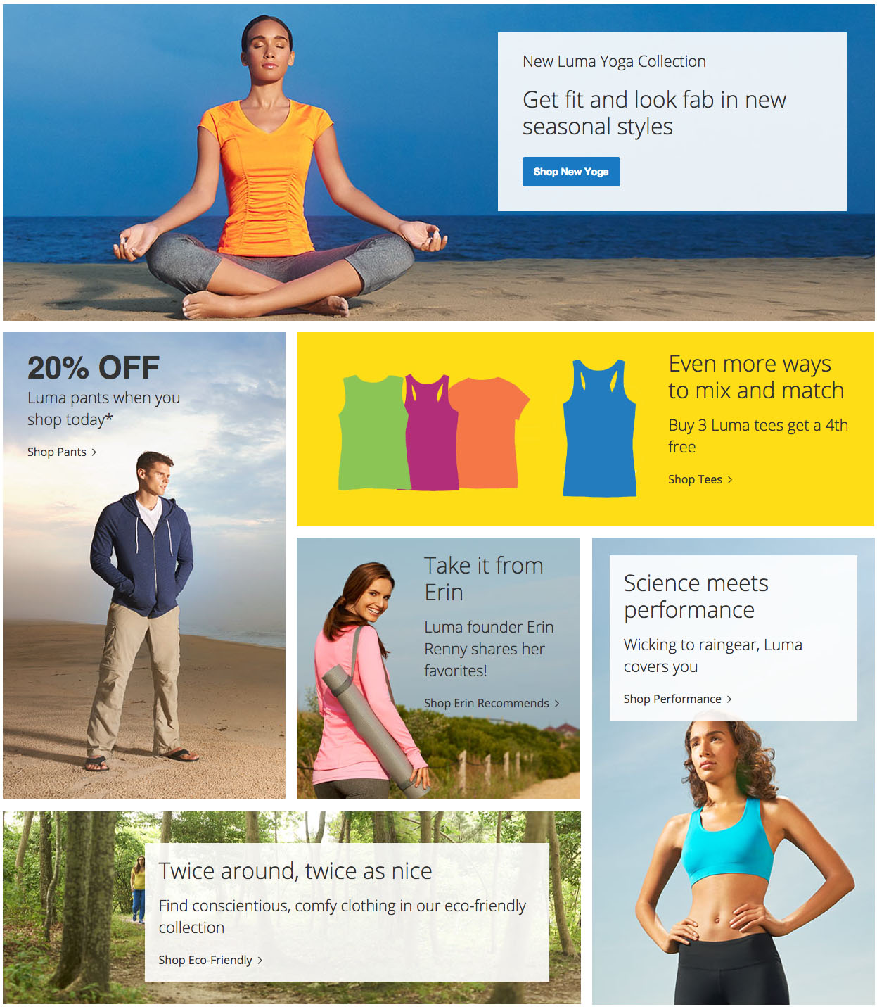
While desktop tiles mostly look clean and nice, if you take out middle tiles where readability is slightly lower, text and layout on other resolutions are not properly scaling towards smaller screen sizes.
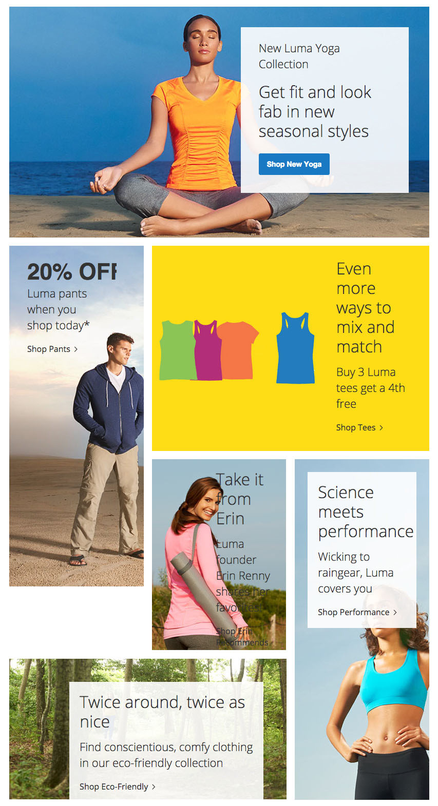
Below is the picture of tiles on 768px where you can clearly see how issues arise. Example; white space appears below the second tile (tile with “20% OFF”) and the title is not fully visible. Readability of “Take it from Erin” tile decreases as there is not enough contrast between the text and the background. Padding of last two text containers breaks.
On 480px you can easily notice issue with inequality of the tiles’ width. That inequality creates inconsistency and makes it difficult for users to track content.
Here’s an example:
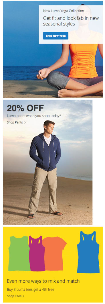
Since Luma and Magento 2 are still in Beta, we can clearly see that there is work left to be done regarding responsive images and responsive typography.
Next difference between the themes is the area for Featured products on the Homepage. On Madison Island theme, products are presented in 1 row with small image thumbnails (155px x 155px).

In Luma, images are larger (195px x 243px), but products are displayed in 2 rows. If the second row is not completely filled with products (and that would mean you’d need to have 10 products showcased instead of current 7), a visual gap is created and eye loses focus. Example is in the image below:
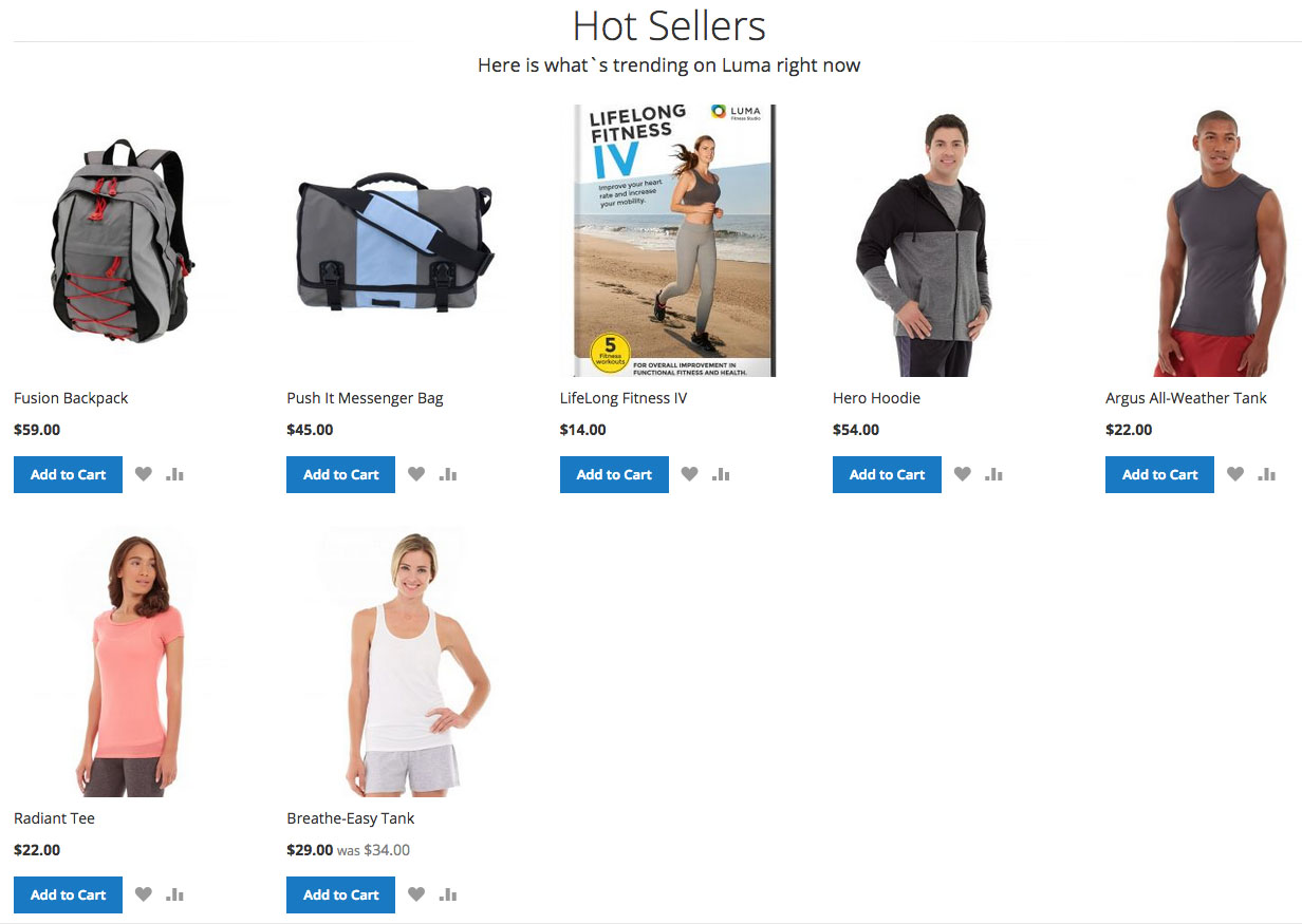
There are 2 solutions to fix that:
- Restrict the number of products to 5 or 10 so the whole row is filled and a gap is avoided.
- Implement a small slider with pagination controls that appear inside of it.
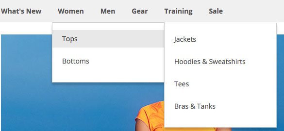
Another thing with the Homepage, most specifically in the navigation area, there is another usability issue – users do not have a clear visual indicator of a dropdown menu which shows that a certain category has its subcategories, not just the link to it.
Without visual dropdown indicators, users have to resort to guesswork and method of trial-and-error. They can only see subcategories if they hover over the specific link in navigation. Solution for this would be to include a small dropdown indicator, like a downward-pointing arrow to inform the user that there is more than one layer of navigation available.
Category Page
Great improvement is accomplished on the Category page. Luma’s Category page now has clean lines which makes it easy to follow the page, products are in focus and images are big enough so users should not have troubles identifying the product and see its details even from thumbnails (226px x 282px).
Main difference between the themes, and also a big improvement, is the product listing. In Madison Island the default width is 680px and Luma expands that to 980px. Because of that extra 300px, product image thumbnails are more prominent.
Why is that important?
Users are attracted to high-quality product images and they are extremely important to online shoppers. Using the right images can boost your site’s conversions and get you to connect better with your target audience.
Even though the category page is clean, there are still some issues to be solved.
First issue is with certain resolutions between the breakpoints. On resolution range from 640px to 768px filters are not on the left sidebar as is the case with other resolutions. Instead, they are placed below the product list, making them difficult to find. That means that users have to scroll through all products and then narrow down the choice with filters.
Next issue is with the “Add to Compare” option. If a user selects several items for comparison and decides to clear the list, he is taken to the previous page he visited. It means that if a user was on the Homepage before clearing compared items from the list, it will take him there and possibly lead him away from the desired category. Aside from that, the icon for comparison is not clearly representing its purpose.
Product Page
Product page is very clean and understandable, with focus on the product image and with clear call to action and product details.
One thing that could be improved is the notification that shows when a user adds the product to the cart. Instead of displaying notifications at the top of product page, they should be placed near the area that user interacted with – “Add to Cart” button. This way, we will display right information to the user without creating additional friction by displaying notifications outside of that area, forcing users to ask themselves if the product was actually added to the cart or not.
Cart and Checkout
Both are very simple, intuitive and easy to navigate.
On the Cart page, within “Discount Code” area, there is no information how to get a code and customers could feel that they are overpaying when they see a coupon code field for coupon that they do not have and do not know how to obtain. Because it’s so obvious others are getting a discount, some might feel it’s unfair that they aren’t getting a discount as well. A better solution would be to change the wording a bit and add a simple link saying “Have a coupon code?” which would display the form field and an “Apply Coupon” button would be shown only after the click.
Second solution would be to include link “How to get a coupon code” next to the “Discount Codes” area and display a modal window with those information on click, so users don’t need to leave the cart.
Required fields label on the checkout is marked with a red colored asterisk (*). Research proved that most users are still not sure if the field without an asterisk is optional or not. Solution that would be of bigger benefit to the user is to write “Optional” to indicate optional fields, possibly in a slightly grey tone, in parentheses at the end of the label.
Conclusion
Magento 2 Luma is a great improvement compared to it’s Madison Island predecessor featured in latest versions of Magento 1.x. Adopting modern design trends and implementing them in current flow that should serve as a starting point for merchants is not an easy task and there are still details to be polished before the stable version is released to the public.
However, we can tell this early on that the general look and feel, as well as the performance of this theme shows promising future for Magento’s frontend.
While using the default theme can be a good starting point for the merchants, it is not for everyone and it certainly doesn’t cover specific needs a business will have.
Building a custom theme specifically for the needs of merchants and their customers across different industries is where we excel at, and we can help you create a completely custom solution or evaluate your current site’s design and usability if you are looking to improve your user experience, so why don’t you get in touch to see what we can do for you?
