Do you know in how many steps designing a Magento web store is divided? There is so much “invisible” work behind the final design of a Magento web store and in the following text I will try to explain how and why we do what we do.
Visual aspects are, of course, a very important part, but our design lies behind a big number of data, user research and understanding how users interact with a web store.
We divide process of designing a Magento web store in 4 steps: research and planning (1), sketching (2), wireframing (3) and design phase (4).
1. Research and planning
As mentioned, we start every process of web store design with an extensive research. We believe that a good plan is a prerequisite for a successful project, and in order to achieve that, we have to gather the required data.
In order to do that, we usually implement Hotjar (or some other similar service) if a client already has an existing web store. With a help of heat maps, recordings and scrolling maps, Hotjar became a very useful tool that gives us specific information about users’ behaviour. This way, we can truly understand how users engage with a web store and what bothers them.
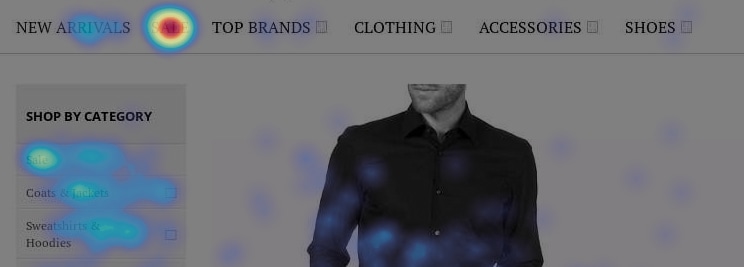
A great thing about Hotjar is the possibility of recordings, where we can literally see where users click and encounter problems. It takes time to watch all those recordings, but in the end, this is the only way we can really see whether users have issues using or navigating specific parts of the web store.
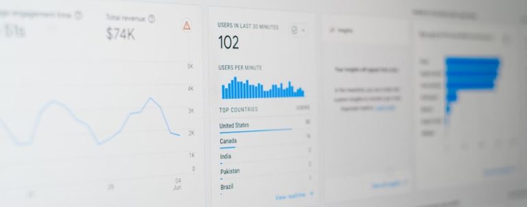
In addition to Hotjar, we use Google Analytics. With its help we can get to know our users, see which pages are mostly used as starting pages and which pages are the biggest drop-offs.
Besides Hotjar and Google Analytics, we do one more part of the research. This one is aimed at getting more familiar with the client, their business culture, industry, internal processes and competitors as well as their short and long term business goals. By understanding this part, we can start developing a creative strategy for our client’s online presence.
This entire process help us to make data driven decisions about pages and elements on web stores that are the most important for our client’s business. Collected data influences the layout of the homepage, category, and product page, the main menu items, and general internal linking structure of the website.
2. Sketching
After we establish conclusions which are the result of our previous research, we start with a quick sketching on the paper. This way we shape our ideas into a form and create a few variations of the basic layout. With a help of the sketches we can quickly think about element positioning, their relationship and functioning without wasting too much time.
After choosing the best layout, the next step is creating a wireframe.
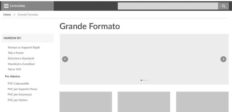
Wireframe is a visual guide that presents the website’s structure and informational architecture, avoiding the emotional deviations caused by styled or colorful elements. Using the data from the previously conducted research, we continue the process of building the web store while the main focus is on element positioning and functioning.
3. Why are wireframes so important?
It’s very important that we create wireframes while constantly thinking about Magento and its limitations. We communicate daily with our frontend and backend developers trying to achieve the right balance between technical performance and the best possible user experience.
In this phase the biggest highlights are communicating with the client, resolving any issues he might have and understanding their needs. We always listen to our client’s demands, but if we find any usability problems in those, we do our best to explain why that might not be the best solution for them, and suggest a better option.
This approach is time-saving and cost-efficient, where new inputs and ideas can be effortlessly implemented and assessed with minor time requirements.
4. UI Design phase
Once the final wireframes are approved, we delve into details to develop a unique design solution that will help our clients’ business grow.
We always create visual elements based on the current visual identity of the brand. It means using the same colors which are already in the logo and adding some neutral ones with which we create a color palette. Furthermore, we add a contrast color that will be used as the “call to action” color.
It’s the same with typography. We always reference on the logo and usually define 2 fonts that will be used for headings and body text. Note that typography and colors are just a small part of the style guide.
To show our clients the progress with our work and to help them feel how store will function, we use interactive prototyping tools that transform static screens into clickable prototypes. We typically do this for every major interface of their store. After designs are approved, they are ready for the development phase. But our work is not completely finished. Throughout the development phase we spend quite a big amount of time on quality assurance while communicating with our developers on a daily basis and if there are some issues, we work on resolving them immediately.
After the launch…?
No, our work does not stop even after the web store launch. Why? Because a web store is a living organism – it grows and changes very often, so it needs constant care. We like to continue our research using Hotjar and Google Analytics to see if there is something that we can improve or create some new visuals.
We are very passionate about our work and dedicated to our projects. Just as our clients, we want for their businesses to grow.
Design as a team work
Our design team has 4 designers and we all have different views and special skills. Some of us are better in complex web stores, some in detail analysis or in coding and some in illustrations. Explore how our Magento Design Service can benefit your store.
When one of us is assigned to a project, that person works exclusively through all the planning phases until the final design is approved and ready for the development. But, since we work as a team, our work is always seen by more than one pair of eyes. We are constantly looking for feedback or different approach ideas from the other team members.
What is your experience with the design? If this process is a little bit overwhelming for you – no worries, you can start with something smaller – usability audit. Make sure to get back to us with. We’d like to hear your opinion on design processes or get back to you if you request a quote.
