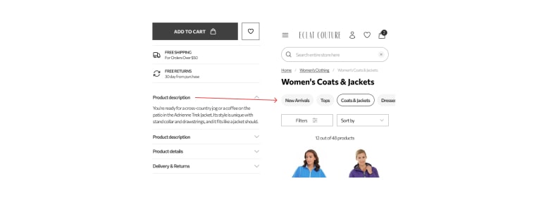
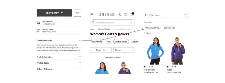
Creating a scalable interface involves breaking the design into smaller, reusable components that fit together to form the whole. In other words, instead of focusing on one specific page or section of a design, the focus is shifted to the building blocks and patterns that can be reused across different interfaces.
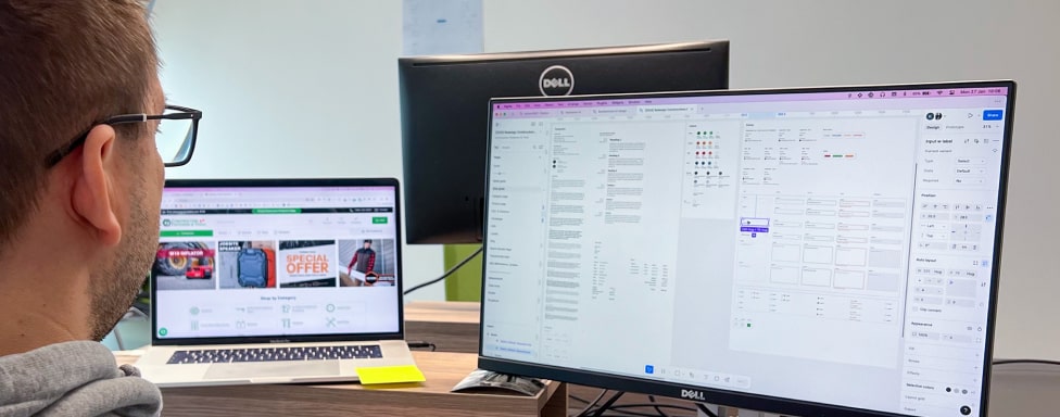
Such methodologies have become increasingly popular due to their efficiency, consistency, and ability to handle complex interfaces. Examples can easily be found in different component-based frameworks (such as React or Vue), Brad Frost’s Atomic Design Principles, and the recent rise of design systems. These have resulted in design tools like Figma and Sketch incorporating such workflows at their core.
We’re talking about modularity in design, a principle that breaks down the system(s) into smaller parts that can be independently created and mixed to form a whole.
Core Benefits of a Modular Design
Modular design shifts the focus from the end product to creating reusable components (like buttons, cards, forms, etc.). Each module is designed to serve a specific purpose. When combined, they form building blocks that can be used to create different layouts and designs.
Some of the key advantages of using modular design are:
- Reusability – components and patterns are reused across multiple interfaces, saving time
- Consistency – ensuring a uniform look & feel by sharing the same components
- Scalability – reduces time in upgrades because existing components speed up the process
- Maintainability – updates are usually handled in a single module and automatically reflected in all instances across all interfaces
Component Libraries in Modular Design
Modular design implies using a component library, a subset of a design system focused explicitly on the actual interface elements. As the name implies, a component library is a collection of pre-defined components that tremendously improve the time efficiency, thus saving the budget.
You’ve probably heard about Google’s Material Design, Bootstrap, Tailwind, etc. Although they differ in many ways, they share a common denominator: a library of ready-to-use pre-made elements, such as buttons, icons, tabs, menus, modals, alerts, cards, and similar elements.
Using such libraries gives a pretty good head start when building a solution – one doesn’t need to make up and build the basic building blocks of an interface from scratch. They’re there – ready to be utilized. In other words, time isn’t wasted on re-inventing the wheel. It’s used to create a value.
A Myth About Homogeneity in Modular Design
When discussing modular design and component libraries, people often think it’s like entering a convenience store, picking a few items, and piecing them together for the end product. This mindset naturally leads to the following question:
Won’t modular designs all end up looking identical?
While the answer is simple: “No,” understanding the “why not” requires some explanation.
For simplicity’s sake, let me walk you through an industrial example.
Take a look at your closet. It has several components shared with basically every other closet.
- Doors,
- Hanging rods,
- Shelves,
- Drawers,
- Handles,
- Sides, etc.
In addition, some of these are shared with kitchen closets, TV commodes, or other pieces of furniture.
While they all share some structural elements, their appearance varies depending on how they are styled or customized.
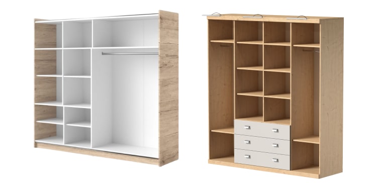
So, even if both these closets share (some of) their components, what sets them apart are, for example, the wood color and the storage layout, making them both unique in their ways.
The same principle applies to practicing modular design in the interface design context.
A component library contains the building elements an interface needs. Just like a closet, for example, always needs shelves and hanging rods, an interface will always need a set of components such as buttons, accordions, flyout menus, forms, and similar elements.
Branding, color schemes, typography, layout, and interactions are the ones responsible for influencing the uniqueness of a component.
In other words, modular systems more than allow creative and distinctive implementations, even within the constraints of shared components.
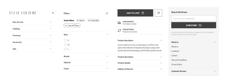
Here’s a UI example of three product cards, which all started from the same component:
They share a fair amount of structure, but all three breathe differently in at least four areas:
- Image style
- Typography
- Color scheme
- Layout
While this is an isolated example, the same principle can be applied to create and style the entire website interface to match a particular brand.
Reusability in Modular Design – Efficiency Through Shared Components
Reusability is considered as one of the core principles of modular design. It refers to using the same components across different interfaces and contexts.
In other words, there is no need to rebuild something from scratch if an existing component can be used with minimal modifications.
This principle reduces redundancy, saves resources, and maintains consistency.
For example, let’s look at a common component found in many places of an interface – an accordion, a component that allows users to toggle between hiding and displaying content.
In the eCommerce context, we’ll probably see it in
- Main mobile navigation
- Footer links
- Category filters
- Product description, etc
If we’re focused solely on the interface we’re working on, this can easily result in 4 different components. But, if we take a modular approach, this is simply one accordion with the difference in the content.
In other words, the core component is always the same. By reusing it, we save time (on both design and development), the design is consistent, and we don’t have redundant, look-alike components doing the same thing.
If we put it in the context of atomic design principles, our accordion is a molecule that consists of a label and icon atoms. This implies that both “label” and “icon” are singular components that can be mixed with other elements for different purposes. For example, the same “label” can be used for a subcategory navigation slider.
While it may not be evident, these labels share the same properties of size and color. However, the second example mixes the label with a small button container to create a new organism. Let’s call it “bubble-link”. Further on, this “bubble-link” is re-used as a search preview link for the category.
That’s how modular components can evolve and adapt, creating versatile building blocks while maintaining consistency and flexibility.
Balancing Overrides with Modular Consistency
Sometimes, modifying a component instance is necessary. For example, we might want to make our “sale” label bright red in the main navigation.
We have two choices.
- 1. Prepare a new component (or its variation)
- This is our best option if we expect this case to be repeated constantly. Otherwise, we’ll have to look up each instance when an update is needed.
- 2. Override the instance
- If we’re sure this is the only place such a modification will occur, overriding it will eliminate the redundancy and keep things manageable.
Although overrides are acceptable, it’s easy to push it to the extreme and break out of modularity. In the previous example, if our accordion(s) ends up
- plus, instead of the arrow on this one,
- font size bigger on that one, and
- an icon before the label for this one,
we’re steering away from modularity and adding unnecessary complexity, quickly leading to maintainability issues and communication challenges in development.
If this challenge occurs frequently, it’s safe to assume our core component isn’t well-thought-out for all possible applications.
The most critical step in preparing a component is in the discovery phase – understanding its application and defining the correct requirements.
Scalable Design with Modular Components
Besides being an excellent choice for starting a project from scratch, modular design’s key advantage is its scalability, which enables the interface to grow and adapt.
As systems evolve, the need to handle growth starts to emerge. If the design behind it cannot support it, that growth will lead to bottlenecks and significant future costs. A modular approach to design saves you from that trouble. Since all interface elements exist as decoupled core components, mixing and combining them into something new is easy.
Here’s a simple example: Let’s say we received a feature request to implement a form where customers can request subsidized products. The interface needed the following components.
- a page title and description
- an info message
- a few inputs for the customers to leave their contact information
- a submit button
Just by glancing at our core components library — everything was already there and used on the entire website. Page titles and descriptions are already on each page; an info message already exists for user activity confirmations; inputs already live at the checkout, and we have buttons all over the place.
We did have an override, though—we removed the icon from the info message so it’s distinct from the global success message, which will be displayed once the form is submitted. Although debatable, this seemed like a pretty good reason to do it. Other than this override, it all boiled down to playing around with the layout, and the design was done.
Further on, let’s imagine we decided we want some subtle corner radiuses on buttons and inputs because rounded edges are a thing in UI design now. We only need to change the radiuses on our core input and button components. No need to go screen by screen doing it for hours!
Modular Design in a Collaborative Environment
Since our design and development share the same core components library, transferring that design to the storefront is quick and easy. The only thing noted in the design handover was the instance override. No additional input was required, nor any bottleneck was encountered.
This is just one example of how modular design affects communication and understanding between team members and how things can get quickly expedited to production.
Don’t get me wrong — we did discuss the feature, but the conversation was never about questioning the design or development decisions.
You can read more about our approach to scalable and collaborative design here.
Challenges of Modular Design
Yes, modular design is great, but it’s not flawless. There are some challenges you’ll encounter heading this way.
- 1. Preparation and integration
- You probably already guessed this, but preparing a modular system requires a fair amount of time. Thinking about possible requirements, needed components, variations, and applications and then preparing these in UI and development tools isn’t exactly a picnic.
Best advice – think interactive and agile. You’ll never cover all the cases from the but, but you’re always free to update your modules, just like any other developer updates their application from time to time.
- 2. Standardization and team acknowledgment
- Modular design requires adhering to previously established standards. Archiving this adherence in multidisciplinary teams may pose an issue. Forcing the modular design on one side and ignoring it on the other will lead to inconsistencies.
Best advice – don’t push it. On one hand, modular design is just one of the methodologies available. Conversely, you’re always free to tweak it so it works for your team. We did this and still haven’t heard anyone complaining about it
- 3. Skill set
- Working in a modular design environment requires some skills in planning, research, knowing when to take a step back, and naturally – understanding how the component library in use works.
Best advice – focus on planning the library, maintain an agile approach, and keep the team involved. Good things take time!
Wrapping It Up
Modular design keeps things flexible, consistent, and easy to maintain. Sure, it takes some planning, but in the long run, it saves time, effort, and a whole lot of headaches. If you’re thinking about applying modular design to your projects or need a fresh perspective, let’s chat—we’d love to help!


