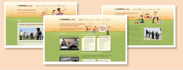
Yesterday we launched a new, redesigned version of our Croatian website – inchoo.hr. The new design follows the inchoo.net’s look and feel with a little twist in the header to improve the differentiation of the two websites. The difference is obvious in the color scheme and contour of our hometown Osijek that can be seen in the header.
The purpose and goal of the new inchoo.hr website is simple: To attract potential employees, educate them and give them a good idea of what working at Inchoo is all about. We intentionally put emphasis on career section, making it the most prominent part of the homepage. Homepage also features a rich multimedia section with videos and pictures. We created detailed explanations of the types of employees we’re looking for and outlined all of the benefits and opportunities that working at Inchoo gives you.
Since the goal of the project is to attract potential employees, and job applications started arriving immediately after the launch, I’d say we achieved exactly what we wanted and project is a success.
Website’s beautiful design is a work of Lyssandro. Slicing and coding was done by Stanislav. This was Stanislav’s first project at Inchoo and I’m proud that he did such a good job. Project management and copy-writing was done by yours truly.


