We all now that image is everything, especially when you’re selling the product online. There are some obvious facts that need to be taken into concern. This post will include some (IMHO) valuable reminders and a checklist for the shop owners willing to reevaluate their product presentation.
Also, let’s remind ourselves that eCommerce product photography is probably one of the most important steps in “optimizing” the performance of your eCommerce online store.
1. The image quality – Good is not good enough
Producing images should definitely be handled by a professional photographer, you know, the one with the “costs more than an average car” equipment and a stunning portfolio done in a proper studio. Yes, producing the images is the right word for this task since the images need to be edited to look their best, using an image editor of course. Editing or enhancing images is an integral part of the production process since it will gain more from the same photo session with some color and contrast improvements that make an image “pop-out” from the rest of the page and just catches the attention of the user.
Like these for example:
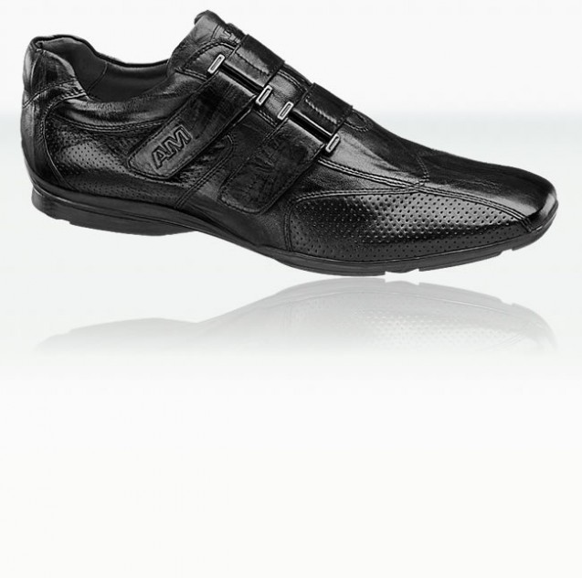
A high quality image of a shoe with that always stunning reflection applied:
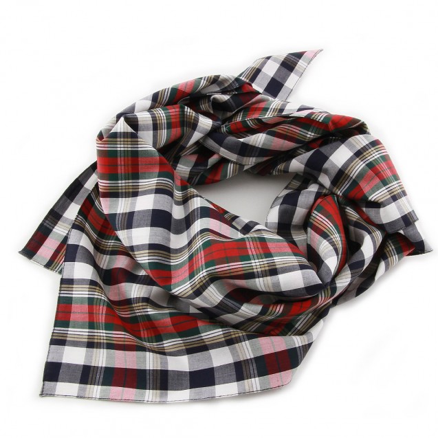
A perfectly arranged scarf with looks to die for if you’re into scarfs and all 🙂
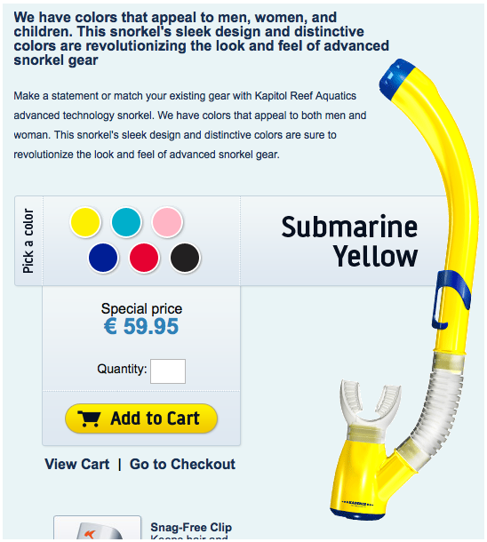
One image done right with different colors available:
Or this yummy cookie:

2. Product image is more than a product image
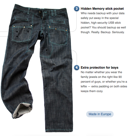
Wow, you really outdone yourself now. I know. If you can’t or don’t want to use a model for your pants image, make those jeans attractive by arranging them as if someone is wearing them, and possibly achieve a 3D effect by using some subtle shadows. And your point is? The point is that if you look at the image below from wtfjeans.com you’ll see that the pants gained a more interesting poise than with just having them laying around, lifeless (Adding key points to the image also helps ).
3. Cover every angle and packaging and then some
Having multiple views of the actual product will definitely increase interest in the product. Even If your selling a product that’s flat as a paper sheet you still need to show both sides of the product. If the product comes with some fancy packaging place that also under the additional images so the potential buyer has some extra thing to look for when buying the product.
One very good example would be when selling shoes. Take that picture from every possible logical angle to show the quality of the product.
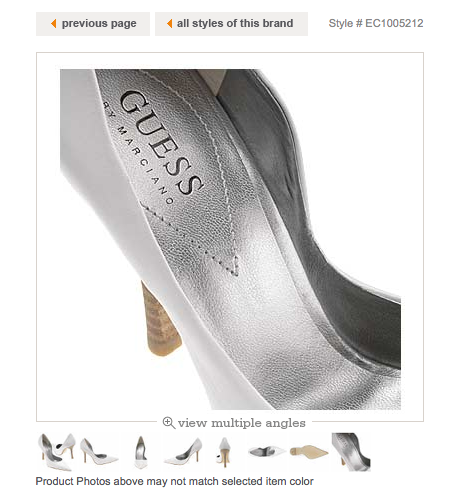
Present the packaging. This one can make a great decision maker when one is buying a gift for someone else and we all know that packaging is the important thing when buying a present.
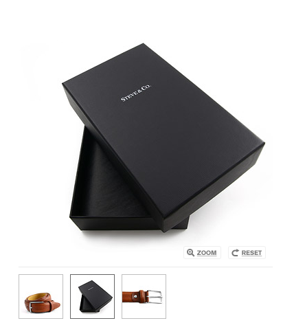
All of these steps to a perfect product image will have a tremendous effect on the buyer since you’re sending out some very subtle and important messages:
1. We care about our products therefore we care about our clients
2. We meticulously prepared them for you buying pleasure which means we care about our own presentation therefore we are the right choice to have business with
3. Our high quality images mean that we are presenting high quality products therefore we’re selling the right stuff
Bottom line would be that no matter how good your product is that when you fail presenting it to the public it’s not a good product anymore.
I wish you all the best pictures you can get and a ton of happy customers.
Practice what you preach: I’ve deliberately used only one example from our portfolio to make this post universal and non-bias. Hooray for me 🙂
In case your products or listings need some extra attention, we got a whole team who can help you out!


