Whenever you speak to a conversion rate optimization specialist or internet marketer in general regarding sliders you’ll hear a big rant about them. They’re bad for usability. But why do we still see so many sliders all around the web then?
Why are there sliders?
Sliders are the best way to hide important information on the prime real estate of your homepage while convincing yourself that users see it.
You hate them on other websites but somehow, when you think about your own website you think it’s a good idea to have one.
And the real reason why?
Because:

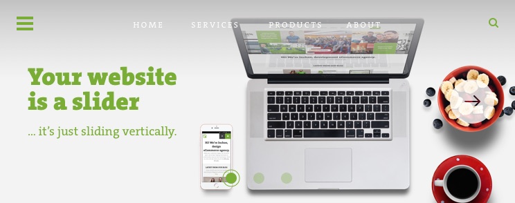
That’s right. Your whole website is a slider, it’s just sliding vertically.
Your website has a fold. And you love placing important things above the fold.
That’s because stuff bellow the fold is less visible. You’re well aware of that and that’s why you insist on all of the important things to be above the fold.
Because out of sight is out of mind.
And yet, somehow, you manage to convince yourself that’s not the same with sliders. And you’re not alone in this delusion. There are countless examples of sliders still out there in the wild. Hell, even this very website you’re reading right now has a slider on a desktop version of homepage.
The big guys don’t play with sliders
On the homepages of top 10 most visited websites in the world you’ll find exactly 0 sliders.
And there’s a good amount of niche diversity in the top 10. There’s Amazon which is an eCommerce site and it has no slider on homepage. There are search engines. There are social networks. There’s Yahoo which is a news portal (the most common offenders of no slider on the homepage rule… well… maybe after eCommerce websites) and even they don’t use a slider on homepage.
When is it acceptable to use sliders?
Sliders are not always bad. Remember, your website IS a slider. And your customers “slide” (scroll) through it.
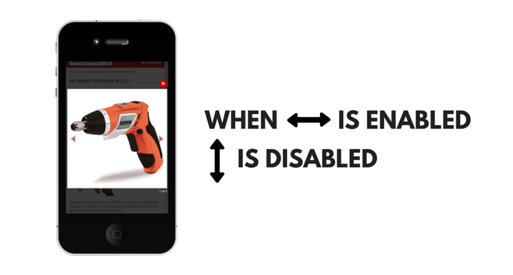
The problem with sliders is that your website is already a vertical slider and adding a horizontal slider to it is extremely problematic. It’s a slider within a slider.
One area where sliders are shown to be effective user interface and provide a good user experience are image galleries.
Image gallery sliders are good user experience because they only scroll horizontally. Vertical scrolling is disabled when you enter the gallery. You’re not using a slider in a slider like you would with usual homepage banner sliders.
Even the big guys – Facebook for example – use sliders for image galleries because they provide a good user experience.
Another reason why image galleries are usually good sliders is that they don’t rotate automatically. The user is in control of how long and which slide he will look at.
Can you think of other cases where using a slider provides a good user experience? Let us know in the comments bellow!