Designers are constantly trying to develop a healthy design process by experimenting with tools in an attempt to find the one that works best.
I’ve been using Photoshop as my primary design tool for almost 10 years, and the fact that Photoshop wasn’t created for UI design was never a real problem. Why? Because Adobe was always throwing new features to support UI design. The main problem is that Photoshop’s engine was never optimized for UI design, it is huge, memory-consuming, and many designers weren’t pleased with it’s performance.
The more large files you work on, the more you can get stuck and that was the main reason to look out for new and better alternatives to an existing design workflow.
Arrival of Sketch
A few years ago Sketch has become one of the favorite topics for discussion in UI design community. Sketch is 100% vector, lightweight, fast, focused solely on working on UI design and built exclusively for Mac by Bohemian Coding.
Almost two years ago I decided to give Sketch a try, but after a few days, initial enthusiasm began to wear off. It was buggy, messy and very frustrating. I still remember very weird bug when text disappeared suddenly or become uneditable. The only way to fix that was to close and reopen the file.
I’ve lost too much time on a project with Sketch and decided to move back to Photoshop in the middle of design process.
It was obvious it has many potential, but it wasn’t 100% ready to use for production. I decided to wait some time because it was getting better and better with every update. Finally, this year, after Sketch 3.7 was released, I decided to give it another try.
How creating a website in Sketch improves the design process?
This is not going to be another “Sketch vs Photoshop” article with features cited against each other. In this post, I’ll briefly explain our thoughts and insights into Sketch, and we’ll take a dive into key features in future posts.
Interface and Artboards
Sketch’s interface is clean and simple, it offers only what can be recreated with HTML and CSS3 so everything is perfectly suited for interface design.
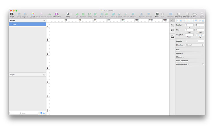
First thing you’ll notice is Sketch’s infinite canvas. You can scroll as far as you want, so if you’re creating a responsive web design you may want to set up your working area by adding artboards first. Simply type the letter ‘A’ and the Inspector will show up with some common templates.

Creating separate working frames, with customisable built-in grids, in a single canvas makes Sketch perfect for designing responsive sites and apps.
Scalability and Pixel Precision
Sketch works in vectors so it is easy to rescale the objects on canvas without losing quality and you’ll also get precise pixel control making it perfect for design in a world of different screen sizes and pixel densities. If you want to see the non-vector degradation, just switch to View > Canvas > Show pixels and you’ll see equivalent to exporting the image to PNG and then zooming in.
Shared Styles and Symbols
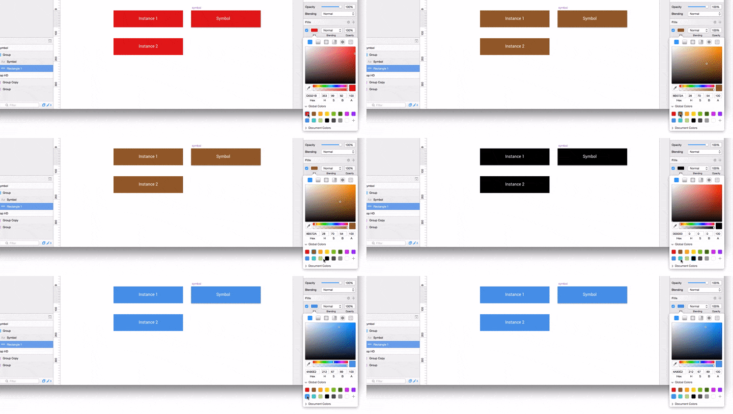
Symbols allow you to save time and make designs way easier to maintain by reusing elements across Artboards and Pages. To create a symbol, simply select a group, artboard, or a selection of layers and click the Create Symbol icon in the toolbar.
Although they are still not powerful like Smart Objects in Photoshop (resizing is not available), they still allow you to improve your workflow. If you use Atomic Design approach by Brad Frost the symbols page will give you an overview of all building blocks.
Plugins
Let’s face it, Sketch still lacks many features we are used to, but there is amazing community of designers and developers who have created impressive range of Sketch plugins and I’ll go through some of the ones I find most useful.
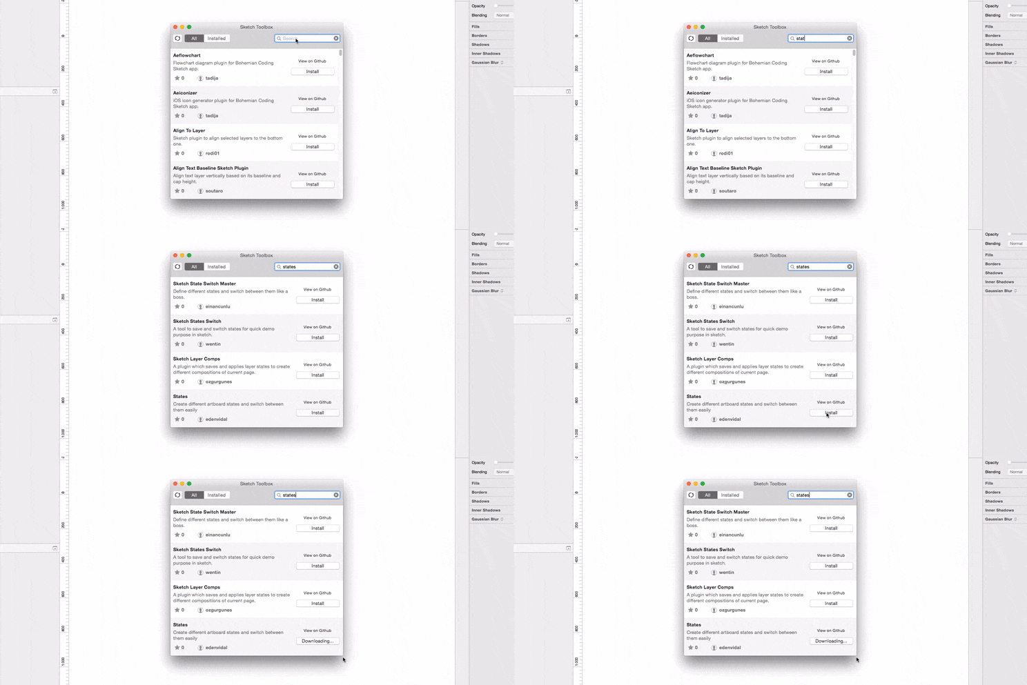
The first plugin you need to download and install is Sketch Toolbox. It is a simple 3rd-party plugin manager which allows you to easily browse and install plugins without much hassle. With a single click it will download and install new plugins while also keeping up to date the previously downloaded ones.
Dynamic Buttons
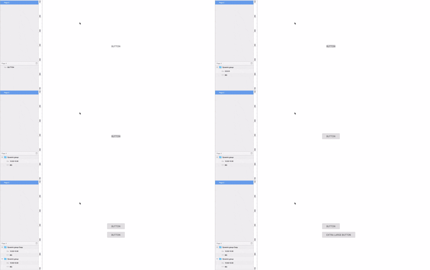
Let’s say we have a few buttons with the different labeling text and the same style. Dynamic button plug-in allows us to create buttons with fixed paddings so they automatically expand based on the text they contain.
Just create a text layer and use shortcut Cmd + J to create a dynamic button. After Dynamic Group is created, use CSS shorthands to define padding (e.g. 10:30:10:30) and use Cmd+J to update button. Now you can duplicate button and change text, to update just press Cmd + J and button will change automatically.
Craft
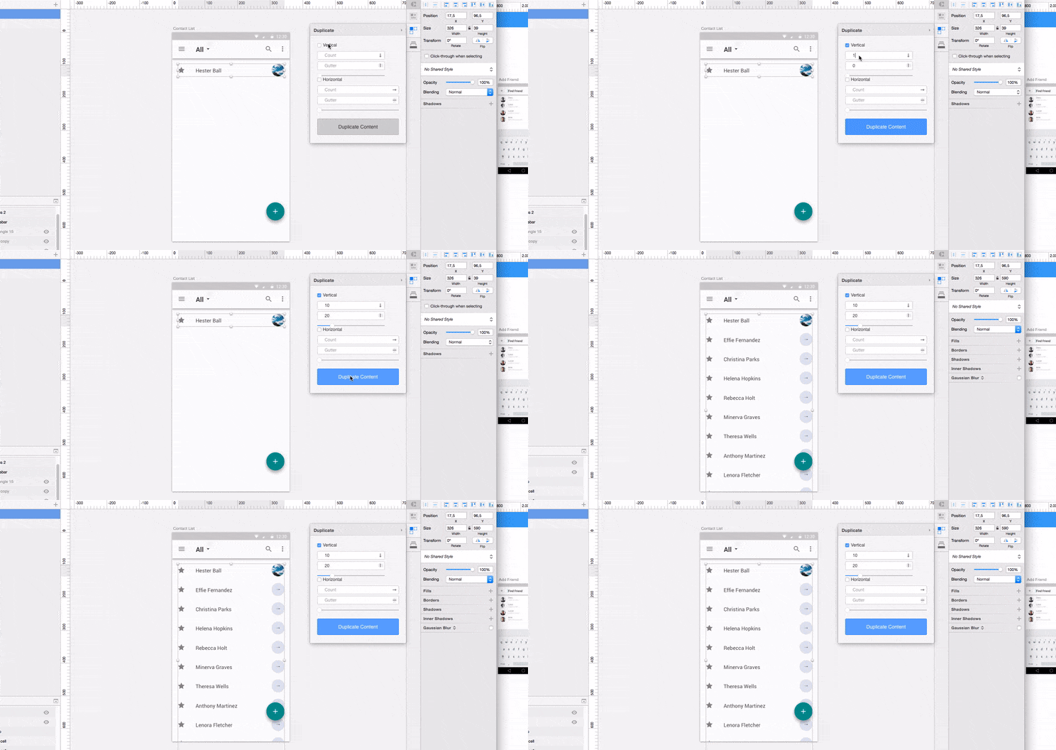
Craft is a plugin suite created by InVision Labs which comes with three plugins: Data, Duplicate, and Library. It allows you to quickly pull in contextually relevant content in your designs, duplicate design elements quickly with pixel perfect accuracy, and keep your design library cloud-connected.
Data

Duplicate
States
If you’ll ask UI designers what feature they would like to see in the next upgrade I’m sure many would say they want an equivalent to Layer Comps. Unfortunately there isn’t that feature in Sketch at the moment, but Eden Vidal created great plugin called States and it works similar to Layer Comps (you can change positions and toggle visibility of layers).

Sketch Palettes
Color management system in Sketch is really simple, there’s just global colors and document colors. If you want to create a different palette for each project, you’ll have to use a plugin. One of the best is Sketch Palettes by Andrew Fiorillo.
You can save color palette from either the Global or Document Colors.
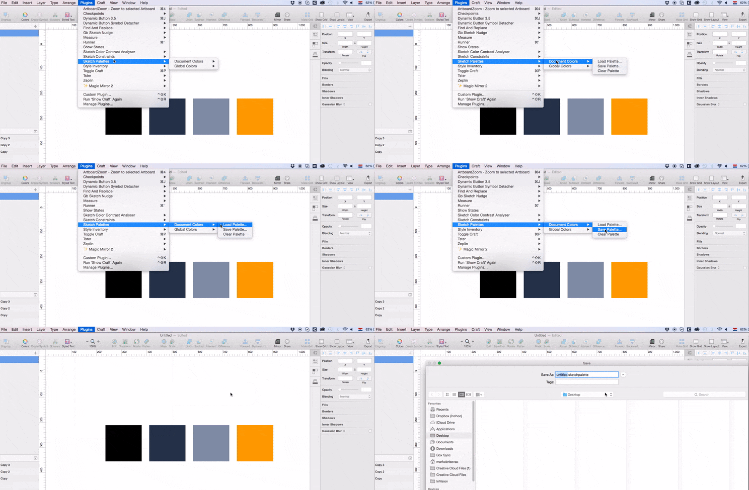
Once you’ve saved some palettes, you can load them as needed by opening a .sketchpalette file containing the colors you want to load. This will replace current colors in the selected section. Saving palettes in the cloud is also a great way to share them between the team.
Exporting screens and integration with other tools
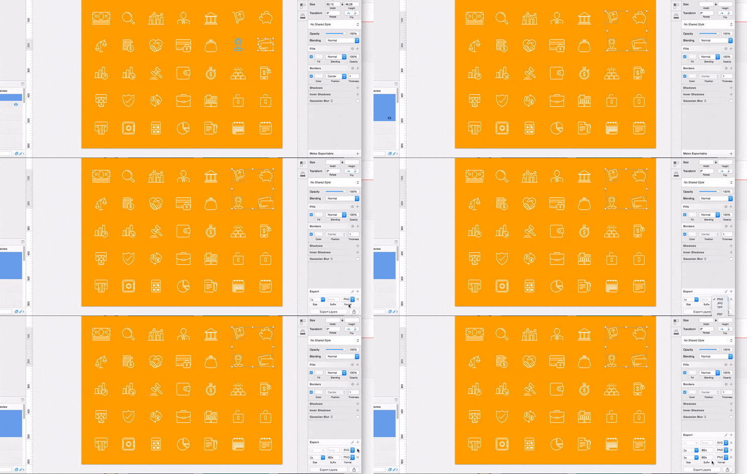
Many developers don’t have experience with Sketch yet, and since it is Mac only tool many of them won’t be able to open Sketch file if they are on other OS. For that reason, very often designers will have to slice up all of the assets for them. Fortunately, exporting the assets in Sketch is super-easy and it allows exporting multiple sizes and multiple formats.
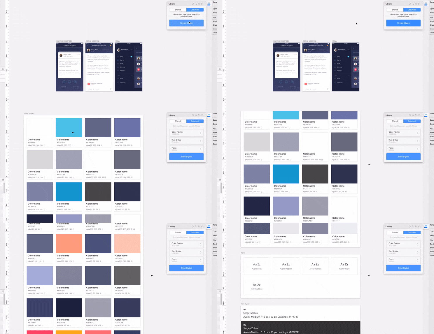
You will also have to spend some time creating a style guide in order to prepare styles developers will need to get started. Again, this won’t take you more than one click in Sketch using Craft Library plugin. It’s going to look an entire document and create a style guide in the new page named Styles.
Another option is to use collaboration tool like Zeplin. Sketch Zeplin plugin will send your artboards to project in Zeplin where you have up-to-date repository for collaboration with developers. Developers can click on a layer and see all the information.
Prototyping tools like InVision, Marvel, Framer and Principle have also their own Sketch integration, so you can turn your designs into interactive prototypes automatically without extracting your screens and assets.
Price
Comparing Sketch’s price to Adobe’s subscriptions revealed it’s cheaper in the long term. At this moment (v3.7.2) fixed price is $99 versus $19.99 a month for Photoshop CC. But it is important to mention that Sketch announced new Versioning and Licensing model. A license of Sketch will still cost $99 USD, but for one year of free updates.
The Future of Sketch
Sketch is not perfect yet, it does have a few downsides and lacks some useful features, but it is already a tool that makes design workflow much faster so we can focus on other aspects of design process. Also we shouldn’t forget it’s only a few years old and the team behind it releases new updates constantly. No one can reliably predict the future, but Sketch is definitely moving at a good pace. It will be interesting to see their reaction to Adobe’s XD, long-awaited design/prototyping tool which looks very promising too. One thing is for sure, the only one who will see a benefit from this war will be designers. We’re already working on creating the best user experiences – if you’re interested in seeing how, get a custom detailed eCommerce UX & usability audit from us!
