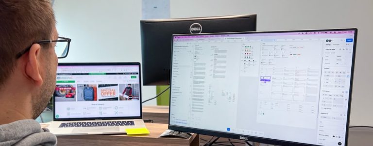
As a merchant, sometimes you may find high bounce rates, lower conversion rates than you’d like, or any other signal warning you of troubles in your online store.
Online merchants are leaving plenty of money on the table by missing a very important component of an eCommerce business: online store usability. Many of them fail in their primary goal of making purchasing easy for their customers.
So, why do customers leave and how to change that?
Customers could leave due to numerous factors, some will find a navigation too complicated or find themselves staring at a mobile page icons attempting to figure out what to do next. There are plenty of other sites which sell the same products and your customers aren‘t going to take time to learn how to use your site; they will just walk away and see if the shopping would be easier with your competitors.
There are many eCommerce usability guidelines online with actionable instructions which should improve your store usability and try to help you get the lower abandonment rates and boost conversion. However, there is one problem with all those guidelines, they’ve tested many eCommerce sites, but not yours.
It is true that most online stores face similar usability problems, but each business is unique with different type of customers, specific industry and business strategy. For this reason it is not possible to create feasible list of guidelines which will work for all online stores. What works for one online store may not work for another. Nevertheless, there is a way to find and resolve usability problems and make users less likely to abandon your site.
Auditing Usability Of Your Store To Detect Possible Flaws
Our Magento UX audit is a detailed analysis of store’s usability, created without any automation software. Main goal of this audit is to assist merchants with overcoming obstacles standing on the path to realize full potential of online store.
Comparing your online store against usability best practices is only small part of our UX audit. What’s different about this audit is web store accessibility analysis and analysis of micro interactions; areas that many tend to ignore or overlook even though they can have great influence on success of the store.
Another important difference is user research. Our goal is to better understand how customers are using your store and develop better experience.
It is possible to measure two types of data: quantitative and qualitative. Most agencies will use Google Analytics to collect numerical data that answer questions who, what, and when, but they fail answering more important questions: why and how? To answer these questions we need to use usability testing tools and methods. At Inchoo we use HotJar which allows us to collect heatmaps, visitors recordings, conversion funnels, and help us understand how visitors engage with a store.
To conclude, it is crucial to couple numerical data with qualitative data measurements to have a complete picture of users and their needs, to be able to detect possible flaws and compile a UX audit report.
With our Magento eCommerce UX report you get a list of recommendations based on both quantitative and qualitative data, that could help solve the issues that affect your store and improve usability and user experience.
Implementing suggested changes
With concrete design recommendations in-hand, we discuss the next steps together with a client. Sometimes, if there are too many issues to resolve, it is more efficient to create everything from scratch, but usually we recommend incremental redesign strategy to minimize risk, maximize ROI and improve your web store continually.
Let’s say one of the recommendations on your list is to consider switching from a carousel to an alternate way of showcasing important information on the homepage because your users aren’t clicking on it. Many merchants will probably suggest copying the layout from their more successful competitors, and many designers may follow suit without questioning it. However, at Inchoo, we take a different approach. We prefer to leverage data and the power of cognitive psychology to understand customers’ needs and optimize your online store based on their behavior. Explore our Magento Design Service to learn more about how we can help you create a customer-centric eCommerce experience.
A/B test – validating new design changes
Once we’ve collected enough data, we can set up conversion goals and create design iterations. However, we can’t be sure that the new design will perform better than the current version without testing. We need to discover which of the two versions will be more successful – should we go with the version A or version B? To find an answer to that question we should run an A/B or split test. This is the simplest testing method available. It is an experiment between different design versions of the same page used to test potential improvements. Once we find out which version is more effective at driving the behaviour we prefer, we are ready to implement the winning version.
So, are you facing usability issues on your store?
To conclude, if you fail in successfully converting visitors into customers, your visitors are probably facing usability issues on your store.
Recommended solutions are:
- Identify pages on your site suffering from usability issues by auditing usability of your store
- Gather quantitative and qualitative data to understand how visitors engage with a store
- With design recommendations in-hand set up conversion goals
- Create design variations for A/B testing and run a test
- Implement more effective design version
Whether you are running a successful Magento store or you are aware of usability issues, there’s always room for improvements so get in touch to get a detailed report with recommendations and guidelines to improve your users’ experience and increase conversion rates.


