As designers and developers, we often find ourselves in the same situation—starting a project from a blank file and setting up the basic building blocks, such as color scheme, spacing math, typography setup, and similar.
In another example, sometime after the initial project is done, we’ll approach a change request, but upon opening our tools, we will stop and ask ourselves things like:
- What was the spacing math here?
- What was the scale ratio?
- What was the default text color?
After a few hours of retracing our past steps, we are ready to begin the work. The time has passed, but no actual value has been created. In other words, the time we could’ve invested better is often misspent simply because our foundations weren’t sustainable.
For the most part, any design or development project isn’t a one-off, and eCommerce systems are no different. On the contrary, they are scalable at their core, so everything around them should be allowed to grow and progress.
A (design) trip down memory lane
In the beginning, there was Photoshop. One tool to master every graphics need one needs, be it photo manipulation, graphics, or web design – you’d go for Photoshop. In a way, you didn’t have much choice. Still, Photoshop lacked a vector design focus needed for scalability and responsiveness (though it didn’t matter much until responsive web design was born), had a poor workflow for any kind of interaction design, didn’t support any type of collaboration efforts, not to mention a pretty steep learning curve.
As for the development hand of – pdf, pngs, and jpegs were not your best friends if you wanted to achieve precision.
Somewhere in 2010, Sketch – a lightweight app focused on UI design was born. It had potential, but it was buggy, messy, and often brought frustration, so Photoshop was still a go-to app. Fast forward to around 2014/15, Sketch 3 came into production. Why this was a big thing can be put together in a single sentence from their release docs:
“With this new version, we have implemented our number one feature request: Symbols – the ability to re-use the same group in multiple places across your document and have all copies sync when one is updated. In addition, we have shared layer and text styles, allowing you to share the same style across multiple shapes or text layers, keeping them all in sync.”
For the first time, we had a tool to reuse interface components, sync changes across multiple instances, and share styles on different layers.
Reusable components in graphic tools marked an era when big things for UI designers started to shape up. Unfortunately, Sketch had one significant disadvantage—it was (and still is) a MacOS-only app.
Around 2019/2020, Figma caught traction and soon became the go-to tool for many design teams.
Its feature set was quite similar to the one Sketch offered at the time, but it brought us the following:
- It’s a cloud app, so your operating system doesn’t matter (Hello, Linux and Windows!).
- Since it’s in the cloud, there’s no need to share a new file with the team each time a design is updated—the team sees the same document and changes in real-time.
- Design collaboration – multiple designers could work on the same file simultaneously.
- Dev Mode – a bridge between design and development, making the handoff process smoother
- Native prototyping tools were introduced, and including animations—considered a significant “wow” factor at the time—made them stand out.
- We could easily import Sketch files into it and continue our work.
- Version control.
- In its basic plan, it was free.
Fast-forward another five years, and Figma is packed with many new and valuable features that are hard to beat when discussing interface design, scalability, design system management, and collaboration — especially with development teams.
Moving towards modern design & development stack
If there’s one thing we’ve learned through the years and tools, it’s that modern web design and development are impossible without collaboration. Ideas, feedback, and information must flow freely among team members, and understanding must be behind it.
When we say “understanding,” we think of two things
- Mutual understanding between the team members
- Understanding the creative process(es) behind the actual work of individuals, regardless of the department
As much as we tie creativity to the design due to its connection to the visual side, there’s much creativity involved in development that we often overlook because it happens “under the hood” of the site, but trust me—developers are incredibly creative.
Creative synergy
Web development and UI design still have bridges to cross, best described in the typical example – It’s easy to go wild using graphics software. However, going wild can easily result in budget and timeline challenges from the development end.
That’s precisely why active inclusion of all sides is needed to create creative design & development synergy. The experiences of different team members bring tremendous value from various perspectives. There’s never that one who can connect the dots solely.
This is more important than ever now. Today, designers typically have little or no coding experience, while developers often lack a design background—a stark contrast to ten years ago, when a “web designer” often handled both design and development as a one-person team.
Over the years, these roles grew apart, and people specialized in one or the other. This naturally created collaboration and communication gaps, often stumbling blocks for many teams.
When design and development collide – part I
We take pride in having designers and developers work closely together under the same roof. While this might not seem particularly significant—especially in a post-COVID world where remote work is the new normal—it becomes a powerful advantage when viewed through the lens of collaboration, mutual understanding, creative synergy, and shared experiences.
This unique combination forms a core pillar supporting much of what we do.
We actively discuss, confront, share ideas, and improve by learning from each other. We’re not just a group of disconnected people handing over the project assets one to another. We’re a team constantly pushing ourselves forward
Design and development workflows and systems
We’ve always used some kind of system(s) at Inchoo. We tried, succeeded, and failed multiple times: magic numbers, ratios, math-based style generation, asymmetry experiments, atomic design principles, components, and objects… You name it – and we’ve probably used it at some point.
One thing we learned about systems is that nothing is forever, and more importantly, nothing is set in stone. Things change quickly; some principles remain, some are twisted and put to better use, and some become a thing of the past. But this doesn’t stop us from optimizing our workflow as much as possible.
In other words, the point of the system is not to have it. It’s to evolve it repeatedly and adapt to the times ahead.
This iterative process aligns well with structured approaches like creating measurement plans, which allow teams to track the effectiveness of their work.
When working on a system, upgrading it, or evaluating its components, we always had a few main goals and a set of subset goals:
- Collaboration
- Working in multidisciplinary teams requires close collaboration. Everyone needs to be on board with this and understand its foundations.
- Reduce repetitive work
- All user interfaces share many of the same components, so they don’t need to be reinvented a few times a year just because they can be.
- Mainatability
- The system should evolve so that when updates are introduced, they don’t disturb the rest of production.
- Avoiding the bus factor
- Knowledge should be shared, and the system can not depend on one person alone – which brings us back to – collaboration.
- Decrease the average lead time
- Learn something new at each step and invest the knowledge to optimize the next one.
How we build scalable and collaborative eCommerce systems
It sounds like a cliché, but- it’s communication and respecting the needs of team members that form the base. Everything else is built on top of it and results in;
- Less need for frequent consultations
- Fewer reports in quality assurance reports
- Improved collaboration
- Faster handovers
- Improved time management
The backstory
Right around the time the design team wanted to end repetitive parts of the process, our frontend team was at a crossroads, trying out different CSS frameworks and tools to optimize the time needed to code our design deliverables. Our end goal was pretty much the same—decrease the time needed to launch a project while keeping the quality intact.
As we usually discuss these things amongst each other, both the design and frontend teams knew what the other team was having trouble with. In one of these discussions, a framework that seemed to kill two birds with one stone (no birds were harmed along the way) emerged.
As we, the designers, reviewed Tailwind, we noticed some similarities between how Tailwind works and how we set up projects in the design context. Spacing, color palette generation, etc.. It was pretty much along our alley – a standardized set of values used throughout the project with a few custom things here and there.
It seemed like our existing design workflow, but we always missed one key thing in every design tool we used – classes. That changed in the summer of 2023 when Figma released variables and disrupted the design workflows globally.
“Variables in Figma store reusable values that can be applied to all design properties and prototyping actions.”
If you came across Tailwind, this sounds familiar.
Tailwind in design context
Once on common ground, we needed to build a Figma library of Tailwind classes – and prepare a universal styles library based on Tailwind classes. We envisioned using such a library later be shared among projects.
This would streamline the basic styling between the design and frontend and make it much faster for designers and frontend developers to complete their work. In addition, such a common-ground approach would tick the boxes for our previously mentioned goals.
The logic behind it was simple – whatever the Figma variable developer sees should match the Tailwind class they should use.
For example, if some spacing variable is named “spacing-3” in Figma, the same “spacing-3” class should be used on the frontend. The result should be visually the same on both fronts. No questions asked.
The same principle was applied to
- Colors
- Typography
- Links
- Buttons
- Forms
- Tables
etc.
If we peek into Figma’s dev mode, we see how easily developers can see it.
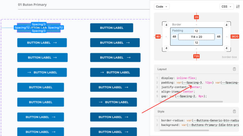
So, instead of inspecting and deciphering our previously fancy-named styles (such as nightly-sky and similar creative names we loved to use) and creating their own semantic variables, we simply use the same variable and class naming convention.
This approach improved team collaboration and made preparing and exchanging the work and feedback much faster.
Atomic Design Principles
If you need a refresher on Atomic design, read more here.
As noted earlier, reusable components in UI design tools have existed since 2014, and we’ve been actively using them ever since. The challenge with those was that you’d never have explicit property identifiers (in terms of classes) if you didn’t write them down near the element.
Doing that was tedious (and naturally, we never did it), so if you wanted to check what styles you used for, for example, input fields, you’d have to find and review an input field. And that’s the easy part. Imagine inspecting different headers or some other larger element properties. But that’s a horror story we’ll tell another time.
Atomic Design – with variables and variants
Since their inception in Sketch, we’ve used reusable interface elements, but the lack of classes hugely affected how they were used, overridden, or extended. A simple change would often require a new instance of the same thing with a minor adjustment, and the two were never synced amongst each other as they were visually the same but physically different components.
Let’s take a button, for example. It usually has the following properties
- background color
- border color
- text color
- padding
- radius
To build the button, you must also consider all possible states it may appear in (such as idle, hover, pressed, or disabled) and switch up properties for each. That’s a lot of work if you do it from scratch every time.
Component sets and variants
With the release of Figma’s variants, we got our solution.
Variants allow you to group and organize similar components into a single container. This simplifies your component library and makes it easier for everyone to find what they need.
In our case, component variants are those exact states. A single component, whether a button, navigation, or open or closed accordion, has all its states prepared in component variants.
The great thing is that changes are automatically synced from the initial component to an already overridden component in some other state (for example, changing the background color in the hover state).
For example, let’s say we have a button with five states. At some point, we decided the text label should be in bold font, not medium. Instead of switching the typography five times (5 states), we have to change it on the initial component, and all other states in the set will follow. The same will be reflected on each instance, wherever it may be among ~ 50 screens we usually prepare in the design.
In other words, there’s a “class” for the button’s text label, so just like in CSS, we can simply change it in one place in our tool, and it will be applied to the rest. Now that’s a time saver.
We apply the same principle to larger components, which may consist of other elements and other components and their variants.
Atomic design context
If we put this in the Atomic design context, here’s an example of what’s happening here:
Header component (organism) – contains the following components (molecules)
- search,
- wishlist,
- shopping cart link,
- navigation
Each of these molecules can have different states (variables) – the search can be active, navigation can be opened, or the shopping cart link can be hoverable.
To prepare a prototype, we’ll usually boil it down to shifting component variants per screen. If a change request comes in, there is no need to run through all the screens to make a change appear in many places – we just do it once. Again – this is quite similar to what is done with CSS classes.
Variables and classes in component context
If we look at the previously mentioned properties of a button,
- background color
- border color
- text color
- padding
- radius,
What becomes apparent is that these can work as CSS classes, and we already know that each CSS utility class can just as quickly become a Figma variable. If we start applying variables to our components, we’ll get much more flexibility and control over our puzzle pieces.
In other words, we can quickly re-configure our button’s appearance by shifting the variables without changing the button’s actual instance.
The same principle we’ve further applied to many different interface areas, such as
- Typography styles (such as sizes, weights, lists, links, etc)
- Input styles (such as forms, checkboxes, etc.)
- Pagination styles
- Product cards
etc.
Connecting things in such a way enables us to work with pre-built component libraries.
Component libraries
User interfaces are built around the same components — buttons, inputs, dropdowns, menus, toggles, icons, etc. There are always some specifics, but you’ll see most of the same elements if you’re looking at a banking application or an eCommerce site, whether you’re unaware of this or not, due to the surrounding context.
Since we’re an eCommerce agency, all our components live in the same context—eCommerce—giving us more leverage.
After 15+ years of experience, we’re safe to say we have a clear picture of the specific components needed to build any eCommerce site interface.
Using leverage and understanding enabled us to prepare different reusable component libraries—a set of interface elements transferable to any project at any stage, build, or growth.
For example, if a dropdown is needed to hide the filter values on a category page, we don’t build it from scratch on both the design and frontend fronts each time. A designer will simply take the element from the library and change its variables and variants to match the project styles. Frontend developers will later use the same principle because there’s a frontend counterpart of pre-built elements for each component prepared in the design library.
Since both use the same starting point and set of variables and classes, this is the easiest handoff you can imagine.
When design and development collide – part II
As you may notice, this isn’t a strictly design-themed article because crafting an interdisciplinary system requires an integrative, holistic approach encompassing perspectives from different fields.
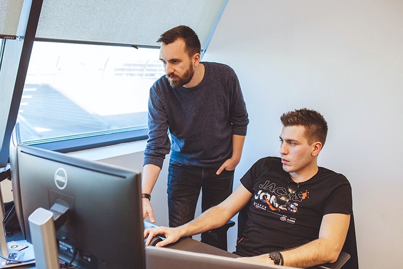
Innovation is free to thrive when design and development collide because creative ideas meet technical expertise. That’s precisely the spark of synergy needed to create exceptional customer shopping experiences while building a scalable, efficient, and maintainable eCommerce system behind the scenes.
In another perspective, this is the essence of teamwork—blending together diverse skills and perspectives of individuals into a unified system that achieves more.

