If you’ve ever tried to publish something on social media, you’ve probably gone through the wringer trying to use the interface. Especially if you’ve tried to publish an ad on Meta or LinkedIn. Try to choose a country? Or is it a region? Good luck, have fun.
So what’s wrong? Where does this problem originate? Why do some of the most used, everpresent web products on the planet have such unintuitive, difficult to use interfaces? The problem isn’t even just that the interface is hard to use – it’s incredibly slow. But we all need social media. If you’ve got a public presence, social media is inescapable.
Nevertheless, let’s take a look at some common social media platforms we all use and see what’s causing us trouble, and what we can learn from it.
UX Problems
What makes bad UX design? As concisely explained by Ramotion, an American award-winning design agency:
Any design that does not help the users accomplish their tasks or hinders their progress when they interact with it is an example of bad UX. From overwhelming the users to being the cause of multiple errors, bad UX can be detrimental to a product or service.
The simplest way to describe the interfaces on major social media platforms is – overwhelming. It’s cluttered, inconsistent, and often confusing. Perhaps it’s not so noticeable if you are an average user, but once you go deeper into the platform for business purposes, the sheer number of options undoubtedly hinders the user experience.
Further in the text, Ramotion analyzes Amazon Web Services, singling out the frustrating design of its main navigation. There is so much going on in the main navigation that it’s difficult to find the right information, especially on a device with a smaller screen size. Despite the aesthetically pleasing design, users are likely to feel overwhelmed and lost.
Similar issues arise on social media platforms such as Facebook or LinkedIn. Facebook is infamous for its cluttered interface and overloaded menus, as well as frequent design changes that have the power to make the whole experience confusing all over again. In fact, this has been a common complaint from 2012 to 2023. LinkedIn is also criticized for its overly complex interface, user-unfriendly search functionality, as well recurrent changes to its interface that make it hard to stay oriented.
Additionally, inconsistencies in how features and options are presented across different devices (desktop vs. mobile) can lead to confusion and a fragmented user experience.
Ultimately, these issues highlight the lack of adherence to user-centered design principles, such as simplicity and consistency, which tend to be neglected in favor of introducing more features and functionalities.
Publishing an Ad on LinkedIn
Let’s take an example of bad UX on social media: publishing an ad on LinkedIn. Just thinking about making an ad on LinkedIn probably gives you the shivers. It feels like you have to learn the interface all over again every time, doesn’t it?
It’s no overstatement to say its Campaign Manager is packed with features. On one hand, it’s understandable: you have to have a plethora of functionalities to create and publish the right ad. But there is an issue in how this information is presented and communicated.
Let’s take a look at how the process works. First, make sure you’ve got the right account. Then you have to create a campaign group. However, you probably wanted to create an ad, so if you’re not versed in LinkedIn’s vernacular, there’s a high possibility the terminology is already confusing you.
But once you’ve got your campaign group, you then have to create a campaign. Still not an ad, but we’re getting there. This is more understandable.
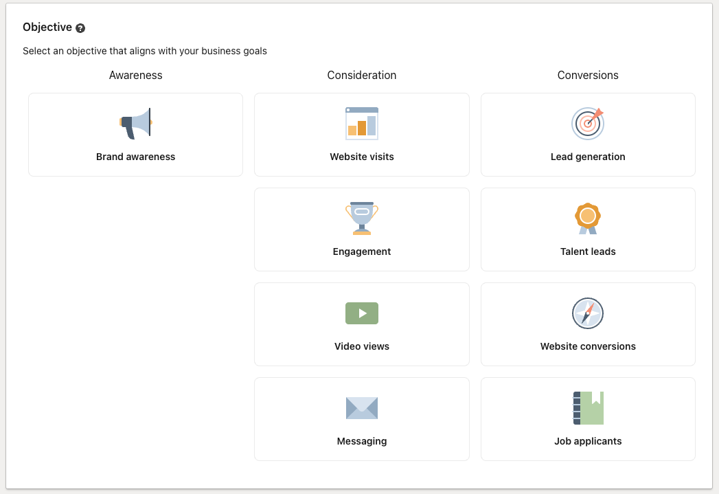
And once you get started making your campaign, this is your next encounter.

At first glance, this is clear as day. You know what you need, right? However, what does it actually mean? What’s the difference between choosing Website visits and Website conversions? How does it change the outcome?
There is an option to click the little quest mark next to Objective to further explore LinkedIn’s explanation of these options, but nowhere on this page specifically is that information plainly communicated.
The assumption LinkedIn seems to be making is that whoever is using this interface understands exactly what they need. But would not this assumption draw away less experienced users? What if the user is an owner of a small business who would like to boost a post about a new product? It’s possible they won’t have extensive understanding of these terms and would need to do significant research to figure out what they need.
And doing research is good, but it almost feels as if LinkedIn is deliberately making the experience harder. It’s overwhelming, time-consuming, and unnecessarily difficult to manage.
After overcoming this hurdle, new problems arise as you’re building your ad – this time not because of a lack of information, but because the interface becomes difficult to use. Choosing the right parameters for your target audience is an effort in itself. In order to target the right audience, you need to understand the nuances of job titles, company sizes, industries, etc. Further options such as cost-per-click (CPC), cost-per-impression (CPM), and cost-per-send (CPS) require you to know how each model works best and which one would suit your campaign the best.
It’s possible LinkedIn would like to avoid mismatched, low-effort ads. But for such a popular platform, conforming to the lowest common denominator in your UX should be a given. It should not be so unintuitive, clunky, and difficult to navigate, often requiring multiple clicks through various menus until you find what you need.
What can we learn?
If your users are frustrated using your product, you are doing something wrong.
Social media is complex. There is a level of understanding users might need some time to understand and absorb the interface, but rather than continuing to complain about the lack of measures taken to prevent frustration, let’s take this as a learning opportunity.
When building our Magento stores, we make sure to build user experiences that ensure simplicity, consistency, and user-friendliness. Excessive features and poor communication can deter even the most seasoned of users and complicate the user journey.
A well-designed user experience should facilitate, not hinder, the user’s ability to accomplish their tasks. Embrace these principles to create more effective, satisfying digital interactions.


