
It’s been over a decade we’ve been surfing using our mobile phones. Gone are the days we browsed the internet on mobile phones in a hurry, used it to kill some time while waiting (or riding) the bus or to check the weather for the day.
Over the years, our mobile phones became fierce rivals to our desktop device, and they are slowly and surely taking over.
In 2018, mobile sales accounted for nearly 40% of all retail eCommerce in the US, and projections are, that this will surpass 50% by 2021.
With so much retail sales going on on mobile, it’s quite clear eCommerce development teams need to give a lot of focus to mobile user experience, especially taking into account its limitations over desktop devices (such as screen sizes, touchscreens, interruptions, etc.) while all along web stores are becoming more and more complex.
Although responsive web exists for over a decade, it’s still quite common to run into neglected mobile interfaces, so we’ve listed the most common ones, mainly present in readymade themes and templates.
From our own experiences, it’s not that shop owners don’t care, it’s, in fact, quite the opposite. Most of them try to place themselves in the customer shoes – while getting ideas and requesting design changes – looking at their large monitors – while at work – working with desktop devices.
See the pattern?
That’s precisely why we always imply the importance of the mobile-first approach when planning the design strategy and approach, and why we always ask clients to check prototypes for mobile interfaces on their mobile devices and not on desktops.
Large monitors can fit much content, but designing for mobile from the desktop-first perspective is challenging if you’re trying to bog down feature-rich desktop experience to a stacked mobile experience, all the while trying to avoid super-long pages.
This brings us to the popular UX myth:
People don’t scroll
The myth’s been debunked more than a few times. Yes, people do scroll, the fold is a mythical creature that lives in a magical forest, and the scroll action is natural. Yes, this is true – for lengthy content pages like articles, tutorials, etc., but a lot of the heatmaps from web stores tell a different story – you can’t directly apply the same rule to an eCommerce site.
Don’t get me wrong – people do scroll while shopping, but not as much as we think. Less than 50% of visitors go below two screenfuls. Why is this? Well, it’s simple – people scroll if they have reason to do so (e.g., reading a blog post).
This is why it’s vital to start from a mobile-first approach and prioritize content. At the same time planning it properly, in order to keep the high priority content closer to the top of the page. Planning to encourage scrolling rather than using false floors (such as fullscreen hero content) or too big of a margin between sections.
people will scroll unless you tell them not to.
example from Lina Hansson talk at #gconvert18 pic.twitter.com/m7Ij7MVCMO
— Luke Wroblewski (@lukew) November 6, 2018
While on the subject of myths, there’s a significant dispute going on for years:
The hamburger menu
It’s kinda like “It’s bad UX, you shouldn’t use it,” but everyone still uses it. From an eCommerce point of view, it’s tough to find an alternative way to cover the category tree without cluttering the interface thus enabling direct category access while having a single element throughout the site to act as navigation. It sounds complicated but isn’t.
The icon itself is recognizable and well-accepted among users, so we can’t say it’s not discoverable (meaning someone won’t find it). Just one look at any heatmap, it’s clear that, alongside the search, this is the most used element. I’ve already written about different types of navigation, but to summarize – if you have a limited set of categories, you have some options. However, if your categorization is extensive (and most are), chances are you’ll find no better alternative to cover your gound for the main navigation. But this doesn’t mean you can’t pull a few additional tricks to avoid relying solely on it.
“Recent tests suggest e-commerce sites could see an increase in mobile conversion rate by adding a bar of [category] navigation links” https://t.co/iY5F59za4p pic.twitter.com/4UwbXl5W8c
— Luke Wroblewski (@lukew) August 7, 2019
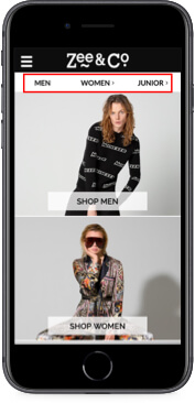
I’ve always loved how elegantly this is solved at Zee & Co website. The site comprises of men/women/junior stores, and all three are available right off the landing page, without the need for opening the navigation. Perhaps it won’t provide direct access to a specific category (like men> accessories > sunglasses), but it’ll tell you that they stock men, women and children’s apparel. This is something you won’t find on many apparel stores without taking a look at the menu itself.
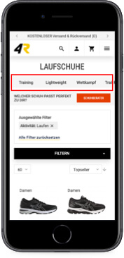
Moreover, it’s also transferable to a category page. An excellent example can be found at Shop4Runners website. Why browse the main navigation all over again every time a user just wants to switch the subcategory?
Some recent tests suggest eCommerce sites might see an increase in conversion rates just by adding this type of navigation link.
Speaking of limitations, touchscreens have a significant one:
The moving finger
Some time ago, when first “touch devices” appeared, we used styluses for interacting with touchscreens, but as technology progressed, along came the screens that recognized the touch of a finger which kind of gave us an issue – the finger is rather thick which is bad for accuracy.
Adequately sized touch targets are critical for using a touch interface. Based on a study conducted by Parhi, Karlson, and Bederson, for users to quickly and accurately select a touch target, its minimum size should be 1cm × 1cm. A past study from the MIT Touch Lab found that the average person’s fingertips are 1.6– 2cm (0.6–0.8 in) wide. The impact area of the typical thumb is even larger — an average of 2.5cm (1 inch) wide.
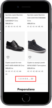 Examples of this type of minimalistic pagination are oddly quite common to find in web stores. Odds of hitting page 3 while trying to tap the link for page 2 are 50% because the target area is just too small.
When the touch target is small, it takes more time for users to tap it (Fitt’s law) and it increases the chance of accidentally tapping the wrong target if it’s placed too close to the desired one. Pretty much what happens on the pagination on the image to the left. Even if an error is avoided, just noticing that an element seems problematic to select creates the perception that the interface is difficult to use.
While we’re on the subject of touch elements, there’s an evergrowing debate on:
Carousels
Carousels on mobile have an essential role – they fit a lot of content into a small area, which is great because the screen real-estate is small from the start, but they do come at a price.
They are often affected by:
Low discoverability – it’s quite easy to miss that something is a slider.
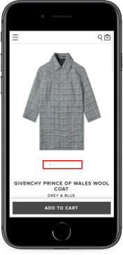
Cues like subtle circles, squares, rectangles, etc. are usually not enough for a user to understand. One would expect to see more product images on this screen, but there are none – oops! I missed the circle cues.
Sequential access – carousels are quite inefficient as well because they require the user to scroll from the first slide to the last one, without direct access. This is especially an issue if there are more than 3-4 items in the slider. This is because most people stop sliding after reaching this number.
Don’t respond to a swipe motion – some older sliders won’t react to users’ swipe motion, but rather force them to use arrows. And that is only if they exist, because many times the only “navigation” is the dots that are too difficult to tap accurately.
So when thinking about using a slider, beware of placing too much content and use strong cues and adequate navigation patterns to avoid ambiguity.
Talking about sliding things, we often see:
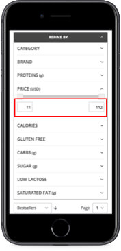
Range sliders
Range sliders are an excellent choice if a precise selection is not necessary (like your phone ringer volume), but when in need of accurate selection, sliders are entirely useless.
Anyone who’s ever tried using it with precision knows the frustrations – small target area, obscuring textual value with your thumb while adjusting it and accidentally releasing it and getting unwanted page refreshes with accidental filters applied.
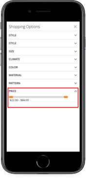
If you feel the slider is the way to go, or if you have a specific feature that needs the slider, always try to have a backup option in forms of input fields or similar.
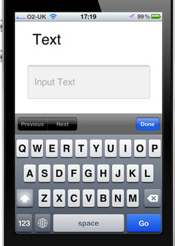
In terms of accuracy, we often see every input filed set as type “text,” although different input types trigger…
Different keyboards
There are a lot of input types – text, email, number, phone… All of these trigger different keyboard layout enabling users more precision, less chance of error, and giving them a clearer idea of what the input is supposed to be.
For instance, many times during checkout, users are asked for their email address and a phone number. If the input type for a phone number’s been set to “text”, this is what they’ll see:
However, if the input type is set to the appropriate one, they will see this
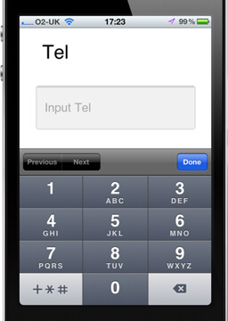
And this makes much more sense, doesn’t it? So, when creating mobile interfaces, consider the input types you’re using!
These were just some of the most common annoyances found in today’s online stores. They are all quite easy to fix, but somehow always go below the radar.
What’s next?
Do you want to check your website for similar hiccups? We can help you do a UX audit of your website. This way, you will get a detailed report of your website’s UX and expert advice on changes that will improve your usability and increase conversions!


