Last month I’ve seen one of our clients suffer from an unusually high checkout abandonment rate. I found out they installed a OneStepCheckout. We rolled up our sleeves and tested the OneStepCheckout extensions versus Magento’s default Onepage checkout. I can’t name the client or disclose more info than I did in below. Results? For me expected, for some, very surprising.
In this particular case Magento’s default Onepage Checkout brought almost 2 times more checkout successes than OneStepCheckout (sample size a bit over 200 transactions, ~2 weeks test period).
Magento industry is crazy about OneStepCheckout so much that they forget about the most important thing: always test everything. No case study is universally true – you have to test it on your own store, on your own customers. In this case, Magento’s checkout was almost 2 times better, but I’ve seen cases where it’s a completely different situation. You can’t just take a case from some other store and assume it will bring the same results for you.
Please note, I’m not saying you shouldn’t buy the OneStepCheckout. As the matter of fact, please DO buy it and test it to see if it performs better in your case, since even a small improvement on the checkout abandonment rate could return the investment on that extension pretty fast.
BTW. I can see I’m not the first to find this relatively surprising result, there is an article from Netmedia about it. I also see there are lots of troll comments on the article, possibly from the people that develop different onstepcheckout extensions. Troll comments on this blog post will not be tolerated.
OneStepCheckout and Onepage Checkout are not the only options
Don’t limit yourself to testing only these two options. FIrst of all, OneStepCheckout is not the only one step checkout extension for Magento. For example there is a GoMage LightCheckout which is totally worth checking out and there are quite a few more competitors out there.
Also you can test some other modifications of Magento’s default Onepage checkout, such as removing (in your case) unnecessary steps – I’ve seen this one often. You can also try and play around the first step, which is proven to be pretty problematic. I gave some interesting thoughts about improving Magento’s first step of the checkout based on a solid research by Jakob Nielsen in one of my older articles.
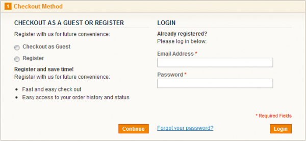
In his research, Jakob concluded that the first step of the checkout such as the one Magento’s Onepage checkout has is pretty confusing to the average user and based on a real people sitting down and trying to go through it on a pretty nice sample – they don’t read and they don’t know where to click:
They tend to:
- Write down their e-mail and password and click “Continue” instead of log-in – they can even repeat this behavior without adjusting their strategy and clicking on another button several times and often give up
- Write down their e-mail and password even though they are not registered user
- Click on “Register” select box and then write their e-mail and password on the right thinking they are going to register with that e-mail now
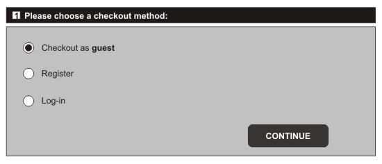
That’s why I proposed one of the solutions for the first step you can test would be something like this:

There are several innovative approaches I’ve seen so far with combining cart and checkout into a single unit, but with little conversion rate and abandonment data, I can’t say if they actually worked well.
If you take anything home from this article, let it be: always test everything.
If you did test everything and something still seems to be off but you can’t quite figure out what, we’re here to help. Feel free to contact us – we can start with simple yet effective UX & usability audit and go from there!
EDIT: I wrote some more on this topic after a few nice studies have been released and concluded that the number of checkout steps doesn’t really matter.


