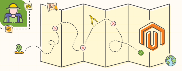
The amount of checkout steps doesn’t matter!

The amount of checkout steps doesn’t matter!

E-commerce industry has obsessed with the amount of checkout steps in terms of conversion rate optimization for far too long. It’s time we put a stop to it. Lots of businesses – services, extension providers etc. – were built upon idea that one step checkout is far better for your conversion rate than multi-step checkout.

These services will continue pushing case studies where one step checkout has performed far better than the multi-step checkout, however there are clear cases where the opposite is true.

The truth is, the amount of steps doesn’t really matter! It’s WHAT and HOW you ask your customers for information that matters.

It’s a cruel truth and I’ll give you two links that that will help you see my point:

Accordion Style Checkouts – the Holy Grail of Checkout Usability?

This amazing piece of content is produced by researching top 100 e-commerce website’s checkout usability and reporting on findings. The article suggests that accordion style checkouts might the best option at the moment, but if you dig deeper into the article, you’ll figure out that the message behind it is that it doesn’t matter if it’s accordion, one step or multi-step checkout. What matters is how you ask your customers for data. How easy it is to fill out the forms. How usable the checkout is and so on.

The best point I’ve seen in that article is that users perceive accordion style checkouts as multi-step checkouts, and they might use the browser back button to go to the previous step, which in most accordion style checkout implementations wouldn’t bring you to the previous step but to the URL before that. This behavior often results in checkout abandonment due to frustration.

Just look at your funnel if you have it properly set in Google Analytics to track each step of the checkout, and imagine yourself on one of the last steps of the checkout process hitting the back button to correct something on the previous step, and you’re taken right back to cart and have to go through the checkout process from scratch once again. You’d be pissed right? That’s how your customers feel.

The State Of E-Commerce Checkout Design 2012

Among the top 100 e-commerce most grossing websites the average checkout process consists of 5.08 steps. These are the companies who invest a lot of money in conversion rate optimization testing. The difference in just 1% could mean millions and millions of dollars for some of them. Do you really think they wouldn’t push for one step checkout if it really was the holly grail of conversion rate optimization? Yes they would but it’s clearly not the case. The case is, just as in previous article, that the amount of checkout steps doesn’t matter.

You have to solve the usability issues of the checkout. Don’t ask for the same information twice, don’t ask for information that’s unnecessary to complete the order. Allow guest registration if possible, or write clearly to users that they are not automatically subscribed to the newsletter if they register, since this is the most common reason why they don’t like to register.

Why would people think that registering is equal to automatically subscribing to the newsletter you might ask? It’s not just because most online stores pre-select the “register for newsletter” box, it’s also because some of the biggest stores in the world actually automatically register you for the newsletter without the box! They just write in terms and conditions that by registering you’re also subscribing to the newsletter and that’s it.

So if your store requires registration and you can’t allow guest checkout (for example, you sell downloadable products that have updates so users actually have to register), you should clearly mark that by registering users are not subscribing to the newsletter, and also a nice trust sign in form of the image of a lock with a tool-tip explanation might be useful next to the e-mail field in the checkout process.

To conclude: concentrate on removing the pain from user experience in checkout rather than reducing the amounts of steps.

Related Inchoo Services

You made it all the way down here so you must have enjoyed this post! You may also like:

Add static content in Magento Checkout address form Mladen Ristic
, | 2

Add static content in Magento Checkout address form

How to display CMS block in Magento 2 Checkout Nenad Andrakovic
Nenad Andrakovic, | 7

How to display CMS block in Magento 2 Checkout

Tracking Onepage Checkout abandonment using Google Analytics Drazen Karacic-Soljic
Drazen Karacic-Soljic, | 70

Tracking Onepage Checkout abandonment using Google Analytics

1 comment

  1. based on my experiences one page checkout goes well and converts more, in my recent couple of proejcts i was asked to install one page chekout module and none of the clients liked default checkout.

Leave a Reply

Your email address will not be published. Required fields are marked *

You may use these HTML tags and attributes: <a href="" title=""> <blockquote cite=""> <code> <del datetime=""> <em> <s> <strike> <strong>. You may use following syntax for source code: <pre><code>$current = "Inchoo";</code></pre>.

Tell us about your project

Drop us a line. We'd love to know more about your project.