So you’ve decided to do a complete site redesign or came to a conclusion your metrics don’t behave as you thought they would? Have you finally decided to implement that feature you’re sure will skyrocket your conversions?
Here are some common eCommerce design pitfalls we often see in the wild you think about when considering taking the next step in growing your eCommerce business.
Table of contents:
1) Don’t use yourself as a typical persona
2) Always track changes and new features
3) Optimize for your customer’s device, not yours
4) Be clear on the category hierarchy
5) Don’t skimp on search functionalities
1) Don’t use yourself as a typical persona
A common thing both web designers and merchants sometimes do is think they know what’s best and subjectively walk the straight line without looking left and right. We tend to define needs based on something an individual assumes is necessary. Hence we often fall into the assumption trap — if it solves my problem, it will 100% solve everyone else’s. In other words, if something makes sense to me, then it must make sense for customers as well.
Well… not quite. While some things may be “as clear as day” to you, you’d be surprised how many people would think of or imagine the same thing completely differently.
While you should aim to solve your challenges, and achieve your business goals, always remember that you’re not your target customer. You must always test how customers will respond to it. If they don’t get it, it won’t aid your business goals.
2) Always track changes and new features
So you’ve just launched a new feature on your eCommerce website. It’s awesome. The dev tools console doesn’t give any errors. You’re pretty confident this will revolutionize how your customers use and perceive your store. Three months later, your sales are doing fine. You are satisfied, but do you have an idea how the new feature affected sales and customer behavior?Are the customers now using this new feature, or are they behaving the same way? Do the ones who use it convert more frequently than the ones who don’t? Did the feature have any impact on your sales?
You’ve invested time and money developing a new feature. Always track changes to define their exact impact. It’s the only way to see if they’re working as you thought they should, or do they need a bit more work.

Remember, a change is not a one-way street. Always analyze your metrics and set meaningful tracking if necessary to know what exactly is happening and how it affects sales and behavior.
3) Optimize for your customer’s device, not yours
We (merchants, web designers, developers, marketeers… you name it) usually use our big screens at work. We’re used to seeing a large canvas with lots of possibilities. And I’m sure that a quick look at your analytics will often tell you most of your customers use small screens — their mobile phones (this may not always be the case, but in eCommerce retail – it usually is).
It’s often quite challenging to scale something we have in mind, and that’s precisely why we must think responsive from the start. Having a feature designed fully for one screen size without parallelly testing how it may look and feel on another screen can get you in serious trouble. You can easily see the difference in conversion rates if things go sideways.

A common scenario is — it looks great on one device, but on the other, the elements are arranged differently. Things disappear off-canvas, making them hard to discover, and the feature loses principles of proximity and similarity.
Always check what screen sizes your customers use and optimize the feature for that screen size first, but at the same time test the look and feel on other screen sizes. Never degrade a feature based on screen sizes.
4) Be clear on the category hierarchy
eCommerce websites usually have lots of categories presented in the menus. Navigation is the data architecture customers use to identify store hierarchy and parent-child relationships between the categories.
While it’s excellent to place some subcategories in more than one category, some stores overcomplicate this. We often see mixing categories, subcategories, and popular filters in the navigation. On top of this, everything is nested everywhere with no clear hierarchy and relationships between them.
Such an approach makes a complicated and too deep hierarchy, making the customers uncomfortable because they become unsure where to look for products they need.
Identifying the appropriate category path becomes quite tedious, time-consuming, and contains lots of dead ends. In other words, it quickly leads to customer frustration.
Overcategorization can easily be recognized if your customers use search more than the main navigation.
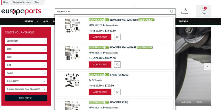
Unless your industry is specific, such as automotive (where customers often search for products based on the product number, and that’s expected) a lot of search usage combined with lots of u-turns on the site indicates something’s off with the main navigation.
Always make sure the category hierarchy is clear, transparent, and easy to scan and understand. If you have any doubts about doing it well, you can always try a card sorting test or check how stores selling similar product ranges handle this. They maybe don’t do it perfectly, but checking out your competitors can help you discover what your customers see and expect in stores with similar product ranges.
5) Don’t skimp on search functionalities
Onsite search engines have come a long way. Today we have tools like Elasticsearch, Algolia, Klevu, and many more. However, surprisingly, we still have stores with poor search support.
They often require the exact words to find products (for example, “blow dryer” query won’t return hair dryer products). They can’t identify spelling mistakes, don’t have autocomplete, and similar.
We often see customers who search and then convert far more often than the ones who don’t. Still, we should distinguish the usual groups of customer who search:
- the ones who know what they are looking for and have a search and buy mindset,
- the ones who got lost in the main navigation and are looking for a way out of the mess.
Regardless of the group, your search engine should always get customers to where they want to be by supporting this purchase path as best as possible. Make sure your search engine can understand synonyms (check your search dashboard often for 0 results queries), offer quick results, and handle typical queries in your search dashboard or Analytics.

A thing to remember is that the search should always retain the user-typed query in the search input field. Lots of times, customers will want to refine their search (search immediately after they perform a search) by adding another keyword (or multiple) to the original query. Not saving the input forces the customer to re-type the original keyword again.
How do you go about a website redesign or adding new features?
These are some of the more common pitfalls we often encounter in our day-to-day work. Is there anything we missed that you’d wish to add to the list? Tell us about it in the comments!
Be sure to get in touch with us if you need help improving the usability of your store. We wouldn’t mind adding our own unique flavor of Magento to your online store if you asked for it!


