In this blog post I will talk about some of the most critical areas of Magento’s conversion rate optimization process – Magento’s shopping cart and Magento’s checkout page.
Online store owners often don’t realize how much more money they could earn if they invested just a small amount of time and money into conversion rate optimization. Each store is unique and different, with different products and design, different customer’s demography etc. This means that each online store needs to be fine tuned to achieve optimal number of sales. This fine tuning process is called conversion rate optimization (CRO).
Although each store is unique, some things in Magento are universal and some mistakes are made very often. I will outline two of the most critical conversion rate issues with Magento’s cart and checkout page…
Magento’s Shopping Cart Page:
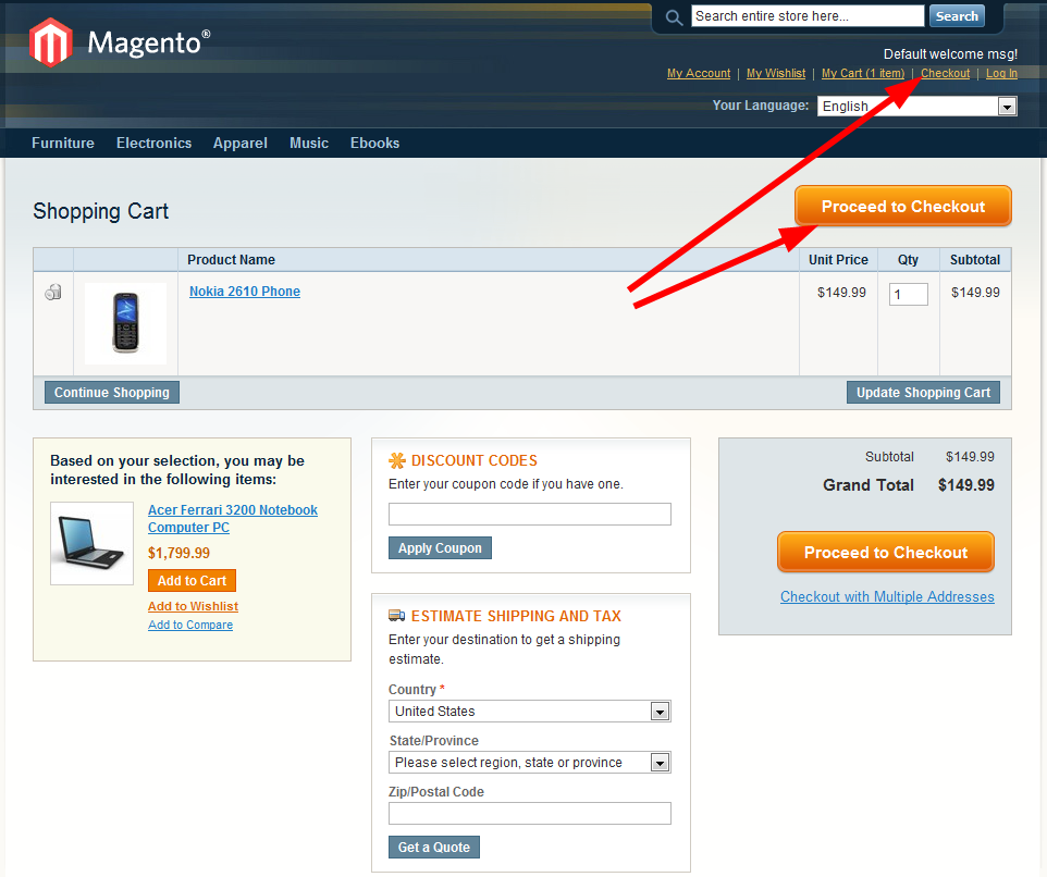
Shopping Cart – a place on your online store where you want your visitors to click on the “Proceed to Checkout” button as soon as possible. Remember the mentioned definition for if you stick to it while you are designing this page, you will reduce the risk of making conversion rate problems on this step.
Design of shopping cart page in Magento’s default theme is very good. The problem often appears with custom designed online stores. We had a client that had a custom design in which the “Proceed to Checkout” button was the same size and color as other buttons on this page. The cart abandonment rate was amazing 52%! After we changed the button to be bigger and in different color, we made cart abandonment rate decrease to only 19%. This means that we almost doubled the amount of sales this online store makes by changing the size and color of one button on the Shopping Cart page!
While we’re talking about the checkout button, note that there is one pretty important link in the top right corner of your Magento store that usually reads “Checkout”. As you can see on the example of this button, “Go to Checkout” sounds like very effective call to action, so I suggest you rename the “Checkout” link into “Go to Checkout!” link. Additional, here is a case study at GetElastic that supports this argument.
Magento’s Checkout Page:
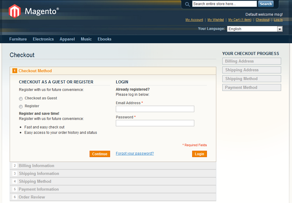
Once we made our online shopper click on the magical “Proceed to Checkout” button, he is faced with the biggest challenge of his online shopping experience – completing the first step of the Magento’s onepage checkout process. This one is actually seriously flawed in the default Magento design.
Have a long critical look into this screenshot and imagine yourself in a role of typical non-tech-savvy person. Do you know what you need to do on this step?
This page makes no sense whatsoever to an average online shopper and he will have terrible time overcoming this obstacle. If your visitor didn’t leave you on this step, consider yourself lucky, for this shopper loves you very much and he made lots of trial and error attempts trying to move forward.
According to Dr. Jakob Nielsen’s study, the average user will not be able to figure out which button belongs to which part of the screen and will probably fill in the details on the right and hit the button on the left. User will repeat this behavior numerous times, not figuring out what seems to be the problem. This is caused by users not reading. They automatically fill what seems to be necessary.
Magento makes this problematic step even worse by putting the red star symbol and marking input fields on the right appear as required while they are actually not required unless you want to log-in.
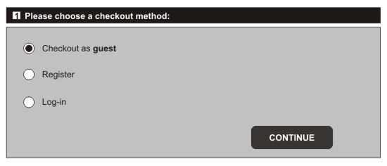
I propose this solution which requires some custom programming:

As you can see, everything is in one step and requires not much thinking or reading. User have guest checkout preselected so that “Continue” button is immediately clickable. You can either show the login fields once the Log-In radio button is clicked on the same page or simply put the login form on the next step.
Enjoy your higher conversions!
For any other bumps on the road regarding your Magento shop, we’re here to check out your site with our SEO audit and help your business and revenue grow!


