Ready to give your customers the best user experience on your Magento 2 store, but you’re still not sure how? Let us highlight some of the best UX features for Magento store owners included in Inchoo Flavored Magento, which we already introduced you to in our previous article.
Inchoo Flavored Magento collects the best UX modules for Magento store we developed in-house, following the latest best practices for creating a great user experience. They consider things like user flow, navigation, and checkout process to ensure the experience is intuitive and efficient.
That being said, we wanted to give you a more in-depth look at those features, how they differ from Magento’s default settings, and how they can work to your advance. We’re talking about UX features such as live search preview, order comments, and load more functionality, which will significantly impact your Magento store’s user experience. Without further ado, let’s dive right into it!
Better Breadcrumbs
Website navigation wouldn’t be the same without breadcrumbs. But what’s the point of them if they aren’t doing your visitors a favor? Some breadcrumbs crumble better than others, and those are the facts. If this makes sense to you, we think you’ll find our breadcrumbs satisfying.
Website breadcrumbs are useful when visitors try to find their way around complex product catalogs. Breadcrumb trails should logically and accurately reflect your site’s hierarchy and appear on both category and individual product pages.
Generally, Magento’s breadcrumbs come in three possible types: hierarchy-based, history-based, and attribute-based. While all of these are great, they do have a fault we noticed and wanted to solve with our version of Magento’s breadcrumbs.
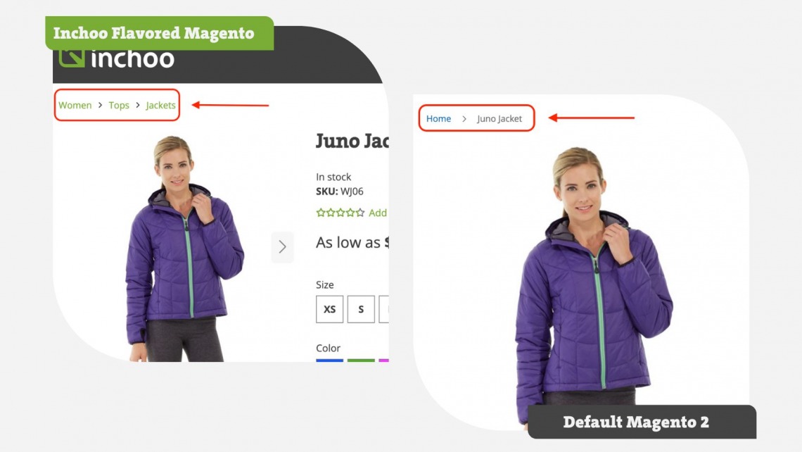
The thing is, when you land on a product page straight from SERP, your breadcrumb trail will look somewhat like this:
Home > Product Name
We’re not really a fan of that, and neither are your customers. Why? Because it assumes the user landed on that product page straight from your homepage, and it only allows them to go back there. It’s like a point of no return, except to the homepage. The whole point of a breadcrumb trail is to help customers know the correct product category, so if the product they landed on doesn’t suit them or is out of stock, they can find similar ones faster and with fewer clicks.
So we took the matter into our own hands and adjusted breadcrumbs to navigate the user back to the right category rather than to the homepage. If the product is in more categories (let’s say Men Outerwear and Sale), you can choose a preferred breadcrumb category or even set it to never show up in any other.
To sum up why we claim ours is better:
- You can have more control over breadcrumbs
- Customers can easily find similar products
- Happy Customers > Frustrated Customers
Load More Functionality on Product Listings
You know how these days everybody seems to scroll to infinity? Well, the same situation is with websites, too. Users nowadays aren’t fond of pagers, which is how Magento handles product listings with lots of products.
The Load More Functionality on product listing pages allows users to view additional products on a category or search results page. They can seamlessly scroll down all the products just by pressing a “Load More” button. This may not seem like a lot because it takes just one click to either press the “Load More” button or press the number 2 page on a pager, but there’s more to it.
Even if you don’t have chubby fingers, it must have happened to you at least once that you pressed a completely wrong page from the one you wanted to land on. A bigger button prevents that from happening because there aren’t multiple tiny buttons. It’s just one. You can’t miss it, and if you do, the chances are likely nothing will happen because you’ll be pressing on white spaces around the button.
Now that we’ve eliminated the “mistake rate,” there are also performance benefits. As the user keeps scrolling, our module automatically requests the “new page,” allowing the browser to load all the content in the background without the need to refresh the page. When the user finally presses the “Load More” button, he won’t have to wait for them to load. Collecting cache? Yes. Works along with your GTM events? Yes.
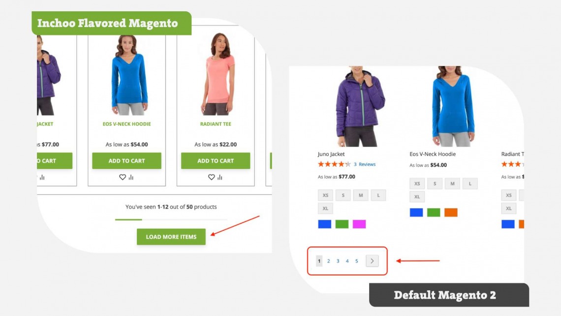
This new feature is completely customizable, it can come in all shapes and sizes (even a progress bar can be added), and it can say whatever you want it to. Here are just some ideas:
- Load more
- Load more items
- Show me more
- Show more products…
Why do you need this feature:
- Clicking one larger button creates the perception of speed for users
- Actually improves speed and store performance by saving cache and reducing the number of page loads
- Completely customizable feature to your needs
Live Search View
Let’s talk about search, one of the most important features of any eCommerce store. The true essence of it, really. The search engine allows users to quickly and easily find the products they are looking for. It’s crucial for stores that have a large number of products. To keep your visitors from being overwhelmed, you must ensure the search bar works as smoothly as possible.
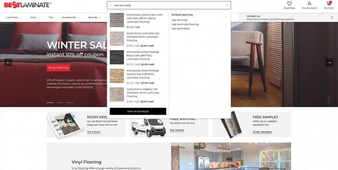
We wanted to chip in on that and developed our module Live Search View, which can work with any search technologies to your preference. The problem with the default Magento search is that it doesn’t really do it for users. If you type in your search term, let’s say it’s a “green shirt”, it will only show you how many green shirts are on the site. Then you have to click on it and maybe even go through a few pages to find the product you’re looking for. See the place for improvement?
With our Live Search View, the suggestions appear after typing in three letters, and they appear in a search box dropdown. The suggestions could contain categories, brand names, product names, images, SKUs, and prices, and it can even search blogs if that search term was used in any of them. All that is configurable to your needs, from minimalistic to giving (almost) all the info. The search experience is also easier because users don’t have to press Enter for search terms to appear and wait for the page to load.
It works just like the name says, live – when a user deletes or adds a few more characters, the suggestions simultaneously change.
Why this works for us and can work for you:
- All information shown in the dropdown can be configurable in admin to your needs
- Fewer steps while searching
- Less frustration because customers can find their desired product faster
Better Sort Order
The sort order on Magento stores refers to how products are arranged on a category or search results page. Magento allows store administrators to specify the default sort order for products and allows users to change the sort order on the frontend of the store.
The most common sort options are by position, price, and name. Your store’s visitor may want to sort products by price increase, from low to high. To do so on Magento’s default sort order, he has to press an arrow to change the direction he wants the prices to go. And sometimes, it takes a while to notice that tiny arrow and figure out what it does. Again a problem for chubby fingers on mobile, but even for desktop users as the arrow tends to be small and thin for a cursor to land on precisely.
We took the matter into our own hands, made it into one dropdown, and got rid of the arrow. From (at least) three clicks (that is, if you aimed well on the arrow) to just two: opening the dropdown and picking your sort order preference, attributes ascending or descending. And, of course, you can choose whichever attributes you want to go into the dropdown.
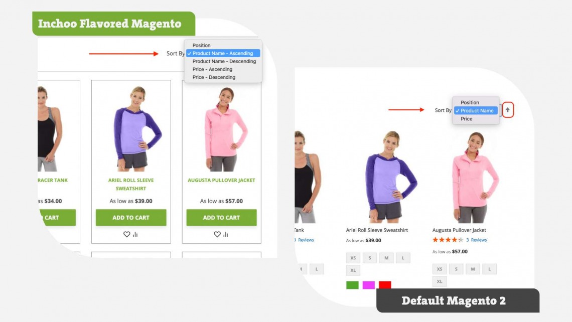
Why it’s better:
- Fewer steps, faster results
- Attributes are adjustable to your needs, and there can be as plenty as you’d like.
Order Comments
Sometimes customers want to give you additional information about their order or give instructions for delivery ahead of time. That is common sense, and most of our clients specifically wanted this feature. The only issue was, Magento 2 by default was lacking it, and we had to come up with our own solution.
So what’s it all about? Order Comments is a new feature that allows customers to leave a message or a note when placing an order. How does it work? A text box will appear to customers in either shipping or billing step and allow them to leave a message they want you to see.
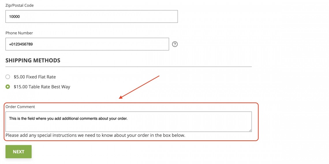
The label is customizable in admin, and you can choose if you want that order comment to show up on the checkout summary. When an order is placed, and you get to handle that order, the comment will be seen in admin under that order.
Why it works:
- Not everyone can offer live support
- Less back-and-forth email communication
Quick Register from Checkout Success Page
Allowing customers to register an account after placing an order as guests can help improve their user experience and loyalty to your brand. That’s why offering them the simplest and quickest way possible is crucial.
On Magento 2 default, when you place an order, you can click on “Create an account,” which will lead you to a new URL that concludes the customer’s info and ask him to choose a password for their account.
Our way of doing is one tiny bit simpler than that. When an order is placed, our feature “Quick Register” module will appear and ask the customer just to pick a password, and he won’t be directed to a new URL.
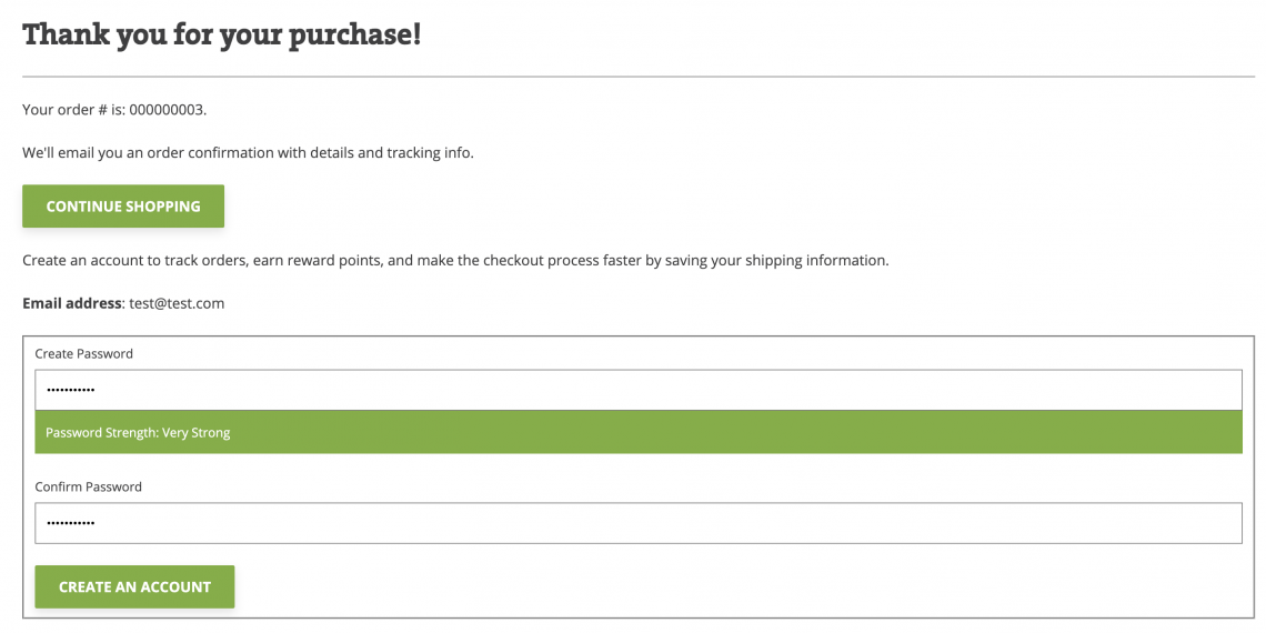
Why it’s better:
- One less step in creating a customer’s account
- That’s it
Inchoo Slider
Want to highlight something important to your eCommerce visitors? Magento, by default, has a standard solution with hero images or banners, allowing you to point out desired content in the form of a single image or video with short text and a button. But what if you need to inform your visitors about hot deals and promotions or simply have more information to share? Also, want to grab attention with more interactivity? That’s when our slider comes into play.
We developed our solution to equip you with a hero slider, mainly used on the homepage (but also available for any other place on your store). It comes with full customization, so by creating its attributes in admin, you can choose what you want to place on it, making rich and appealing content for your visitors’ eyes. You can communicate all you want with our slider and place it in the desired order. So, you won’t be in a dilemma about which information to display to your store’s visitors.
Additionally, we developed our slider as a product widget with a product carousel functionality so you can set out your featured products more elegantly and interactively than using a default Magento 2 product grid. With carousel functionality, you can choose as many products as you want, and it won’t affect your page’s length, unlike a long grid.
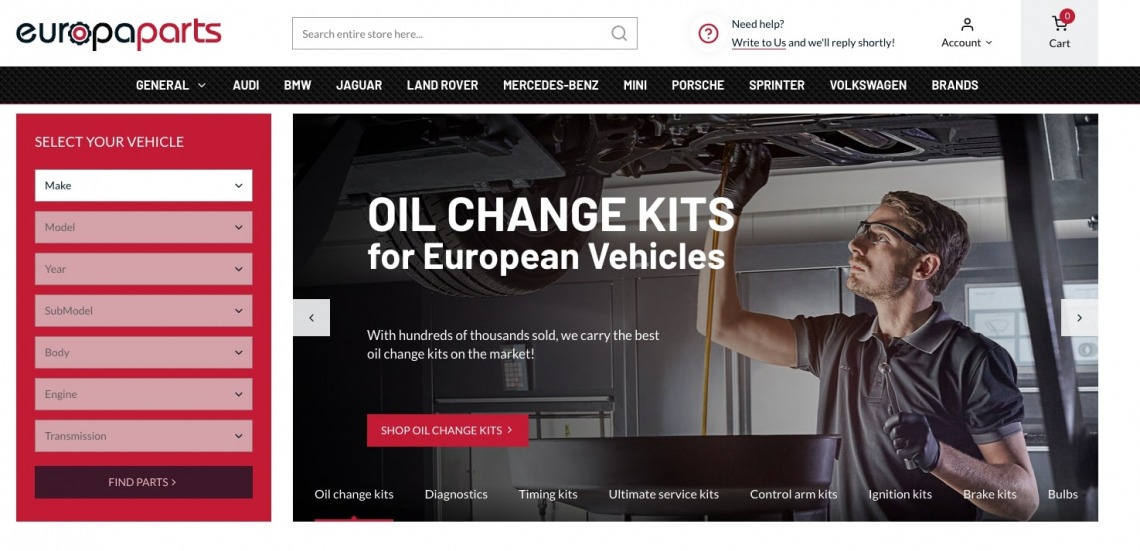
How can you benefit from it:
- Show more information in a more elegant way
- Boost user interaction with the site
- Customize the information look in the way you want
How to get these features for your store?
We offer these UX features for Magento store exclusively to our clients as a part of our standard offer. You can learn more about that here and check out our design process to see how all of the above would be implemented.
Please let us know how you liked this one in the comments. If you have any questions, you can also comment on them or contact our team directly about your project.
