In our last accessibility blog, we discussed the fundamentals of accessibility, its legal requirements, and why it’s essential for creating inclusive digital experiences. Accessibility goes beyond merely accommodating users with disabilities; it involves designing inclusive and functional experiences for everyone, including those with situational or temporary impairments. In this blog post, we’ll dive deeper into implementing these accessibility principles and exploring best practices and strategies to create both compliant and user-friendly designs.
Accessibility & Usability – What’s the Difference?
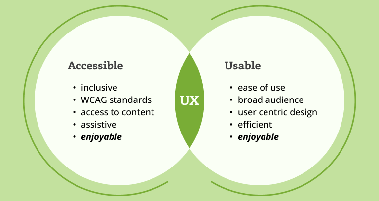
Both are integral to an excellent User Experience (UX) process, yet they are distinct concepts. Usability focuses on ensuring designs are effective and satisfying to use. Accessibility, however, ensures that all users can access an equivalent user experience, regardless of any disabilities.

How to Adhere to Accessibility Guidelines?
WCAG (Web Content Accessibility Guidelines) are the international standard for building accessible sites and applications on the web. They were developed by the Web Accessibility Initiative, a W3C initiative.
You can learn more about the WCAG here.
It’s important to address accessibility from the very beginning of your project, starting at the research stage rather than waiting until the design phase. By considering accessibility early on, you can reduce the need for extensive modifications during development. Delaying attention to accessibility makes it significantly more challenging to address issues later in the project.
WCAG Principles
WCAG principles are four principles that ensure web content is accessible to everyone. These principles — Perceivable, Operable, Understandable, and Robust (POUR) — focus on making content visible, usable, clear, and reliable across different technologies and user needs. By adhering to these guidelines, designers and developers can create web experiences that are inclusive and functional for all users, including those with disabilities.
| Perceivable – Information and user interface components must be presentable to users in ways they can perceive. | This means that users must be able to perceive the information being presented (it can’t be invisible to all of their senses) |
| Operable – User interface components and navigation must be operable. | This means that users must be able to operate the interface (the interface cannot require interaction that a user cannot perform) |
| Understandable – Information and the operation of the user interface must be understandable. | This means that users must be able to understand the information as well as the operation of the user interface (the content or operation cannot be beyond their understanding) |
| Robust – Content must be robust enough that it can be interpreted reliably by a wide variety of user agents, including assistive technologies. | This means that users must be able to access the content as technologies advance (as technologies and user agents evolve, the content should remain accessible) |
Three WCAG Levels
WCAG has three levels of requirements, increasing in their scope and difficulty to support, with Level A being the lowest level and Level AAA being the highest. Each level includes the success criteria from the lower levels.
Level A guidelines
This level includes providing text alternatives for non-text content, making sure that the site is usable when stylesheets are turned off, and ensuring that the site is keyboard accessible. Support for TalkBack/VoiceOver is also included.
Level AA guidelines
On top of the Level A guidelines, this level takes additional steps to ensure that content is accessible to users in a wider range of scenarios. Most accessibility regulations require this level at the moment.
Level AAA guidelines
Represents the highest level of conformance and the strictest set of guidelines. It aims to make information and user interfaces accessible to all users, including those with severe disabilities. This level is recommended for tools that have elderly and disabled people as a target group.

How to Make Your Design More Accessible
1. Maintain consistency
- Do: Ensure that repeated components follow the same design, as well as maintaining consistency through your components that have the same functionality.
- Don’t: Avoid recreating the same things in a different style, this will lead to unnecessary confusion and difficulty in use.
2. Scalable text
- Do: Ensure that text can be resized up to 200% without losing functionality or readability. This accommodates users with visual impairments who need larger text.
- Don’t: Use fixed text sizes that the user cannot adjust, making your content inaccessible to those with low vision.
3. Use various elements to convey a message
- Do: Combine text, colors, and shapes to effectively share information and convey a message.
- Don’t: Rely solely on one method, as this may exclude many users.
4. Alt text for images
- Do: Actionable elements must have an appropriate ID name. At the same time, images need to be provided with a brief description of what is on the image so the users who use screen readers can understand the meaning and intent behind the read elements. Make sure that you don’t just label it as “picture”; give it some context, describe what is happening in the image, and what the image is trying to convey.
- Don’t: Label image elements as “picture” without context, as this benefits no one.
5. Color contrast
- Do: Use high-contrast color schemes to ensure the text is readable against its background. Small text needs to pass the 4:5:1 color contrast ratio in order to achieve maximum readability. Large text needs to pass the 3:1 color contrast ratio in order to achieve maximum readability. There are various plugins to help you with this, such as Contrast and A11y Color Contrast
- Don’t: Release designs without checking element contrast, as it can lead to more work later. It’s better to address this in the design stage.
6. Keyboard navigation
- Do: Ensure all interactive elements (links, buttons, forms) are accessible via keyboard. Users should be able to navigate and interact with your site using their keyboard keys.
- Don’t: Rely solely on mouse-based navigation, as many users with motor disabilities depend on keyboard navigation.
7. Avoid image and color dependency
- Do: Include important information as regular text and additionally in image format. Adding visual cues will help visually impaired or color-blind users distinguish between the elements they are looking at.
- Don’t: Avoid placing important information only inside an image. Images can be stretched; the right color contrast may not be met, and the content inside can become blurred or pixelated, making it harder for users to perceive.
8. Clear and descriptive labels for inputs, buttons, form fields, and links
- Do: Make sure inputs, buttons, form fields, and links have a label that will help users make decisions. That label should complement the body of the dialog. This benefits all users since we’re not wasting anybody’s time and energy on clicks that are not valuable to them.
- Don’t: Avoid the same generic labels for a wide array of options, as they are not precise enough.
9. Identify Errors
- Do: Clearly indicate where and what type of error has taken place. Focus on the element in question, provide an error text next to it, use color, and describe the issue. The message should be specific and to the point.
- Don’t: Avoid using color or text alone; using them together makes the message you’re trying to convey much easier to understand.
Tools and Resources
But the list doesn’t stop here. There are many more guidelines to explore, so check out the linked resources.
| Tools | Figma Plugins | Resources |
Next Steps
Designing with accessibility in mind is not just a good practice; it’s a necessity. By following these guidelines, you’ll create an inclusive, user-friendly eCommerce site that benefits all users, including those with disabilities. Remember, accessibility is an ongoing process. Continually test, iterate, and improve to ensure your site remains accessible to everyone. Your efforts will not only comply with legal standards but also create a more inclusive and welcoming online shopping experience for all.
Stay tuned for the next installment in this blog series, where we’ll discuss the business requirements of accessibility and how you can achieve them with Hyvä!


