Category pages serve as a bridge between the homepage and the product pages, bringing the customers one step closer to finding the right products.
They are an essential step in a customer purchase path for customers browsing the store using the main navigation as opposed to search. They are also among the top pages customers will land on. It means that a lot of users will start their browsing and shopping process here. This makes them even more critical.
Read on to see the best practices for category page design in Magento.
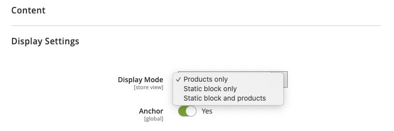
Magento’s category page layout can be set up in three ways:
- intermediary/landing (static-block only),
- product listings (display products only),
- combination of the previous two (products and the static block).
We’ll cover all three approaches and how they can influence the Magento category page design.
Table of contents:
1. Magento intermediary category page
1.1. When and why to set up a static block only category page
1.2. Structuring the intermediary category page
1.2.1. Subcategories
1.2.2. Sub-subcategories
1.2.3. Other relevant content
2. Magento products list category page
2.1. Filters and product attributes
2.2. User-defined input
2.3. Category page list item
2.4. List or grid view
3. Magento category products list and CMS content
Magento intermediary category page
An intermediary category page helps the customer select a better-defined scope before reaching the products. It’s almost like a homepage – for that particular category. It guides the customer deeper to subcategories, promoted products, and other auxiliary content, such as blogs or guides. This is why intermediary category pages often have similar tasks as homepages – to convey the category breadth and show different purchase paths.
Similar to the homepage, all the content can be custom designed. Unique custom design can make the content, and especially categories, much more comfortable to scan and understand, especially if they’re jargon driven. You can’t expect everyone to understand some industry-specific jargon, but you can surely make it easier to understand its meaning.
Intermediary pages will be beneficial to different groups of users:
- users who aren’t looking for a specific product and need some inspiration or guidance,
- users who are searching for a particular product type can quickly pinpoint the category,
- users who choose the top-level category instead of subcategory in the main navigation.
When and why to set up a static block only category page
Sometimes showing the product listings for a top-level category doesn’t make much sense. These lists can be too long, disorganized, and generic. This often happens when the parent category has a large number of subcategories.
One can argue that it’s enough to use products only configuration because child categories in the layered navigation will make it easy for a customer to select a category. Still, in situations when there are more than ten child categories, nothing will beat the clarity of an intermediary category page.
Imagine an apparel store where the navigation is usually gender based on the first level. Upon gender selection, the customer is presented with 25,000 products from 26 different categories. Apparel stores are often full of subcategories that rely on industry-specific jargon. It varies from thematic (such as “prepare for winter”) or even material-related (leather collection) labels. Subcategories in the layered navigation are in text-only format. The customer has no clue what’s behind those subcategories.
See how easy it is to get lost in the catalog pages?
Even shopping for a simple jacket can easily result in a bad scenario for both customer and the merchant.
Structuring the intermediary category page
When using intermediary category pages, subcategories should always have the most important place on the page. This usually means close to the top at the top of the hierarchy. Contrary to the myth, people do scroll – but they still rely on what’s above the fold when forming an opinion about the page and what they can do on it.
Featuring products, inspirational purchase paths, or other auxiliary content is a great addition. Still, these types of content should always have secondary importance.
Subcategories
As opposed to text labels in the dropdown menus, subcategories on landing pages give much more options in terms of visual presentation and custom design. The use of images and different text styles can help in creating both visual presentations of subcategories and their hierarchy, that is, parent-child relations.
Imagery is an especially important piece of information because it gives a much better category preview than a text label. It becomes even more critical if customers aren’t familiar with industry-specific terms. A thumbnail and a descriptive text will mean much more to customers than a text label they can’t quite understand.
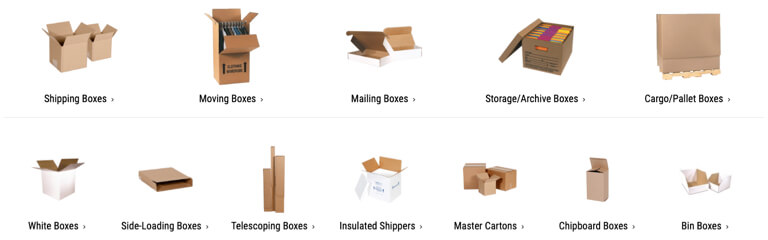
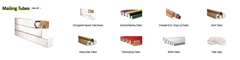
Packaging Price boxes category visually present every subcategory making it much easier to understand the box types they offer. Without the image, it would be impossible for a regular Joe to differentiate one box label from another.
Other than product thumbnails, one solution we often come across is the usage of images where products are placed in a context. For example, a sofa shot in a decorated living room (including table, carpet, chest cabinet, etc.), or a model wearing an entire outfit. This approach, however, leaves the image open for interpretation, because it’s full of different product types. When using such imagery, it’s essential to put the focus on the product types and not the whole scenery.

Is this a sofa category? Table? Can I purchase an entire living room if I click this?
Having a traditional sidebar with textual links to subcategories can also prove beneficial. The textual sidebar isn’t as eye-catching as thumbnails and can be misinterpreted, but some people will always prefer textual navigation because it’s much faster to read through the categories than to scan the graphics-heavy content page section.
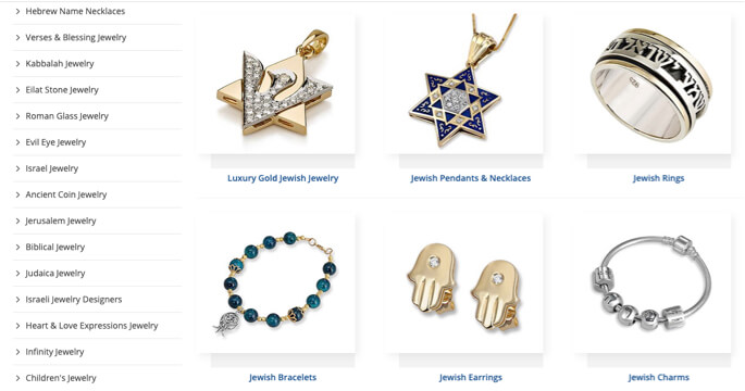
At Judaica Webstore, we’ve decided to include both textual and thumbnail navigation. Our heatmaps show both are used equally.
Sub-subcategories
Displaying subcategories is undoubtedly necessary, but to get things on another level, it’s also great to include the sub-subcategories as well. This is an instant help to customers who might not be sure what sub-sub category will be the right choice. It also shortens the trip for customers who already know the answer because they won’t have to browse unnecessary category pages before reaching the product listings.
When mixing subcategories with sub-subcategories, it’s essential to indicate the hierarchy and parent-child relationships between them visually. This is usually done using indentations, lists, different font sizes, and similar.
Packaging Price displays parent-child relations by varying thumbnail sizes.
Other relevant content
As noted earlier, the intermediary category page design often faces a challenge in conveying the catalog breadth and showing different purchase paths. Using auxiliary content can be an effective way to display different purchase paths, but should never interfere with the subcategories.
This content can be made in the form of featured products (such as category new arrivals or best sellers), inspirational paths (like current trends or seasonal products and categories), or even some guides. Such purchase paths often help customers who are just browsing, looking for information, and not looking for a specific product.
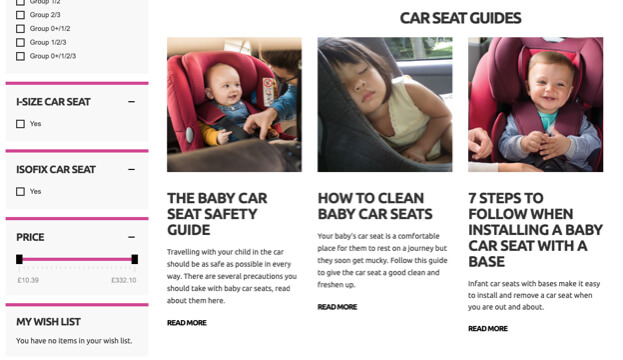
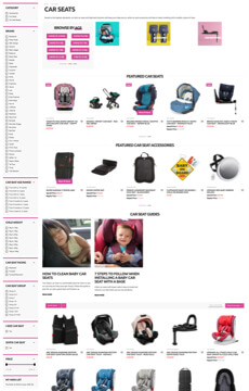
A store we recently audited cleverly incorporates car seat guides on the car seats intermediary category page
Magento products list category page
The product listing page traditionally consists of a list of products, filtering systems, sorting options, and navigation in terms of pagination or load more functionality.
The listing page has its share of design challenges – display enough information, but don’t clutter the interface. It should contain appropriate product information on the product items, and allow for precise enough filtering and similar. Let’s examine these.
Filters and product attributes
One of the major usability issues we see often is poor filtering options, and this is directly related to Magento’s product attributes. Filtering tools enable users to shorten the products list of thousands of products to the ones that have higher relevance to them. It has a crucial role in the user’s product finding abilities.
Figuring out which product attributes to display in a filter list is not an easy task. A good filter list should allow the users to narrow down the scope accurately, but on the other hand, it should not be a long list that will create an overload of options.
Other than some reasonably fundamental attributes such as, price, color variations, or size, filters will depend on the product type, category, and industry standards. There’s no single solution to all.
For example, for a list of shoe products, attributes can be the type (sneakers, heel or flats), material (leather, textile, synthetics) wearing occasion (sports, every day, special occasions) and more.
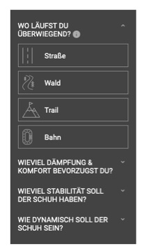
Shop4Runners even include running terrain in the filters list for their running shoes.
Other than product attributes filters, another filter type to be considered is a compatibility-based filter. Some products are simply compatibility dependant. Their compatibility determines their entire relevance with another product a user already owns (accessories, laptop cases, etc.).
For example, if a user needs a power adapter for their laptop, they’ll need to be sure that the two are compatible. Otherwise, the adapter will be useless to them. Using the brand as a compatibility filter won’t usually be enough.
Lack of such filters can easily result in lost sales, anxious customers, and returned orders.
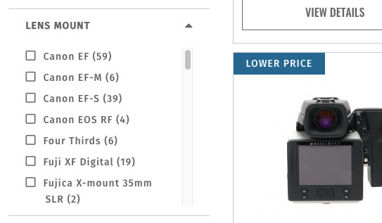
Keh Camera, among others, offer a lens mount compatibility filter.
User-defined input
Often a filter is numeric data – price, weight, power, etc. And these are usually presented as ranges.
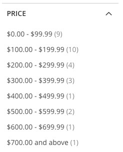
By default, Magento places price filters as price ranges.
Although it’s better than not having them at all, ranges will affect users’ finding abilities, because they’ll rarely match ranges a user is looking for. Furthermore, if more ranges are covered, the list of options will often be very long, or the range values will be so broad they’ll no longer be effective.
The optimal solution for ranges is always to enable users to define their own upper and lower range values. This allows them to get a precisely defined list of products and spares them from making multiple selections if they are only interested in single lower and upper value.
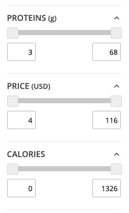
A1Supplements enables customers to input their range for all numerical values.
Category page list item
Determining what product features or attributes to show on the list item is site and product type-specific. A good list item should provide enough information to help the user accurately evaluate the relevance of the items, and quickly compare them to other items listed. Usually, attributes such as title, price, and product thumbnails are fundamental. Still, these are extended further, depending on the store, product type, or industry specifics.
One essential attribute that’s often overlooked is product variations (different colors, sizes, etc.) Without it, a customer might skip the product that they might be looking for simply because they couldn’t see a variation they might like.
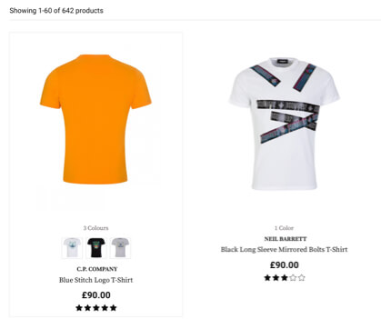
While working on the migration of Zee and Co to Magento 2, we decided to display product variations in two different ways. Textually and on mouse hover.
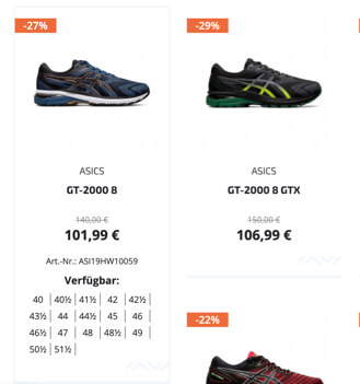
Similarly, Sportwerk displays available shoe sizes on item hover.
User ratings are also something a lot of merchants like to avoid displaying, sometimes even completely turning the feature off. Whether it’s due to fear of bad reviews or lack of reviews in general, ratings are considered to be one of the crucial attributes. Whenever a customer isn’t sure in the particular product domain, they are likely to rely on previous customers as a proxy for making the safe choice.
Tools4Flooring proudly presents user ratings, whether they are great or not.
Many products can have a category or industry standards related attributes, which can be the most important ones. Attributes such as dimensions, age rating, and similar can often affect the decision to open the product page or not. These will vary from industry to industry and category to category but must be chosen uniquely to help customers reach an informed decision.

Barrister Books include industry-specific attributes such as available formats, author, edition number, and ISBN.
Packaging Price has a very industry-specific listing. Quantity and price per each are more important than a generic image of a tube shape box.
List or grid view
We’re used to seeing the grid view. It’s a great choice because it enables more products per row, and a lot of merchants will prefer it.
Grid view is excellent for visually-driven products such as apparel or furniture. It best enables what’s most important for this product – a bigger thumbnail, that is, showing how a product looks. It also works for products that don’t have aesthetics as a primary purchase factor, for instance – supplements or health and cleaning products.
In such cases, while the product is not visually driven, customers may still scan the page looking for images of something they recognize, using a visually driven product finding strategy. 
Judaica Webstore sells visually-driven products, so it’s natural to have a grid view with large thumbnails.
However, not all product types will fit the grid view, especially if the products are specification driven such as TVs, laptops etc. With these products, specifications are vital to product selection and purchase decisions.
With more specs available, customers can better evaluate products in the listing, and the list view gives more room to include specifications. It saves customers the time for going from a product to a product just to get to the specifications list and see if the product is relevant or not. With specifications-driven products in a grid view, it’s quite challenging to find enough space and balance for all the crucial specifications.
By default, Magento offers both grid and list layout views. Still, we rarely see customers using the switch, so resources for creating both layouts should be justified. If there’s a clear consensus that one or the other is enough, it probably doesn’t make sense to invest in both. Apparel, for example, has no meaningful specs to use the list view. On the other hand, computers most certainly do. However, if the products borderline between visually and specs-driven, it can be worthwhile to invest in both.
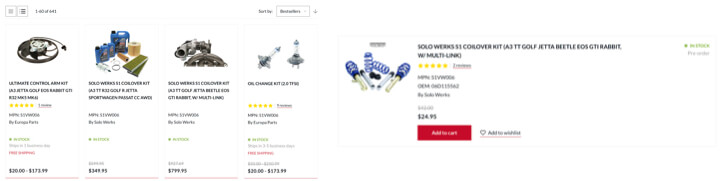
While working on migrating Europa Parts to Magento 2, we’ve concluded that it’s best have both views available.
Magento category products list and CMS content
The third way to set up a category page layout is to have it both ways. This approach has its benefits, but if not done right, it can lead to some serious misunderstandings on how the page functions. It usually crumbles down on “false bottoms“. We’ve seen this a million times. A category page, filled with subcategories, layered navigation… Everything you’d expect on a typical intermediary category page in its full height.
But here’s the kicker – underneath all of that content (that usually requires scrolling), tucked below all of that CMS content – there’s a product list. Why is this an issue? Although people scroll, they are more likely to get an idea of what’s expected from them while looking at the content above the fold. In this situation, it means that a significantly small amount of customers will reach the products list.
A cms block and listing from a store we’ve recently audited.
When combining listings with CMS content, it’s important not to push the listing too far down with the content to avoid such dangerous misinterpretations.
Packaging Price uses both listing and the CMS content in a way that one doesn’t interfere with the other.
Want to make sure your store follows all of the above? Head to our design service page to see what we have to offer.
In the meantime, check out the rest of the articles from this series:
- Best practices for Magento Homepage design
- Best practices for Magento Product page design
- Best practices for Mganeto Cart page design
- Best practices for Magento Checkout page design
- Best practices for Magento Theme design
Share some of the examples of good and bad category page designs you’ve come across in the comments below!