The shopping cart sits near the end of the shopping flow – just a step before the actual checkout and payment process. It’s the place where totals, discounts, taxes, and shipping costs get calculated. Most importantly, it is a magical place where the final purchase decision often happens.
Besides providing an order overview, the cart page is also an ideal place to show some vital purchase information that can weigh in the purchase decision. It can also offer products for impulse shopping to increase the average cart value.
However, we often see shopping cart pages having high abandonment rates. There are many disappointments customers can face on the cart page and leave the store before completing the purchase. Here are some tips for Magento cart page design to lower those abandonment rates and push your customers to the checkout!
Table of contents:
1. Minicart
2. The cart page
2.1. Products overview
2.2. Shipping fees and returns policy
2.3. Trust seals
2.4. Button hierarchy
3. Additional content on cart
3.1. Coupon code options
3.2. Cross-sells
Magento actually has two carts. The first one is the “mini” cart, while the second one is the full cart page. They both serve different purposes but share some similarities. Let’s dig into them!
Mini-cart
Magento’s mini-cart (or drop-down cart)’s primary purpose is to give a quick overview of the products previously added to the cart. Its trigger is usually placed somewhere within the main header. It’s available throughout the site, regardless of the page type a customer is looking at the moment.
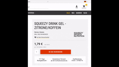
Minicart on Zee&Co.
Some eCommerce stores steer away from this type of functionality. Often, clicking the cart button in the header will take the customers to the cart page. However, mini-cart is a quite handy feature, regardless of the industry. Customers will often need to remind themselves about the products already in the cart to check compatibility and fit with other products.
For example, a customer found a cute purse and added it to the cart. Now the customer is looking for some shoes to match the purse style. Going back and forth from the main cart page to different product pages will become tedious after doing it a few times.
However, using Magento’s native mini-cart functionality, customers can quickly glance at the previously added purse for a quick style overview whenever necessary.
Just imagine the same situation in a brick and mortar store. Would you leave the purse at the cash register and then look for shoes? Or continue browsing the store with the bag in your shopping cart?
Besides its “reminder” functionality, the mini cart can also serve as a feedback signal once the customer adds a product to the cart. Instead of cluttering the interface design with success messages (or modals) that confirm a successful cart addition, you can simply trigger the mini-cart to show!
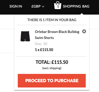
Minicart as a success trigger on Shop4runners.
Other than showing products in the cart, the mini-cart design should provide a way for customers to reach the full cart page, but can also include a checkout shortcut for customers who, for any reason, don’t need to visit the cart page and wish jump directly to the checkout process.
Another quite useful functionality for mini-cart is product manipulation. Similarly to the cart page, mini-cart can also be configured for editing products on the fly. This way, a customer can, for instance, easily remove a product from the cart without leaving the page he’s currently on.
The cart page
Magento’s cart page provides an order summary and a chance for the last review before actually placing an order.
In general, customers are more likely to scan the page that reading it in detail, so making the cart page easily scannable and clear is a must. However, one of the most often issues on cart pages is that they are often visually cluttered instead of providing clear and straightforward layouts.
Cart pages often contain different contents that can quickly draw attention away from the action we want customers to take – press the main “Checkout” button. Whenever including any kind of content that’s not vital to the purchase decision, always be careful not to make the cart page design overwhelming, hard to scan, and what’s worst – slow. Ask yourself are those promotional banners, three rows of “customers also bought” and “real customer reviews” really necessary.
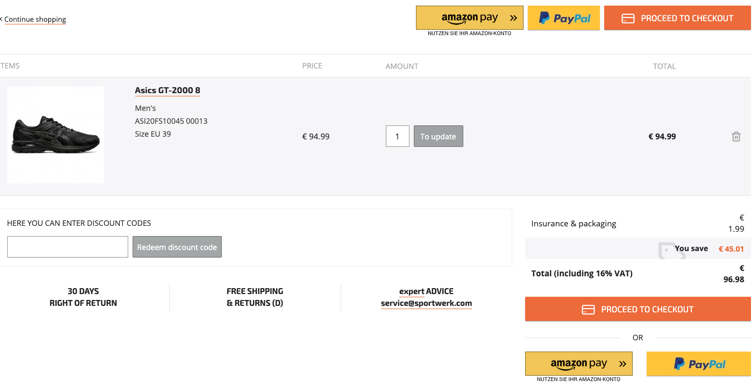
Clean shopping cart page on Sportwerk.
When met with these cluttered layouts, customers are likely to feel overwhelmed. It can all feel like ads that disrupt their shopping experience, quickly turning them away from the purchase. Keep in mind that the cart page’s primary purpose is to push customers forward to the checkout, so the fewer distracting things on the page – the better. Always weigh what’s necessary and steer away from any features that can’t affect the purchase decision or provide some kind of value to the customer.
So what’s necessary on the cart page?
Products overview
Products in the cart should, similarly to product pages, use high-quality images and detailed product summary. Always include customer selected attributes (such as size or color) if the product is configured. This is especially important if the same thumbnail is used for different products and their configurations. Customers will always want to double-check if they are ordering the right thing. If they got it wrong – they’d blame you.
If the product is configurable, always offer an edit option. Don’t make your customers remove an item from the cart and re-add it because they changed their mind on the color, size, or any other attribute of the product.
Similarly, always include an option for quantity manipulation. Even if your customer segment mostly purchases a single product, there’s still a chance that someone will want to order more. Having an option to increase (or decrease) quantity in the cart is much easier than returning to the product page and adding the same product to the cart.
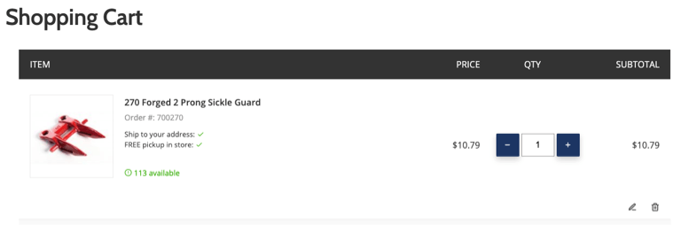
Products overview on Sloanex.
Shipping fees and returns policy
One of the significant Magento features is that it natively offers a shipping calculator on the cart page. When correctly set, it’s quite a useful feature that enables the customers to quickly check the shipping cost and decide whether to proceed with the purchase.
It’s important to note that shipping cost always plays a role in the purchase decision process. Unfavorable shipping costs will affect cart abandonment rates and design-wise, there’s not much you can do here. However, it’s always better for customers to be informed about the shipping cost (or any other extra for that matter) before reaching the checkout. You don’t want to surprise them with additional fees once they’ve already made a purchase decision.
Even if you don’t use the shipping calculators (for whatever reason), make sure you always provide shipping cost information or estimation on the shopping cart page. For the bare minimum, a prominent link to the shipping information page will suffice. By doing so, you’re eliminating the possible negative surprises of added costs on the checkout page, thus reducing the checkout abandonment rate. Never rely solely on the shipping information link in the footer!
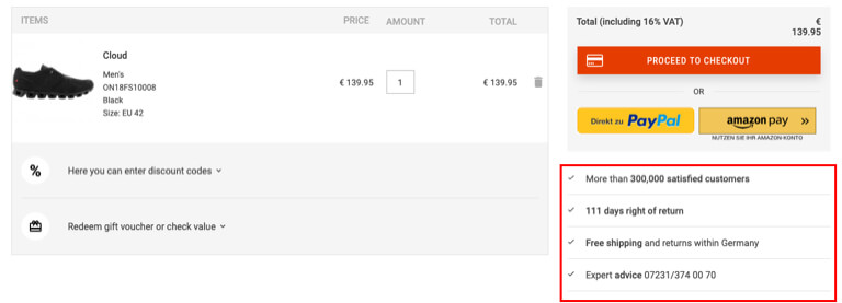
Placement of vital information on Shop4runners.
Many merchants forget it, but along with shipping information, it’s always necessary to provide returns information as well. For someone buying with a dose of uncertainty, returns information can play an even more significant role in decision making than the shipping cost. Similarly to the shipping information – don’t rely on only on footer links!
Trust seals
People want to feel safe when shopping online. Trust seals are small symbols that show your customers your store is secured and reliable. They come in different forms and shapes, but it’s important to note that there are two primary badge types.
The first one is related to 3rd party vendors – specialized companies that issue security certificates based on your certification application. After being certified, you can add the badge to your store. Customers can then easily verify that the store is legit just by clicking on the badge on your store and making sure they are not on a scam site.

Image courtesy of the Baymard Institute.
The second type is about showing some unique selling points of your store to increase the perceived value. These can be anything from free shipping to money-back guarantee badges. For example, if you offer above the average time for returns or free shipping, you should show it off visually! Steer away from generic statements like “Largest US apparel store.” Offer an actual value that can provide additional value to your customers.
Clear button hierarchy
Depending on the content, cart pages can contain different buttons for different actions, such as updating, applying, editing, etc. However, always make sure to have the main “Checkout” button distinguishable from other ones. Having all the buttons visually similar in size, shape, and color easily creates confusion on what different buttons do.
Additional content on the cart page
Coupon code options
Coupon codes are a great marketing tool. However, they come with their issues. Many customers that see the code options, but don’t have a discount code will feel it’s unfair they didn’t get the discount. Some others will try to Google for coupon code, leaving your store and possibly never returning.
LabelValue hides the coupons code behind a dropdown.
When including coupon code options on the cart page, make sure they aren’t as highlighted to avoid these scenarios. The most straightforward approach is to hide the coupon code behind a text link (e.g., “Have a coupon code?”), which opens the actual field on customer click.
Cross-sells
Cross-sells on the cart page are usually complementary or products related to ones in the cart. Don’t mistake them for up-sells, as up-sells are the same product types, generally in higher product ranges. They should not appear in the cart, but rather the product pages. Remember that cross-selling aims for that final impulse purchase (like picking up a pack of gums on the cash register). You don’t want customers rethinking the purchase of the product already in the cart, which can easily lead to cart abandonment. Always be careful what to offer to complement the products in the cart. Offering random products won’t make sense here.
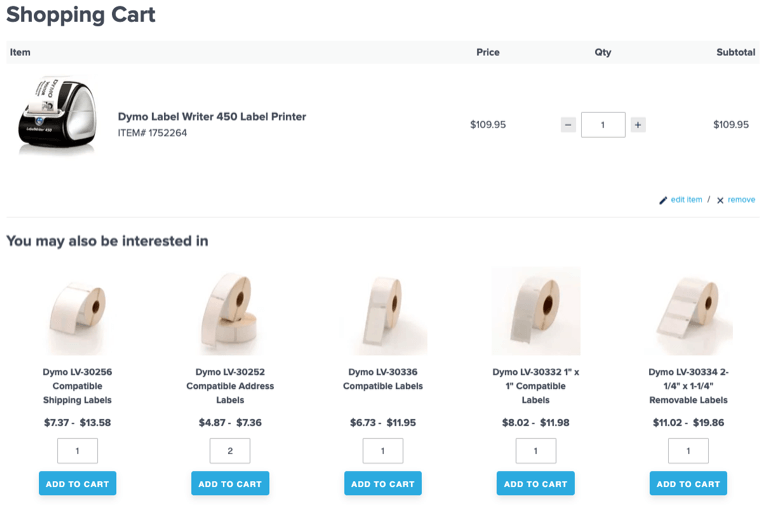
Good example of cross-sells: LabelValue offers compatible printer labels on the cart page to the user who has already selected a printer.
In the meantime, check out the rest of the articles from this series:
- Best practices for Magento Homepage design
- Best practices for Magento Category page design
- Best practices for Magento Product page design
- Best practices for Magento Checkout page design
- Best practices for Magento Theme design
Got any extra tips or questions? Leave ’em in the comments section below.
And if you have a redesign project in mind for your online store, we would love to take a look and see if we can partner on it. Check out our Magento Web Design Service to see our full process.
Feel free to contact us and we will reply as soon as possible!