Just last week, while I was at the playground with my kid, I noticed a parent standing nearby, browsing kids’ bikes on his phone. He was pushing his child on the swing with one hand and holding his phone with the other. Every few seconds, he had to switch between two tasks – looking at his kid (and keeping swinging), then looking back at the screen.
Push the swing. Scroll. Adjust the grip. Push again. Stretch his thumb a little further to reach the next button.
On the third attempt, the phone slipped from his hand and hit the concrete. He picked it up, checked the screen, sighed, and put it in his pocket.
Maybe he would come back later. Maybe he wouldn’t. The purchase moment was gone.
Design starts with a reality check
We often evaluate eCommerce experiences through a visual lens – how clean the typography is, how minimal the interface feels, how smooth the animations are, or how polished the product photography is.
But mobile eCommerce has more fundamental constraints – people are not interacting with a website in a perfect environment. They are standing in line, carrying groceries, drinking coffee, walking, commuting, or like the parent from the playground – trying to shop while doing something else.

A mobile phone is not a smaller desktop computer. People do not interact with it the same way they interact with a mouse and keyboard. They hold it differently, change grips, switch hands, and often navigate using only their thumb, and designing for mobile means designing within those physical limitations.
The goal is not simply to create a responsive layout. It is to reduce friction when attention is limited, and interaction happens quickly and intermittently.
Thumb zone is more than just a theory
If you recently spent any time in UX design circles, you’ve probably heard about the “Thumb zone” research by Steven Hoober. Hoober’s research showed that one-handed use is one of the most common ways people interact with mobile devices – alongside cradled and two-handed grips.
More importantly, when people use their phones one-handed, their thumbs can comfortably reach only certain areas of the screen.
- The green zone – where the thumb naturally rests*
- The yellow zone – reachable with a stretch
- The red zone – requires repositioning the hand
*The exact reachable area varies depending on hand size, device dimensions, and grip style, but research consistently shows that some areas require significantly less effort than others.
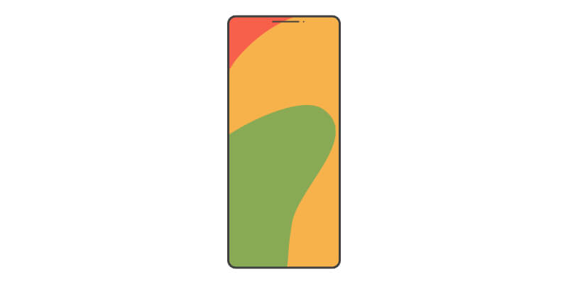
Despite knowing this, countless eCommerce sites still place their navigation, search, and filters closer to the top of the screen. By putting these critical features in that physical “red zone,” we’re basically forcing customers into awkward thumb gymnastics.
So why does the top stay at the top?
If the bottom of the screen is so much better for our thumbs, why on earth do we still force search bars and hamburger menus at the top?
It’s easy to look at this and assume it’s just laziness and desktop-first design. But the reality is a bit more different. There are actually a few practical reasons why keeping these tools at the top remains the standard
Mental models
One of the most foundational rules of UX is Jakob’s Law.
Users spend most of their time on other websites.
Over the last two decades, billions of internet users have been deeply conditioned to look at the top of a page whenever they want to search, filter, or access a navigation.
If you suddenly moved this to the bottom of the screen, you might solve a physical reach problem, but you introduce a new cognitive problem. The user has to pause, break their habitual scanning pattern, and actively search for the tool they want.
Natural flow of information hierarchy
We follow the information pattern from top to bottom. Structurally, it makes sense for the search bar and navigation to sit above the content. Additionally, search is a special case because typing changes the entire interaction context. When the keyboard appears, the interface has to adapt around text entry, results, and navigation.
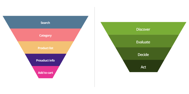
A bottom search trigger may work well, but the active search experience still needs to be designed around the keyboard state.
Preventing accidental taps
The bottom of the screen is valuable real estate. Its strength is precisely why it should be reserved for actions that benefit from constant availability. This means it should be used intentionally, not treated as a universal dumping ground for every action. Modern phones use this area for system gestures, such as navigating home or switching applications. It is also where people naturally rest their hands or adjust their grip. Placing highly sensitive controls in this area can increase accidental interactions.đ
Balancing ergonomics and information
Mobile shopping rarely follows a neat, orderly sequence of actions. People compare products, jump between categories, return to a product page later, get distracted, and continue browsing when they have a moment.
Because of this, good mobile eCommerce design is not about moving every element into the easiest thumb position.
It is about identifying the actions that happen frequently and making those effortless, while preserving familiar patterns where they matter.
The best experiences balance two realities:
- where users expect things to be
- where their hands can comfortably reach them
Here are some ways of achieving this.
The sticky add to the cart
On a desktop, having an “add to cart” button sit statically is fine. On mobile, if a user scrolls down to read the details or reviews, that button disappears. To buy, they’ll have to scroll all the way back to the top. By implementing a sticky bottom button that anchors to the lower edge of the screen as the user scrolls, you keep the primary call-to-action permanently inside the green zone.
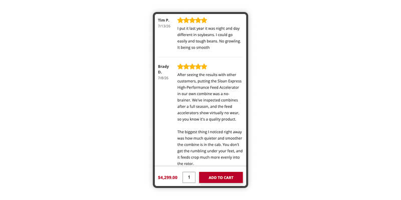
The goal is not convenience for convenience’s sake. It directly protects the purchase intent. A customer who has already decided to buy should not have to hunt for the action that completes the journey.
Sticky bottom bars
While search inputs will likely fill at the bottom due to keyboards, general navigation tabs (profile, cart, wishlist, etc.) can safely live here. Many successful mobile apps use this pattern because these actions are frequent, predictable, and do not depend on a keyboard appearing.
Moving these passive, non-keyboard-dependent navigation elements to a bottom bar keeps the thumb grounded where it wants to be.
Swipe-friendly interactions
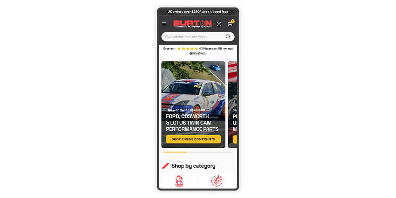
Instead of making users find and tap tiny next/previous buttons or small arrows to view multiple items or product images, let them swipe. Naturally curved thumb swipes are incredibly comfortable, low-effort, and require zero precision.
Accessibility with ergonomic design
Designing for one-handed use isn’t just about moving elements down or up. It also requires us to look at the targets themselves. Our thumbs are not mouse cursors. They are larger, less precise input tools than a mouse pointer.
If your filter options or color-swatch selectors are too small or placed too closely together, customers will repeatedly tap the wrong item – the classic “fat-finger problem.”
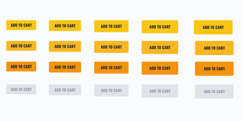
To combat this, target sizes should be generous – around 48×48 pixels and generous spacing between them. This is especially true for destructive or high-consequence actions, like removing an item from a cart.
Making mobile eCommerce effortless
Mobile eCommerce is far from just making a desktop site “fit” onto a smaller screen. It is a constant tug-of-war between the physical, ergonomic reality of how a human being holds a phone and the deeply ingrained mental models.
The best mobile eCommerce experiences do not choose between familiarity and ergonomics. They respect both – keeping familiar patterns where users expect them while placing frequent actions where hands naturally go.
After all, the easier your store is to use with one hand, the fewer reasons your customers have to put it down.