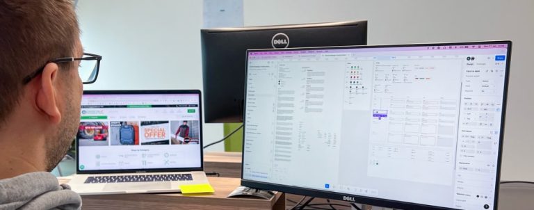
In user experience (UX) design, usability is a top priority, especially when creating intuitive, user-friendly interfaces. One effective method for improving usability is incorporating heuristic design—a set of established principles, or heuristics, to identify potential issues and design accordingly.
Jakob Nielsen and Rolf Molich first introduced these principles in the 1990s, and since then, they’ve become a widely adopted framework in UX design. Heuristic principles allow for a fast, practical way to pinpoint design flaws, making them invaluable tools for teams looking to optimize their products.
Applying Heuristics to Enhance eCommerce UX
Applying heuristics can be particularly beneficial for eCommerce websites, where the customer journey can be long and complex. From product selection to checkout, users encounter numerous touchpoints, and usability issues at any stage can lead to frustration or lost sales. By focusing on key heuristics, designers can create a smoother, more intuitive experience for both novice and expert users.
In the following sections, we’ll explain how these heuristics work and provide practical examples of how we applied them at various stages of the eCommerce journey to make our clients’ websites easier to use, improve the overall user experience, enhance efficiency, and ultimately increase conversions.

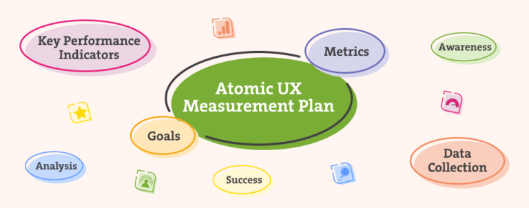
What do Nielsen-Molich Heuristics State that a System Should Do?
Every system should follow these guidelines:
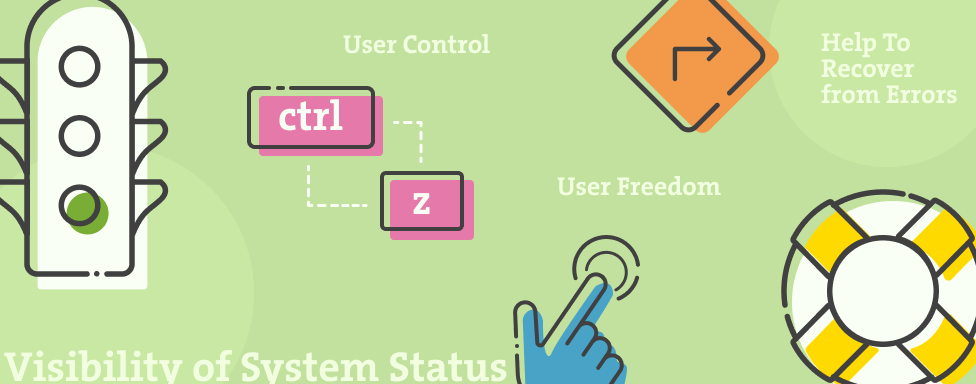
Visibility of System Status
The design should always keep users informed about what is going on, through appropriate feedback within a reasonable amount of time. Clearly communicate the system’s state to users, ensuring no action affecting them is taken without notification, and provide feedback as quickly as possible, ideally immediately.
eCommerce Example
During the checkout process, users should always be able to see which step they’re at, giving them a sense of security and predictability since they know what’s coming next.

Match Between the System and the Real World
Present information in a way that users understand by following real-world conventions and organizing content in a natural, logical order. When interface controls align with real-world expectations and desired outcomes, users can learn and remember how the system works more efficiently, creating a more intuitive experience.
eCommerce Example
In the physical world, people add items to their cart before making a purchase—the same principle applies online. The cart icon has become a widely recognized standard, providing users with an intuitive and familiar experience. Deviating from this convention can lead to confusion, so it’s best to stick with established design patterns that users already understand.

User Control and Freedom
Users sometimes take actions by mistake and need a quick, clearly marked way to back out without going through a lengthy process. Providing an easy-to-find “emergency exit,” such as a well-labeled Cancel button or an undo option, helps users feel in control and prevents frustration. When exits are intuitive and accessible, they create a sense of freedom and confidence, ensuring users can navigate the system without fear of getting stuck.
eCommerce Example
Allow customers to easily adjust their cart by modifying quantities or removing items directly on the cart page. Providing a seamless way to make changes enhances convenience and reduces frustration. Before checkout, offer a clear, final summary of their cart to ensure they have selected the correct items, helping to prevent errors and improve the overall shopping experience.

Consistency and Standards
Customers come to your eCommerce site with expectations shaped by their experiences on other platforms, so following industry standards and maintaining consistency with familiar design patterns is crucial. Using recognizable language and predictable interactions ensures that users understand your site intuitively, reducing confusion. By aligning with platform and industry conventions, you create a seamless, user-friendly experience that meets customer expectations.
eCommerce Example
Users have come to expect a familiar product page layout, including high-quality images, detailed descriptions, customer reviews, and a prominent call-to-action, typically an “Add to Cart” button. Straying too far from these conventions can create confusion and hinder the shopping experience. Additionally, consistency in naming and categorization is essential; while the visual design of eCommerce sites may vary, product descriptions and classifications should align with industry standards. This ensures customers can easily find what they’re looking for, regardless of which site they’re browsing.

Prevent Errors
Preventing errors before they occur is the best approach. Good design eliminates error-prone conditions or detects them early, offering helpful confirmation options when needed. There are two types of errors: slips, caused by inattention, and mistakes, which result from a mismatch between the user’s expectations and the system. Prevent slips by using helpful constraints and predictive suggestions—such as search autocomplete to catch typos. Reduce mistakes by minimizing memory burdens, providing clear instructions, and supporting undo actions. Prioritize preventing high-cost errors first, ensuring a smoother and more intuitive user experience.
eCommerce Example
The checkout process requires users to fill out multiple fields, so it’s important to clearly indicate errors when they occur, such as an incorrect phone number. Use visual cues to highlight where the error is and provide clear explanations to help users correct it. To prevent errors in the first place, use placeholder text or formatting hints to guide users on the expected input.

Recognition Rather than Recall
Minimize users’ cognitive load by making key elements, actions, and options visible so they don’t have to recall information across different interface parts. Information like field labels or menu items should be easy to find when needed. By promoting recognition instead of recall and offering contextual help instead of long tutorials, you reduce the mental effort required, creating a more user-friendly experience.
eCommerce Example
When designing form inputs, ensure the label is always visible above the field or use floating labels, so users can easily see what’s required without having to delete their input to view placeholder text.

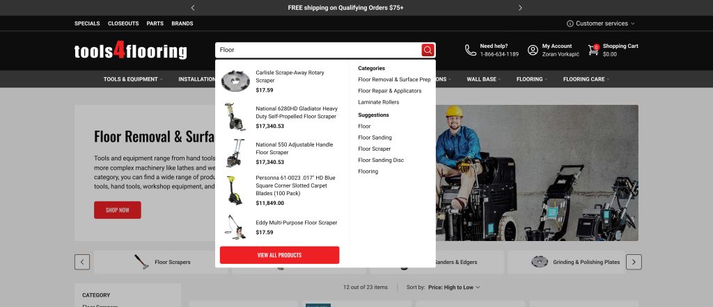
Flexibility and Efficiency of Use
Design with flexibility to accommodate both novice and expert users by offering shortcuts, such as keyboard commands. Allow for customization, letting users tailor content and functionality to their preferences. By balancing efficiency and flexibility, users can choose the best methods for them, creating a smoother experience for all levels of familiarity.
eCommerce Example
Incorporating a search (with autofill) function allows experienced shoppers to quickly locate specific items, while still maintaining a clear and intuitive menu for less experienced users to navigate. This ensures that both types of users can easily find what they’re looking for, whether they prefer a fast, targeted search or a more guided browsing experience.
Aesthetic and Minimalist Design
Keep the interface focused on essential content and features, eliminating irrelevant or rarely needed information that could distract users. Every extra element competes for attention and reduces the visibility of what truly matters. Use visual design principles like scale, contrast, and hierarchy to highlight key tasks and goals, ensuring that users can easily navigate the site. Prioritize the user journey by considering what’s most important for the customer to accomplish on each page and design accordingly to support their needs.
eCommerce Example
While it’s tempting to showcase your skills in animation and motion graphics, it’s important to always prioritize the user experience. Consider whether your design choices will impress users or frustrate them by hindering their ability to complete tasks efficiently. The focus should be on creating a seamless, intuitive experience, where any visual elements enhance rather than distract from the user’s goals.

Help Users Recognize, Diagnose, and Recover from Errors
Error messages should be clear and in plain language, avoiding technical jargon. Use traditional visuals, like bold red text, and error icons to make errors easily recognizable. Clearly explain what went wrong and provide a simple, actionable solution, ideally allowing users to fix the issue immediately without navigating away. This ensures users can quickly recover from errors and continue their tasks with minimal frustration.
eCommerce Example
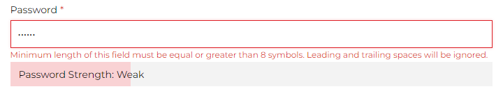
When creating a password during the account creation process, give users multiple visual cues about the error and how to fix it.
Help and Documentation
Ideally, the system should be intuitive enough that users don’t need additional explanations, but when help is necessary, ensure documentation is easy to access and search through. Keep it concise, focused on the user’s task, and provide clear, actionable steps. Whenever possible, offer in-context help right when the user needs it, minimizing disruption and guiding them smoothly through their tasks.
eCommerce Example
Ensure that the FAQs are easily accessible through the footer, and make contact information visible for users who need assistance. Keep any written help concise—avoid lengthy FAQ sections by linking to dedicated pages, such as a returns policy. Help is most effective when provided contextually, so offer short Q&As on product pages to address common questions in real-time.

So, What’s all the Fuss About?
In the competitive world of eCommerce, where users have countless options at their fingertips, the design of an online store can make or break a sale. A well-designed site that adheres to usability heuristics can lead to:
- Increased Conversion Rates: Users are more likely to complete purchases when the process is straightforward and intuitive.
- User Satisfaction: A seamless shopping experience encourages repeat purchases.
- Reduced Bounce Rates: Clear navigation and a logical layout keep users engaged, reducing the likelihood of them leaving the site prematurely.
- Cost Savings: By identifying and resolving usability issues early, you can avoid expensive redesigns down the road. Ensuring your business scales smoothly is key—don’t let design debt hinder your progress.
Conducting a Heuristic Evaluation
If you ever want to conduct a heuristic workshop with your team on a particular interface/user flow, be sure to follow NielsenNorman’s and Interactive Design Foundation guides! They provide step-by-step instructions to ensure the success of your evaluation and actionable steps to improve the user experience.
Keep in mind that while heuristics and usability do have similarities, they are two different disciplines, as Interaction Design Foundation states:
“Heuristic evaluation is based on assumptions about what “good” usability is. As heuristics are based on research, this is often true. However, the evaluations are no substitute for testing with real users. These are, as the name suggests, only guidelines, and not rules that are set in stone.”
They’re not a substitute for feedback from real users. By effectively combining both approaches, you’ll createt a customer experience that outshines your competitors.
We did a whole series of best practices in design; check them out:
- Best practices for Magento Homepage design
- Best practices for Magento Category page design
- Best practices for Magento Product page design
- Best practices for Magento Cart page design
- Best practices for Magento Checkout page design
Are You Ready to Implement What You’ve Learned?
Integrating heuristics and usability principles into eCommerce design is about creating user experiences that are intuitive, efficient, and satisfying. By prioritizing these principles, businesses can significantly enhance user engagement, boost conversion rates, and build long-term customer loyalty.
If you need help, don’t hesitate to reach out. We’re available and happy to help!