Migrating to Magento 2 with a Tailored UX
Background Story
Although the business was functioning well, our client decided to swap on the trend of business digitalization and create Joukhadar’s first-ever online store. They contacted us in search of a trusted partner to bring their ideas and requirements to life which we happily accepted.
Now, months later, our client has a full-functioning Magento online store that (we can proudly say) outperformed the set expectations. Read the lines below to find out everything about this project’s specifics and to look into our journey with Joukhadar Ljekarne.
Starting with design
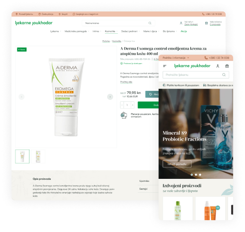
Having a good representation of health and beauty products was essential for our design. This category includes cosmetics, supplements, etc. Talking with the client, it became clear to us that we’ll need a well-defined visual identity. Previously, the client had a logo, a green color, and a design for a loyalty card that we decided not to use for the project. The webshop needed to exude a minimalistic, clean, and modern design as opposed to a playful and colorful loyalty card design.
As a symbol of trust and safety, we kept the green color, which is common in this industry. To complement the client’s green color, we added a nice shade of light brown and turquoise blue. The color palette is inspired by nature, with turquoise coming from the sea, brown from the sand, and green from plants. Everything was set in a way that represented the natural and healthy products our client business sells. Lastly, we chose serif typography and prepared a guide to help our client stay on track, which matched the elegance of cosmetics the best.
Our UX designer proceeded to research and decide on segments and functionalities for the online store that would make it easier for the consumers to find what they are looking for. The header consists of the top-level product categories, guiding the customer through a versatile category tree. By utilizing the ElasticSearch solution and our Search Preview extension, customers can see the search preview while typing.
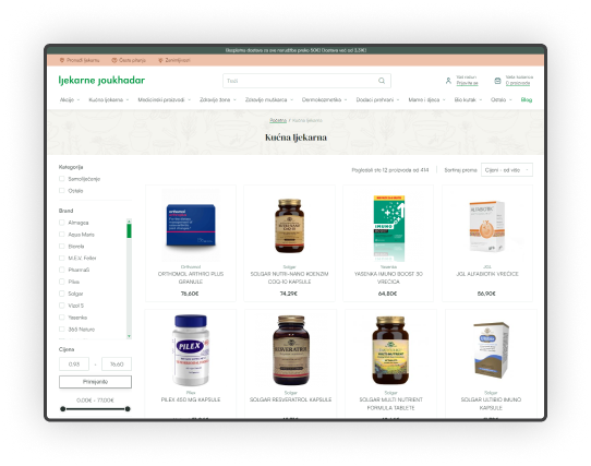
The secondary navigation also provides customers with information such as FAQ, contact information, store locator, and blog. For the customers that landed on a specific product page, there are breadcrumbs that make sure the client finds products from the same category or similar products. Also, if a customer prefers brand of products that they landed on, there’s a link to all the products from that brand right beside the SKU.
Regarding the homepage, impressive hero images are followed by selected products, featured brands, featured categories, recommendations, and blogs.
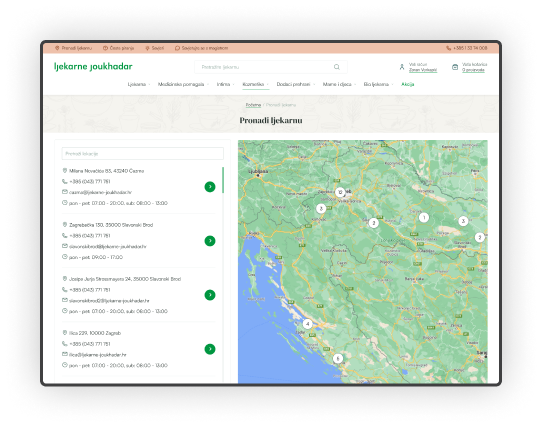
Through Joukhjadar’s carefully designed store locator, the customer can find the nearest Joukhadar pharmacy store. It also provides more information to customers, which we will discuss in more detail below.
The project’s main functionalities
Developing this project from scratch, we had to ensure the solution we produced would complement our client’s needs. Most importantly, we had to provide the solution we developed that suited the existing business processes.
Our usual project base is Inchoo Flavored Magento, and this time, it was no exception. Inchoo Flavored Magento was, further down the road, adjusted to our client’s needs. Many of our modules were included, but we’ll go through the main ones. Starting with Better Breadcrumbs, whose importance lies in providing the customer with path information. That way, customers who landed on one product page can easily find similar products following the category breadcrumb. In other words, customers have full path info. If the product itself is in more than one category, you have more control over choosing the preferred breadcrumb category as a merchant.
Following that, a Load More module allows users to scroll down seamlessly by pressing the more noticeable button. It is an upgrade on the usual Magento Pager on Product Listing, which is an outdated UX practice.
As the previous website listed all of the locations of their pharmacy stores, logically, we included it within the webshop. For that reason, we used our module Store Locator. It enables customers to search for their nearest brick-and-mortar store, providing them with the location, contact information, and business hours.

Live Search View offers customers autocompleted search results for their queries. A search box dropdown displays a small preview of search suggestions with product name, image, and price included. We also included a blog, so you’ll get both suggestions when searching for terms contained in product and blog names.
For the theme, as in most of our projects, we used our Improved Base Theme theme with UX/UI improvements on the Magento default one.
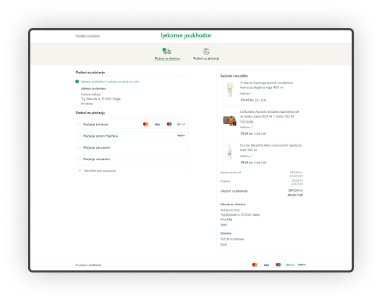
Lastly, something special. These modules were developed due to the specific situation in which Croatia was transitioning currency from Hrvatska Kuna to Euro. For that reason, every merchant has to display their prices in dual currencies and, to prevent inflation, the lowest price in the last 30 days.
For that reason, we developed Dual Prices Display and Lowest Price in the last 30 days modules. Dual prices Display is free and available on the Magento Marketplace. It is developed based on the Croatian government’s official proposal and obligation to display prices in both currencies during the transition period.
Main integrations
Firstly, we needed to make sure everything ran smoothly. As a result, one of the main modules was for the purpose of exchanging data between Eskulap and the online store. The module was set to send the new orders to Eskulap and to process the data Eskulap sends back to the webshop. Having that ready to go, we continued to provide methods of payment. For the card payments, we integrated the extension Monry Payment gateway. Except for the cards, customers can also choose between cash on delivery and bank transfers.
Our client chose GLS as their delivery service provider, so we got the task of developing an extension because there’s no extension for Croatia. This module provides all the necessary actions for the page administrator, like defining the amount for free delivery, defining countries for which delivery is available, etc.
Lastly, we implemented Locodels. Locodels is a city delivery service focusing on same-day, door-to-door, last-mile city delivery for e-commerce and retailers. As this method of shipping extension does not exist, we developed a module to integrate it with the webshop. Both the shopper and the administrator have access to the shipping status. And the method is available for Croatia’s capital city – Zagreb, at least initially.
We are not done yet
Our work on this project resulted in a highly functional online store with a modern custom design. But we’re not done just yet. Considering our client’s long-term goals, we made a list of suggestions that could be implemented in the future. Everything in order to better the customer experience and, ultimately, increase the business’s profits. As we are still collaborating with our client for support and maintenance, we believe the best is yet to come. And also, we wish our client the best of luck!
If you’re also interested in building an online store on Magento 2, send us some basic information about your project through this contact form, and we will reply as soon as possible.
CLIENT TESTIMONIAL
Don’t just take our word for it
Related Inchoo Services
Do you need an experienced eCommerce partner?
We combine the analytical with creative thinking to design visually attractive and high-converting eCommerce stores. Get in touch and turn your visitors into customers!


