Did you know that customers are more likely to land on a category or a product page of your Magento store than on the homepage? Nevertheless, the homepage remains an essential part of an eCommerce store for many customers who start their shopping process. It also acts as an anchor to refer back to throughout the shopping experience.
The homepage introduces the website, explains what it sells, and sets some expectations. It should convey brand values, inspire customers to explore, display product ranges – and accomplish that without visual clutter.
It acts as a shop window to an online store, so cramming things inside might result in a lower perceived value. You wouldn’t clutter your shop window, would you?
A homepage needs to show customers a clear way to three primary product-finding paths:
- main navigation,
- search,
- curated tracks such as new arrivals or shopping wizards.
How to design your Magento store homepage to achieve the best click-through rates and lower bounce and exit rates? Let’s go over the most common homepage elements and find out!
Table of contents:
1. Header
1.1. Main navigation
1.2. Search
1.3. Courtesy navigation
2. Footer
3. Main
3.1. Hero content
3.1.1. Slide control
3.2. Promoted categories and products
3.3. Value propositions and unique selling points
3.4. Additional content such as blogs, testimonials & reviews
Header
Although a global Magento element and not an exclusive part of the homepage, the header plays a vital role on every website. The header should easily enable the first two most common product finding paths – main navigation (which can admittedly be placed as a sidebar) and the search.
Main navigation
Store’s main navigation is a visual representation of the category taxonomy (the category taxonomy and information architecture won’t be tackled here). It provides the primary tool for browsing the store and helping the customers find products they’re looking for.
In essence, it has to give a good overview of product ranges. If they can’t find it – they can’t buy it!

The top-level categories should always be included in the navigation (if possible, of course). This gives an excellent overview of the type of site and its products. But it also sets the right expectations, so avoid hiding them under a single “Products” label. If using a dropdown menu (especially a popular mega menu), it’s great to indicate the hierarchy and group items visually.
This is quickly done using different text styles or spacial indicators, such as whitespaces or borders. It makes it much easier to scan and prevents choice paralysis. Also related to dropdowns – use a symbol, such as a down-facing arrow, to show that the menu contains hidden items.
Search
Search is the second most common path to finding products. It’s no secret that customers who search are more likely to convert, so having a great search is incredibly important.
The search input filed itself should be long enough for a typical search query. Narrow fields result in a scroll action and decrease usability. A button to submit a search query should also be available. Don’t rely on customers knowing the enter key will submit the query.
One great way to improve usability is to provide search suggestions and autocomplete to help guide the customers.
Courtesy navigation
Courtesy navigation provides easy access to secondary actions and tools such as account, language or currency switcher, phone number, etc. This navigation also affects your customers, their experience, and engagement.
Courtesy navigation should be easily accessible and placed in a visible place, such as the top right corner of the header. We often see the usage of icons for these actions, but using icons can be ambiguous, so text labels should be included as well. Not everyone will understand the meaning of an icon, especially if it’s not a standard one (like three lines for menus, or magnifying glass for a search).

Header on Packaging Price website. One of our clients.
Footer
Footer is also a global Magento element. Its placed at the bottom of the page. An ungrateful position because we all know that it doesn’t get much attention. But, people actually do use footers to find additional content after browsing the site.
Customers also intentionally scroll to footer to find the information they expect there to be, such as company details, shipping policy, contact information, etc., and that’s why its an essential part of the entire website.
For an eCommerce website, some of the most essential content elements are:
- utility navigation (such as links to privacy, shipping details, returns, customer services, etc.),
- awards and security seals,
- customer engagement content such as social links and newsletter subscriptions.
A lot of websites will go for a minimalistic footer. However, functionally and semantically divided footers increase the engagement much more than the minimalistic ones.
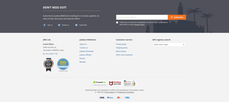
Footer on Judaica WebStore website. One of our clients.
Main section in Magento homepage design
If we remove the header and the footer, what’s left is the actual content of your Magento homepage design template. While it doesn’t have a semantic name, we’ll call it “main” for more natural organizational purposes.
The homepage content is colorful and differs from site to site but in general, it falls into a few usual categories:
- hero content,
- promoted categories,
- promoted products,
- sales / special offers & similar,
- value propositions & unique selling points,
- additional content such as blog, guides, testimonials, etc.
All these elements should give the customer a good idea of what the type of your store is. Misinterpretation of the kind of store can be harmful as customers won’t look for a kind of product they don’t believe the website will carry. This brings lost sales and high bounce and exit rates, so it’s necessary to ensure a broad selection of categories and different product types on the homepage. A simple glance over the homepage should indicate the store’s diversity.
Hero content
Hero sections are quite common these days, but if not done right, they quickly become the pitfalls of a homepage. A most common scenario to why this happens is an issue called “The illusion of completeness”. It’s a situation when the hero content populates the entire viewport of the customer’s display.
This is usually a static image with some text and sometimes a call to action button. This kind of design pattern leads the customers to believe they’ve seen all there is on the page. They’ll often skip the rest of the homepage content because they feel there’s only that one button to click or leave the site because they lack information scent.
That single button is never enough.
Apart from a single image, a common element found in hero sections is a carousel of images. Most customers will see a few slides, but don’t expect they’ll see them all. We can assume that only the first slide will have the number of views close to pageviews because customers are likely to scroll down fast.
It’s easy to conclude that the first slide is the most important one. Placing vital information within the carousel should be avoided, because chances are, many people won’t get to see it. If important information is placed in the carousel, it should also be placed elsewhere on the page to make sure it’s discoverable.
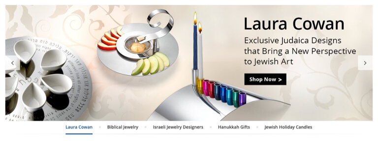
A hero section on Judaica WebStore.
Slide control
It’s always hard to pinpoint the right time for auto carousels. The best chance is to conduct a short usability test or just leave it static and let the customers change the slide once they’re ready. For navigating the carousel, don’t just rely only on the small dots we often see used. They blend with the background easily, they are difficult to click and are often hard to notice.
On mobile, the carousel should respond to the finger slide motion. On larger devices, bigger targets (such as large icons or a list of items) make it much easier for navigating the carousel.
Promoted categories & products
Some are tempted to use a few rows of products only, but this is not a recommended approach. Featuring only selected products on the homepage narrows down the visual display of the catalog range a store carries. This is especially an issue if the store is selling various ranges of products and don’t feature all product types.
Based on a quick page overview, a customer might conclude the store doesn’t carry the products he’s interested in and leave. A far better approach is to mix categories with products to ensure the catalog’s breadth and product ranges are understandable to customers.
A popular approach is to display the main navigation and some important sub-categories on the home page content. This is great if category browsing is an important product finding strategy in the target industry (such as the apparel industry) as opposed to search. Unlike the main navigation, categories on the homepage content have much more freedom in terms of choice and their visual appearance. They can be promoted using imagery, different text styles, icons, and more.
Another popular approach is to use “inspirational” (thematic) paths. This is great for customers who come to explore or search thematically-oriented products (such as “Valentine’s day gifts”) and need some inspiration or guidance for purchase. When using thematic categories, keep in mind that they should only be used as an addition to the regular ones. Customers who know what type of products they’re looking for won’t be able to find it in thematic categories.
When featuring products on the homepage, also make sure to feature products from multiple categories to assist in displaying the different product ranges. Don’t rely only on products you may find attractive, ones that have a higher profit margin or ones that don’t sell well, but you’d like them to. Featuring isn’t a guarantee they’ll sell. Run frequent tests of this section, especially if you run a wide range of products because it’s hard to cherry-pick the products customers will be interested in. We often see this section ignored in many stores.
Check your analytics for products people are searching and buying and combine them with industry trends and products you may want to feature for whatever business reason you have.
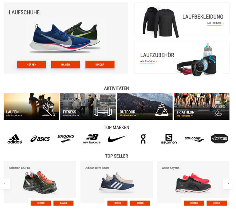
The main section on Shop4Runners websiite. One of our clients.
Value proposition & unique selling points
When customers land on the homepage of your Magento store, they start shaping their perception about the store. They need answers to questions like:
- What is the product range the store carries?
- How do they benefit from shopping here rather than elsewhere?
To answer the second one, different types of value propositions or unique selling points can be used. These can be anything from short sentences to more beefier descriptions. The idea behind it is to raise the perceived value, set expectations, and establish trust or relevance.
The value proposition should be among the first things your users see when they visit your website. A compelling value proposition can convince potential customers to take action and push them down the sales funnel.
Some of the tips for creating a value proposition:
- it should speak to your market,
- it should be unique,
- it should be easily understandable.

The value proposition of Packaging Price.
Additional content such as blogs, testimonials & reviews, etc.
Additional content adds up to the perceived value. You can create more content to engage the potential customer and add fresh content for search engines.
Having a blog, for example, brands you as an industry expert. It helps your SEO because it creates more content and can create a community. It also helps in building brand loyalty and supports your social media marketing efforts. You could say that it is a free marketing platform.
Similarly, testimonials, just as product reviews, drive conversions and help SEO as well. They are persuasive because they give social proof – a psychological concept based on the idea that people are more likely to follow the actions of others. Social proof helps by using existing customers as a leverage to sell to potential customers, and 61% of customers read reviews before making a purchase.
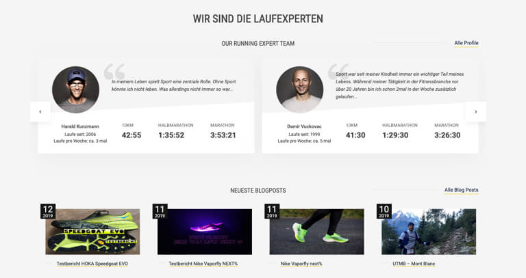
Additional content on Shop4Runners website.
We’ve covered the basic approaches to designing a Magento homepage. Hopefully, we gave you some ideas on how to improve your user experience by tweaking and adding new content to your homepage.
In the meantime, check out the rest of the articles from this series:
- Best practices for Magento Category page design
- Best practices for Magento Product page design
- Best practices for Mganeto Cart page design
- Best practices for Magento Checkout page design
- Best practices for Magento Theme design
Got any questions? Be sure to comment below, or fill out a contact form, and we’ll get back to you!

