Profile
Packaging Price is a packaging products and materials supplier, based out of Illinois, USA, and covering the entire country from their fulfillment centers in Georgia, Illinois, Pennsylvania and Texas. They take pride in the customer pricing, service, delivery and rewards model based upon many years of experience and customer feedback, and believe that their model is the best in packaging industry.
Challenge
They were operating an old website on an outdated Magento version when we first took over the ongoing technical support and maintenance several years back. After conducting a technical audit on their website, we continued working on a number of code and UX improvements, however all of those investments were simply to maintain the status quo or fix things here and there. We all knew a more serious revamp was needed, and soon.
We quickly laid out a plan for a design and technical overhaul in order for Packaging Price to better support their customers, and ensure that the customer experience they take so much pride in can be adequately presented to their existing and new customers.
We also wanted to enable them to take proper advantage of digital marketing services that are available to them, but were used scarcely and were hardly optimized to begin with.
The biggest challenge in the process of the website redesign was in the information architecture revamp. We had to dig deep into the way users behave, get the grasp of the industry specifics, in order to match the findings with the technical requirements of enabling such product taxonomy that would:
- Fit the needs of the customers and the way they search the products
- Set proper foundation for SEO improvements
- Allow the client to take advantage of data feeds for PPC marketing purposes
Since we were in a position where we earned the client’s trust with previous engagements, we were able to create an environment in which our UX design, digital marketing and custom development expertise aligned perfectly in order to create a solution that makes sense and will bring long-term gains.
Solution
Product Taxonomy as the Groundwork
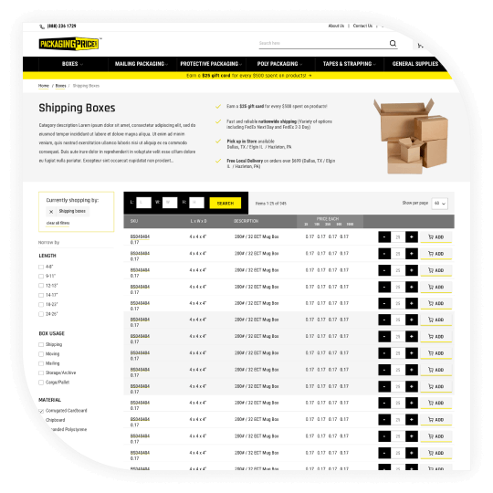
A completely revamped product taxonomy, where we made a lot of changes in the way the products were organized on the website, to the ways they were/are presented within category listings, to careful selection and grouping of attributes by which customers can filter the products.
All of this was done in close collaboration with our client’s team, because they know the product and, to an extent, their customers’ needs. What we brought to the table was the analytical mindset stemming from our eCommerce experience across industries, that helps our clients avoid the most dangerous trap – thinking they know what the customers want.
We had to look deep into the data to get both the trends (what many users are doing) and individual challenges (what bothers particular users) in various user flows throughout the website, in order to improve the experience of the customers looking for their next big box.
Revamped Rewards System That Customers Love
We worked with our client to rework their rewards system, as it was becoming an increasingly important part of the relationship they have been building with their loyal customers over the years.
With the customized solution we enabled the customers to either use the reward points towards new purchases, or to redeem a Visa Gift Card with the balance they are free to use anywhere, even outside the Packaging Price store.
This was greatly accepted and, even though the client expected the customers to mostly use the gift card option, they saw increase in both new orders and gift cards redeemed.
UX Improvements Across the Board
Once the data was in, it provided valuable insights into the UX improvements. Studio33 created a new logo, while our designers developed interfaces using client imagery to visually differentiate product types.
More critical than visuals was presenting products, options, and pricing on category and product pages, given the complexity of different packaging options, bundles, and price tiers. With creative design and custom development, we built a solution that aligns with customer needs while maintaining business logic and workflows.

Results
Even though all changes were done with the long-term gains in mind, we managed to improve website performance even in the first weeks after the launch.
Comparing the first several months of new website’s performance with the same period in the year before, we have seen a lot of improvements (check the numbers at the top!).
In this project we saw just how important the information architecture considerations are, especially for a B2B eCommerce business looking to adopt new technologies to increase customer base and improve sales. Without a data-driven product and categories structure revamp, none of the technical or visual changes would bring these improvements.
We keep working with our client engaging a full set of our services, to enable continuous growth across all the channels.
Related Inchoo Services
Do you need an experienced eCommerce partner?
We combine the analytical with creative thinking to design visually attractive and high-converting eCommerce stores. Get in touch and turn your visitors into customers!


