Product pages are the center stages of any web store. They carry significant weight in the purchase decision, and they are often the landing pages for people coming from search engines. It’s, therefore, important that product pages perform flawlessly for the customers.
Magento’s product page layout comes with several key elements, such as product name, product gallery, descriptions, pricing, CTAs, reviews, and upsells. Still, it leaves plenty of room for enhancements that can be incorporated into the product page design.
We’ll cover some of the fundamentals of Magento product page design and see how we can utilize existing elements and expand them to achieve more benefits for both your customers and your eCommerce business!
Table of contents
1. Breadcrumbs
2. Product imagery
3. Main purchase area
4. Product description layouts
5. Social proof
6. Up-sells and cross-sells
7. Recently viewed products
Breadcrumbs
Some find breadcrumbs trail an excess of information or simply find them visually unappealing, especially if they tend to break into two or more lines. However, breadcrumbs are quite useful to customers when determining their position in the site hierarchy or going back and forth between category and product pages.
Breadcrumbs become significantly more important when a customer lands on the product page from a SERP (search engine results page) page. In such cases, Magento will generate a “Home/$(product-page)” type of breadcrumb by default, but it’s actually not such a great approach. By looking at the breadcrumb, customers won’t know the product’s position in the catalog, that is, the parent category for that particular product. If a customer wants to see more products from the parent category, they’ll have to plow the navigation to find and guess what category the product belongs to.
A better approach is to set the breadcrumbs to display the full category hierarchy. If customers want to find more similar products or possible product variations, they can immediately recognize the category the product belongs to, and browse more products.

Judaica Webstore displays full breadcrumb path, regardless of whether a customer lands from SERP or from the navigation category.
Product imagery
Buying online doesn’t get the actual product in front of customers’ eyes, or its texture underneath their fingertips. To help customers get a better product perception, it’s always good to provide high-quality images. Images should depict the product from several angles (something like this can be achieved with 360 rotating images). Someone buying a product online wants to have a clear idea of what they are purchasing, so having high-quality product imagery is undoubtedly a must. Low-quality imagery can seriously hurt the purchase decision. Customers will quickly get disappointed when looking at a grainy and low-quality image because they are likely to have a negative or utterly wrong perception of a product.
One common trick to use is to have at least one image that depicts the product within its natural surroundings, that is, an image that will represent the product in scale. This helps customers to get a general idea of the size or help them visualize the product in their own surroundings.

Zee & Co depicts clothing on models. This can easily answer the question of how long the dress is.
Close-ups
If a product contains specific textures or details, it’s always great to include close-up images. Imagine a customer buying a guitar amplifier. He’ll surely look for all the available knobs to see the amp features and effects, even before checking the product details in the description. If the product comes in a variety of colors, make sure to include at least one image of every color.
Zoom
Another sometimes overlooked feature is the zoom. More precisely, the level of zoom, which is often inadequate. If the site offers a limited zoom or the zoomed images are low-quality, customers won’t be able to get all the visual information they need.
Video
We recommend including videos as well, especially if it’s better to show the product in action (such as the curling iron). This way, you can display products in action and explain their features like you would in person!
Main purchase area
The main purchase area is one of the most crucial page areas. It’s the first place where customers can find any product information, prices, availability, possible product variations, and of course, add the product to their shopping cart. Other than the apparent product name and price, how can we design the page to improve our customer experience?
Highlighted content
Whenever possible, some kind of highlighted content is always welcomed in this area. Whether it’s a few key product features, shopping-related information (such as shipping information), unique sale propositions, or similar information that can help customers make the purchase decision, this is the place to put it.

Judaica Webstore displays unique value propositions as highlighted content.
For example, we’re used to seeing shipping related information shoved in the page footer and nowhere else on the page. Still, that information should be easily discoverable on the product pages because it can play a significant role in the purchase decision. Don’t expect customers to always scroll to the footer for such information. We see customers often abandoning the cart and the checkout if that’s the first place they discover shipping information.
Product variations
By default, Magento’s configurable product options will be displayed in the main purchase area. However, a lot of times, identical products with different features will be configured as simple products. For example, the same t-shirt or sneakers in a variety of colors will often be set as multiple single products. This is actually a great approach to product listing because all variations are instantly discoverable. However, product variations should also be interlinked on the product pages themselves.
Imagine a customer landing on the black casual shirt product page (configured as a simple product) from SERP and thinking, “If only it came in blue.” If all variations are instantaneously visible, they’ll have no trouble noticing that the blue one actually exists. However, if the variations are pushed to the bottom of the page and mixed with other upsell products (often the case), they won’t be as discoverable. This quickly brings customers to thinking the store doesn’t carry the product they’re looking for and leaving the page. Even if users want to try their luck and look for other variations, they’ll have a needlessly tricky time finding them if they are not interlinked.

Zee & Co shows alternative colors in the main purchase area. This makes them highly discoverable as they are above the fold on desktops and close to the top on mobile devices.
Product description layouts
The first thing that pops to mind when dealing with product descriptions is usually the horizontal tabs. Horizontal tabs are great for saving space and making the page shorter. Horizontal tabs aren’t the wrong way to go, and sometimes they do make more sense than any other approach. However, their main drawback is the fact they are hiding the content. Any kind of hidden content always poses a risk of not being found by some users. This can trigger them to leave the page. What are some other ways we can present product descriptions without hiding the content?
Display all
This approach works if the page is not content-heavy, and the layout can be split to 2-3 semantic columns that usually fit the viewport entirely. It eliminates the risk of hard to discover content, offers an excellent information overview, and makes it easy to find it.

Shop4runners uses the display all approach so no content is hidden and gives a great description overview.
Long page
Often times, merchants will need a layout that accommodates a lot of content. While tabs seem like an obvious choice, the long page approach works excellent too. The trick with long pages is to have a sticky table of contents to make it easy for customers to access different sections. Even if customers don’t notice the table of contents, it’s still a good fallback. All sections are visible to customers as they scroll.
B&H Photo uses the long page approach with a table of contents that scrolls with the user
Mobile layout
As mobile viewports are smaller, the design should be adapted. Display all approach can still work here as long as the content length is reasonably long to be easily scannable. Nevertheless, longer content will require some collapsing because a lot of content on small viewports creates a mess.
Collapsing the content is similar to the horizontal tabs when it comes to hiding content. However, due to the way the site is scanned (top to bottom) and the collapsed tabs offering section names, it’s typically less of an issue because they provide the information scent. When collapsing the content, the most essential thing to have is a clear indication that the contents are hidden and a way to display it. This is usually done by directional icons (such as chevrons).

Zee & Co collapses the description on mobile but indicates there’s more than meets the eye using directional pointers.
Social Proof
Social proof brings that neutral voice to the page and gives further insights into the product. For example, when unsure, customers will check reviews for more information before reaching a purchase decision. A lot of times, reviews won’t be enabled in the store. It’s not unusual to see merchants turning off this feature out of fear from negative reviews. Still, after product images, social proof is amongst the most essential content on the page. Besides the native Magento reviews, consider using 3rd party trusted reviews services to further communicate reviews legitimacy.
Up-sells and cross-sells
Similar to the product variations, it’s vital to offer substitute products and accessories on the same page, because it makes it easy for the customer to find them. If the product doesn’t meet the user’s expectations, these will keep them browsing your store and stop from leaving. Similarly, suggesting product accessories makes it easier for customers to find the appropriate ones without unnecessary category browsing or comparing specs to see if they fit. Imagine a customer buying a new phone. They’ll undoubtedly want to purchase a case for it as well. Why make them browse and filter another category when you can offer them a selection of compatible phone cases on the same page?
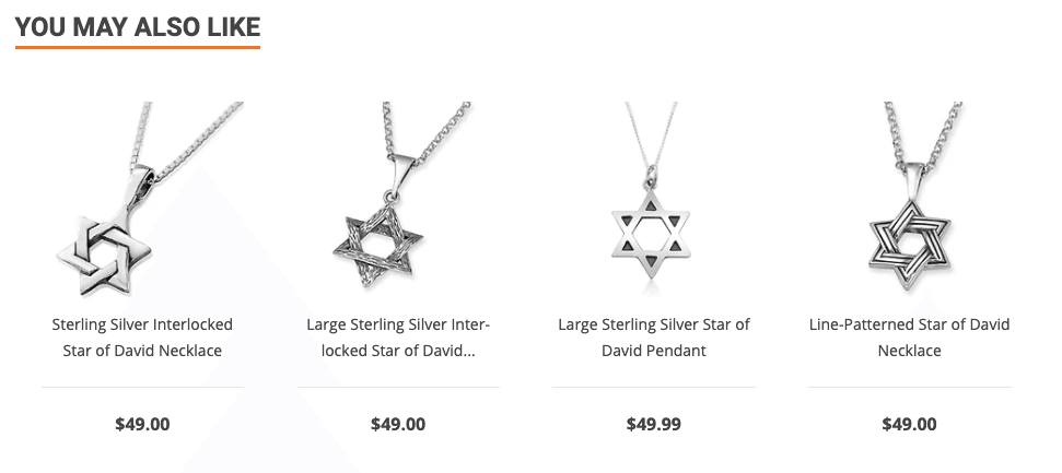
Judaica Webstore offers multiple rows of up-sells and related products making sure that customers find alternative products if the product they are looking at doesn’t meet their expectations.
Recently viewed products
Sometimes customers may want to return to a product they’ve previously visited. Maybe to compare it to another or check compatibility, but this can become quite a complicated task if relying on browser’s back button or trying to re-find the products within the category.
To make it easier to return to the previous products, it’s always good to include a list of previously viewed products.

Zee & Co saves a list of recently viewed product, so users can easily find the products they’ve visited before.
In the meantime, check out the rest of the articles from this series:
- Best practices for Magento Homepage design
- Best practices for Magento Category page design
- Best practices for Magento Cart page design
- Best practices for Magento Checkout page design
- Best practices for Magento Theme design
Feel free to leave a comment if you have some more tips to use when building product pages!